Architect's memo 86: February 2007
The ability to perceive colour is a joyous attribute of the human eye and a gift that we take for granted; but it took the great physicist Sir Isaac Newton (taking time off from the study of gravity) to elucidate the nature of colour.

Experimenting in a darkened room he used prisms to show that white, visible light is in fact composed of several different wavelengths, each of which interact with the human eye to produce the sensation of different colours.
Colour, which had always been very expensive and associated with the rich, became available to the masses (and very big business) subsequent to Perkins synthesising the colour mauve from coal tar. This resulted in an explosion of colour manufacture and became the basis of the modern chemical industry.
With this industrialisation and proliferation of colour came the need to describe, quantify and systemise it. The 'International Commission on Illumination' describe the three properties of all colours as Hue - the aspect that differentiates red from orange, yellow, green and blue (and is related to Sir Isaacs's different wavelengths); Lightness - the aspect that differentiates light from dark and Saturation (or purity) - the measure of how far the hue is from grey.
In 1931, this body (later to become known as the CIE) mathematically defined colour sensations, which enabled a number to be ascribed to any possible colour.
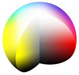
It also proposed the notion of a three dimensional colour sphere. They proposed that the axis of this sphere have no colour at all, being pure white at the North Pole and progressing through a series of ever darkening neutral greys to the South Pole, which is black.
Around the equator (the furthest points from the axis) run the brightest of hues in the sequence of the rainbow. Drill in from the equator to the axis and the bright colour will just get greyer and greyer; take a walk to the North Pole and the colour will become more and more pastel; take a walk South and the colour becomes earthier and darker.
Given this logical framework, several colour systems came into being, generally proscribed by the method that colours were developed or by how they were being measured. Some of the more prominent systems are Munsell, Ostwald and NCS.
When Resene introduced its Total Colour system in 1985 it used a simplified coding system that was primarily based on hue and lightness. This simplified system worked extremely well in its time as the preferred colours of the era were all clean and bright.
Reflecting changing international and local tastes annually in the Resene 'The Range' has placed not only technical demands on how we produce the new colour, but also how we could fit new code numbers for the preponderance of much more subtle, earthy colours into an already stretched system. The system had to change.
We at Resene have decided to move closer to the concept of the CIE and use a code that more precisely defines a colour's position within the colour sphere.
The new codes follow a format such as BR99-010-090. The first letter or letters tells you what group the colour is from:
B = Blue
BR = Brown
G = Green
M = Metallics
N = Neutral
0 = Orange
R = Red
V = Violet
Y = Yellow
The first digits denote the colour's lightness (or luminance) with 0 being black and 100 being white.
The second set of digits denotes the saturation of colour and, in effect, how far from grey the colour is. Colours with low numbers are found closer to the axis of the sphere while those on the equator have high numbers. For example, Resene Black (black) has a value of 000 while Resene Turbo (bright yellow) has a value of 198.
The last set of digits from 001 to 360 indicates where on the equator the hue sits. Latitude 001 is occupied by a red/magenta colour, such as Resene Lipstick.
Travelling east along the equator takes you to red, orange, yellow etc, travelling through the spectrum and ending up at 360, naturally with another magenta/red, such as Resene Cardinal. These numbers do tend to make the initial letters redundant but the letters are more intuitively recognised.
Familiarity with the codes helps the specifier to understand the relationship between colours. Similar hues are similar in the third set of digits; moving between colours that differ only in the second set of digits will show changes in cleanness or greyness and the first set of digits indicates whether a colour is lighter or darker than a similar shade.
If preferred, for most colours the astute colour specifier can just as easily specify by colour name and add quarter, half, double in front of the colour name to communicate what they want and leave the colour code decoding to the colour scientists.
As far as your scribe is concerned, it really doesn't matter two hoots as my wife would never allow me to choose a colour anyway!
Architects memos
The Resene architect's memo section provides technical information on a variety of topics relating to paints, finishes and coatings.