6 (Old) Te Ngae Road, Rotorua
The main focus of the brief directed the restrictive use of primary hues such as red, blue, yellow and green.
The Health Centre conversion of a wing in an existing building was the first stage of a major re-vamp. The centre required spaces for three General Practitioners plus support staff. Two wait areas was preferable due to sometimes volatile youths, with both waiting spaces to be visible from reception. A separate room for ante-natal classes would be a future shared space and did not need to fit within the lockable wing of the health centre. Materials and finishes needed to be reasonably robust. And in place of air-conditioning, there was a geothermal bore available for radiator heating.
We were constrained to fit within the confines of the existing building wing. Accommodating everything was always going to be tight and spaces would need to be used conservatively.
The dividing wall to the remainder of the centre is a multi-wall polycarbonate material, offering good acoustics. It is opaque for privacy as well as being economical. The consultation rooms and toilets are down one side of the wing with spine circulation corridor and support rooms along the other side.
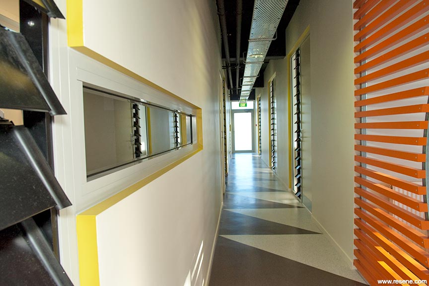
The internal door units to the corridor are combinations of multi-wall panels, allowing borrowed natural light and operable louvers, allowing natural cross ventilation. Two-way acoustic ceilings in the consultation rooms solve future consideration of the use of the floor above. The vinyl flooring in this central corridor is laid in a graphic pattern.
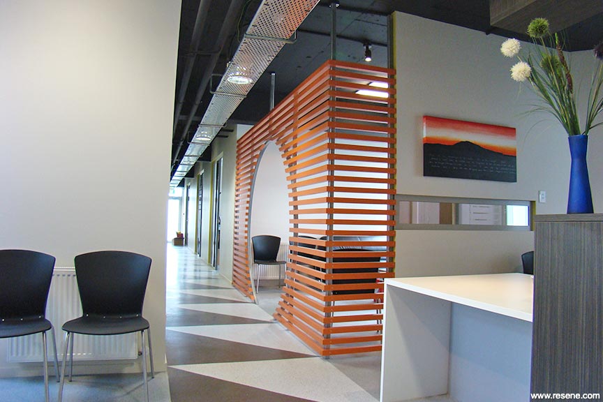
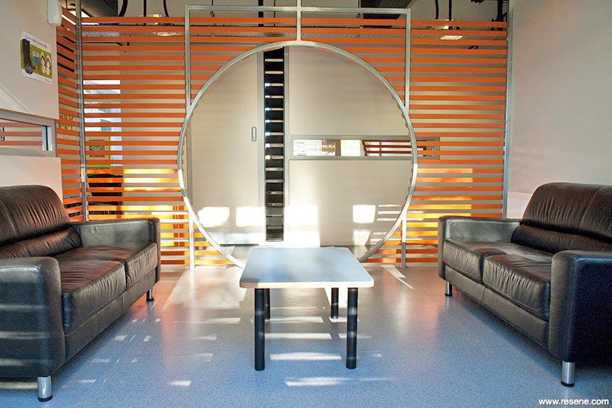
The battened timber screen to the waiting space serves to create a degree of separation and privacy, while still maintaining a feeling of openness. The circular cut-out is a fun play on an otherwise serious fit-out. The existing concrete ceiling and beams are left exposed and painted out a dark colour while cable trays are employed to route services and mount lighting.
The main focus of the brief directed the restrictive use of primary hues such as red, blue, yellow and green. The doctors and staff were clear that youths were very aware of gang associated colours and would either defend their coloured space, or not enter a space which featured a rival colour.
The secondary aim of the brief was to create a calm, inviting and comfortable space.
We chose a murky orange as the defining colour, as this didn’t affiliate with gang association, was gender neutral and has a relatively warm and soothing feeling. This was applied to the batten screen which envelopes the waiting area. The existing concrete ceiling and services were to be left exposed, so a deep chocolate colour was applied to make them disappear. The walls are a dirty neutral, door leaves in a double strength. This was a practical move to hide grubby fingermarks. The kickplates are a pale blue laminate. The reveals to the joinery are picked out in a soft yellow green, defining the lines and shapes as a graphic element.
Finally the long corridor to the doctors’ rooms is laid out in the contrasting triangular pattern. This is a reference to a typical pacific graphic, but also employed to distract from the fact it’s a long corridor.
Because of the restrictive budget, colour and materiality played a huge role in imparting a safe, happy and soothing atmosphere. It must be working as the centre has already reached maximum client capacity after being opened for several months.
Colours used: Resene Black Haze, Resene Blackout, Resene Clockwork Orange, Resene Half Akaroa, Resene Innocence, Resene Karma, Resene Quarter Akaroa.
Products used: Resene decorative paints.
Architectural Specifier: Darryl Church Architecture Ltd
Building Contractor: Burton Construction Ltd
Colour Selection: Darryl Church
Interior Designer: Darryl Church
Painting Contractor: Cantec
Photographer: Tracey Robinson – Darryl Church
Project: Resene Total Colour Awards 2010
Resene case studies/awards project gallery
View case studies that have used Resene products including many from our Resene Total Colour Awards. We hope these projects provide inspiration for decorating projects of your own... view projects
Total Colour Award winners:
2023 |
2022 |
2021 |
2020 |
2019 |
2018 |
2017 |
2016 |
2015 |
2014 |
2013 |
2012 |
2011 |
2010 |
Entry info
Latest projects | Project archive | Resene news archive | Colour chart archive
![]()
![]() Get inspired ! Subscribe
Get inspired ! Subscribe ![]() Get saving ! Apply for a DIY card
Get saving ! Apply for a DIY card
![]()
Can't find what you're looking for? Ask us!
Company profile | Terms | Privacy policy | Quality and environmental policy | Health and safety policy
Colours shown on this website are a representation only. Please refer to the actual paint or product sample. Resene colour charts, testpots and samples are available for ordering online. See measurements/conversions for more details on how electronic colour values are achieved.
What's new | Specifiers | Painters | DIYers | Artists | Kids | Sitemap | Home | TOP ⇧