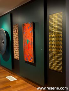
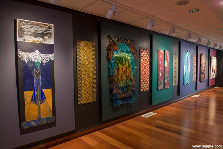
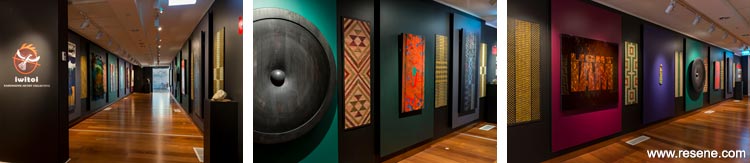
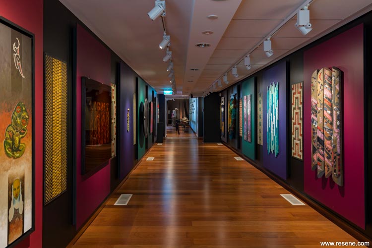
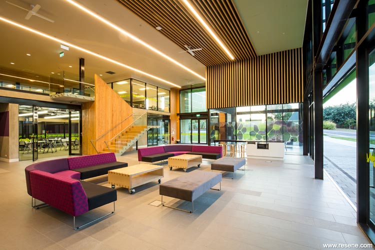
Sumptuous and rich Resene colours that led visitors on a journey from Te Po (The Darkness) to Te Ao Marama (The Light) have won Tūturu top honours in the Resene Total Colour Awards 2017. Tūturu (translated as ‘to be true’) was a collaborative project between MTG Hawke’s Bay and arts collective Iwi Toi Kahungunu, led by renown contemporary Māori artist and author Sandy Adsett. The exhibition was installed in a long narrow gallery, with vibrant tukutuku panels and artworks alternating along each wall. James Price of MTG Hawke’s Bay explains: “We took a thoroughfare gallery and re-designed it to feel like a wharenui (meeting house). Everyone who comes through the gallery feels welcomed into the space. Some have said they would be quite happy to sleep on a mattress under the artworks, as they would in their own wharenui.”
Resene has a long history of colour and today's colour range of thousands of hues is a far cry from the handful that was available when Resene started 71 years ago. The Resene Total Colour Awards were launched to encourage and celebrate excellent and creative use of colour; to showcase striking colour palettes and combinations and provide fresh inspiration.
Awards have been given for the best colour use in: Residential Exterior, Residential Interior, Commercial Exterior, Commercial Interior Office, Commercial Interior Public + Retail Space, Installation - Experiential - Product, Education, Neutrals, Heritage, Rising Star and Lifetime Achievement, with the Colour Master Nightingale Award for the best overall colour use.
Colour Award winners
Iwi Toi Kahungunu led by Sandy Adsett in collaboration with MTG Hawke's Bay. Also winner of the Resene Total Colour Installation – Experiential – Product (interior) Award.
The Resene Total Colour Master Nightingale Award, named after the Nightingale family who founded and still run Resene today, recognises excellence in colour and paint use.
“The judges were repeatedly drawn back to the colours of this project. With a wide range of colours so beautifully chosen to work with each other, this exhibition warmly welcomes you in. The colour frames each artwork and draws you in for a closer look to appreciate each piece’s individuality. It’s a very sophisticated departure from normal gallery treatments. The lighting brings out the moodiness in the colour, the way it washes down the piece.
The colour brings out the best in each artwork, making each the star of the show.”
This project uses Resene Black, with feature colours of Resene Black Marlin, Resene Racing Green, Resene Deep Teal, Resene Sonic Boom, Resene Blackberry and Resene Vanquish.
Find out more about this project
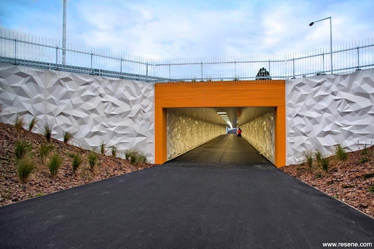
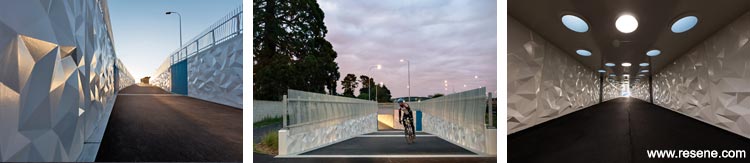
Harewood Underpass by Mike Thomas of Jasmax. Also winner of the Resene Total Colour Commercial Exterior Award.
“This entry was a favourite – the shadow, light and colour – play so perfectly together. Underpasses are usually thought of as spaces you don’t want to visit, but not this one. This underpass is truly one of a kind and shows you what a difference design and colour can make to what could be the most mundane of practical spaces.
Simply impressive inside and out. It invites you to come and enjoy the experience.”
This project uses Resene Carpe Diem, Resene Ship Grey, Resene Rakaia, Resene Captain Cook and custom made Resene Jasmax White.
Find out more about this project
Harewood Underpass by Mike Thomas of Jasmax. Also winner of the Resene Total Colour Maestro Nightingale Award.
“With faceted shapes inspired by the mountains and a wonderful play of shadow, light and colour, this underpass is nearly more art installation than underpass. With such dimension and richness, the design and colours envelope you and welcome you in. Colours are inspired by the underpass orientation and landscape helping to transition between interior and exterior spaces. Paint is used as practical distance markers
This project creates a new vision of what underpasses can look like, banishing the normal dull grey in favour of an inspiring space that is worthy of a visit just to make the trip through. A mastery of shadow, light and colour.”
This project uses Resene Carpe Diem, Resene Ship Grey, Resene Rakaia, Resene Captain Cook and custom made Resene Jasmax White.
Find out more about this project
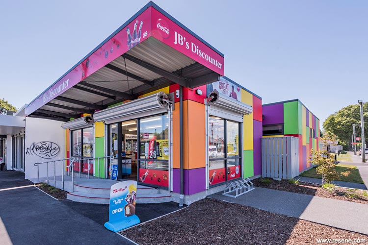
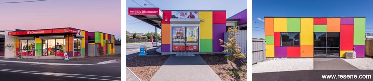
Hills Road Dairy by Dalman Architects.
“Who would think a dairy could look like this? It takes a brave team to ignore the norm and create something unique. Moving away from the sombre colours and wall to wall advertising usually seen on dairies, this project is inspired from the inside out. Bright, bold and irrepressively cheerful jellybean colours are introduced in a blocked Mondrian way. Immediately appealing, and cleverly wrapped around the building, this dairy advertises its presence with optimism.
It’s a colourful welcome for all ages. We hope it inspires a new look for diaries.”
This project uses Resene Belladonna, Resene Wham, Resene Turbo, Resene Roadster and Resene Tango with neutral Resene Black White.
Find out more about this project
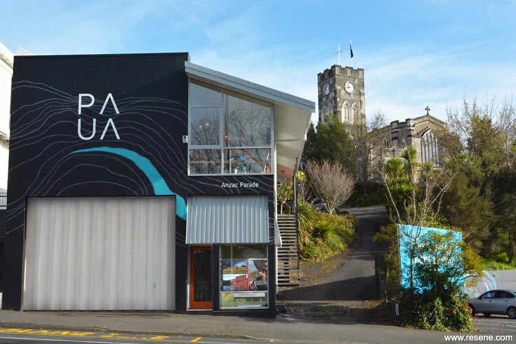
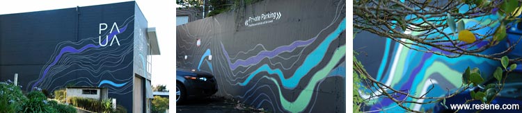
PAUA Re-branding by PAUA Architects.
“Telling the brand story in imagery and colour makes this project ever the more memorable. The brand is not just placed on the building, but is wholeheartedly wrapped around it. The colours are reminiscent of the flow of a river as it meanders along and a clever interpretation of the interior of a paua. The design and colour palette works on both a practical and aesthetic level. The paua contours act as a wayfinding device directing you towards the carpark and into the office. Embracing the brand, it’s lovely, whimsical and a perfect reflection of the creativity that lies within.“
This project uses Resene Double Cod Grey, Resene Christalle, Resene Havelock Blue, Resene Java, Resene Mantis, Resene Half Delta and Resene Quarter Villa White.
Find out more about this project
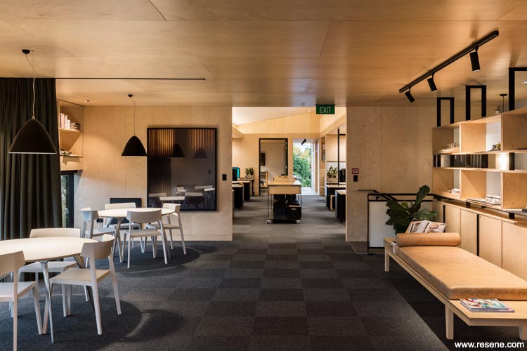
SGA Studio & Workshop by Dave Strachan & Brad Pearless of SGA Ltd. (Strachan Group Architects).
“Colours and coatings are paired together on this project in a highly crafted and robust way. The look is understated, the perfect backdrop to a creative team brimming with creative ideas. By letting the timber show through in a clear finish, the timber acts as part of the colour. The beautiful detailing and uncomplicated colour palette is warm and welcoming, with a sense of space that invites you to think deeper.
Eschewing the clutter of many offices, this project provides built in breathing space.”
This project uses Resene Parsley, Resene Black White, Resene Aquaclear satin and Resene Qristal Clear.
Find out more about this project
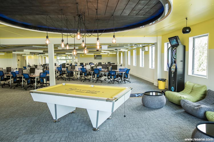
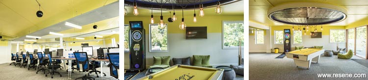
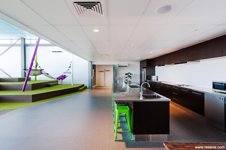
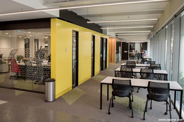
Call Centre Fitout by Mary Jowett and Carolin Friese of Mary Jowett Architects Ltd.
“Working with an existing tired space, colour was used as a hero on this project to bring the space to life. A once grungy area has now become a fresh, light and optimistic space with yellow bringing in a sense of sunshine. Life in a call centre can be high stress. Bringing in uplifting warm yellow, gives staff a fresh hit of energy when they look skywards, providing a soothing atmosphere and helping with memory. Rather than stopping the colour at the ceiling edge, the yellow is continued onto the top of the wall, so the sunshine feels like it is warmly embracing the staff and the space.
It’s amazing the difference colour has made to this fitout.”
This project uses Resene Paris Daisy, Resene Double Alabaster and a Resene custom mixed grey.
Find out more about this project
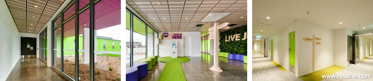
Whitestone City by Annabel Berry, Design Federation.
“An extensive palette of colours is carefully wrapped into this project to celebrate antiquity and support the story telling of history. Visitors are led on a journey of experiences, meandering through a look back in time with something to discover around each corner and interactive activities to enjoy. The colour palette brings a richness to the exhibition that couldn’t have been achieved with duller antique shades.
With such a wide colour range, it would be easy for the elements to compete, but instead they all come together supporting each other, gently evolving as you move through.
Moody, intriguing and a perfect melding of history and colour.”
This project is finished in Resene Half Spanish White, Resene Barometer, Resene Mission Brown, Resene Dark Side, Resene Seaweed, Resene Quarter Bokara Grey, Resene Foundry, Resene Triple Rakaia, Resene Wolverine, Resene Triple Canterbury Clay, Resene Nero, Resene Castaway, Resene Rivergum, Resene Scoria, Resene Sumptuous, Resene Atlas, Resene Green Meets Blue, Resene Quarter Truffle, Resene Chalk Dust, Resene Reflection, Resene Harvest, Resene Colorwood Bark, Resene Jarrah Tree, Resene Ringo and a range of Resene colours for the mural artwork.
Find out more about this project
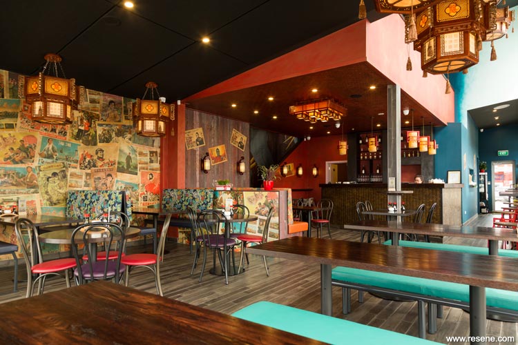
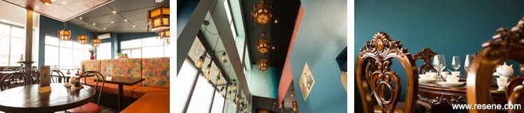
Shanghai Street Dumplings by Element 17 Ltd.
“The slightly chaotic design and colours brings a lively taste of Shanghai and a sense of haggling with vendors at the local markets to diners. The décor is carefully collected, with attention to detail to ensure all elements are authentic to the experience to complement the menu.
The colour scheme is clashy but fun, the perfect backdrop to a fun night out with friends and family or to enjoy on your own. The blue ombre effect is cleverly placed to provide a serene zone in amongst the hustle and bustle. Great zones, great vibes for a great night out.”
This project is finished in Resene Barometer, Resene Reservoir, Resene Jalapeno, Resene Gold and Resene White.
Find out more about this project
Jucy Snooze by Archaus.
“Crisp, fresh and clean, like a crunchy apple, this project has used colours with zesty appeal. Incorporating the Jucy brand colours, there is no mistaking where the colours hail from for instant brand recognition. Their use is reinvented to perfectly respond to the market of young travellers. One colour excites the other. The neutrality of space highlights the brand colour and provides space and a sense of anticipation for things to happen. Colour is used to full advantage, while still allowing plenty of scope for travellers to bring in their own colourful attire and personalities without overwhelming the space.”
This project is finished in Resene Lima, Resene Belladonna, Resene Quarter Black White and Resene Concrete.
Find out more about this project
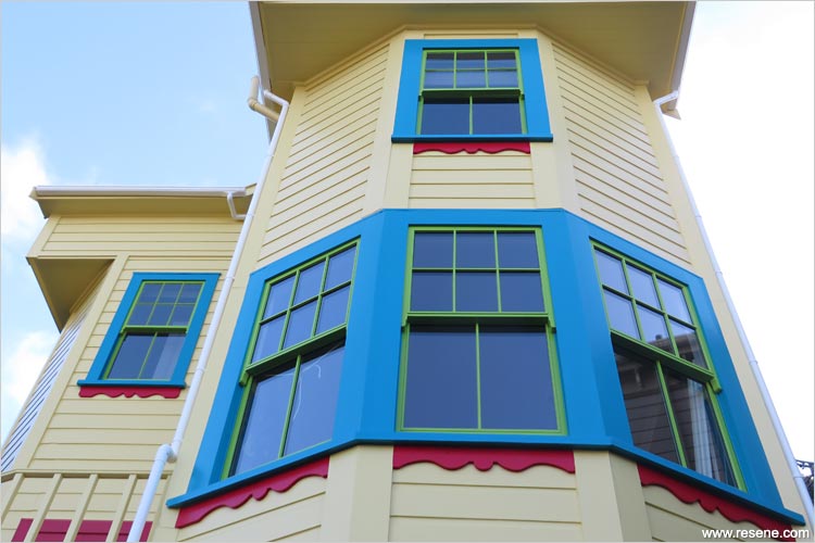
The Fairy Tale House by Daphne Carvalho.
“This home is a celebration of colour and the fairy tale home young children dream of. With an oddly shaped design to work with, most would simply use paint to camouflage. Not on this home. Situated in Aro Valley, this neighbourhood is perhaps more comfortable with home’s having their own distinct personality. With a nod to arty bohemian, homes shouldn’t have to toe the line. The palette is brave and whimsical, with a sense of opening a child’s paintbox for the first time. Once you’ve experienced and enjoyed this colour you can never go back to neutral.
Cheerful and fun, this colourful home is guaranteed to bring a smile.”
This project is finished in Resene Golden Sand, Resene Poppy, Resene Red Oxide, Resene Allports, Resene Limerick and Resene Bright Red.
Find out more about this project
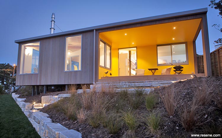
Spitaki House by Lovell & O’Connell Architects.
“This colour palette is inspired by the Michael Smithers’ artwork, which uses colours as musical notation. Wrapped into a more neutral exterior, it’s like a bold jewel box that is enjoyed by its owners, a welcoming torch light inviting warmth into the heart of the home. The hue on this home’s exterior provides a gentle halo glow of yellow to the interior, bringing a sense of sunshine indoors regardless of the weather.
It’s a warm and inspired use of colour.”
This project is finished in Resene Wild Thing, Resene Bright Red, Resene Double Alabaster, and Resene custom colours to recreate the Michael Smithers’ artwork.
Find out more about this project
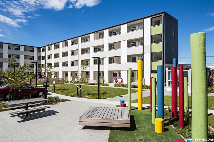
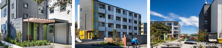
Kotuku Flats Upgrade by Opus Architecture.
“When you’re working with a multi-residential exterior, placement and quantity of colour is often as important as the colours chosen. This project has a restrained use of striking colour, with a Mondrian use of geometric forms that allows bold use of colour to be juxtaposed against a more neutral backdrop. Echoing the colour scheme in the landscape brings the macro scale down to a more tangible micro level for residents to enjoy and connects all parts of the palette into one. Carefully placing the colour on the exterior draws attention to planes that would normally be overlooked.
Well integrated and welcoming, the colour is placed to perfection.”
This project is finished in Resene Bellbottom Blue, Resene Buddha Gold, Resene Koru, Resene Pohutukawa, Resene Double Alabaster, Resene Quarter Oilskin, Resene Truffle, Resene Grey Friars and Resene Eighth Masala.
Find out more about this project
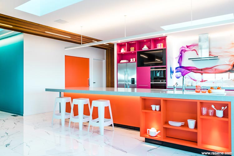
Hill House by Neil Fenwick Architects.
“With a colour lover as the owner, this project needed to truly embrace colour. It has not only embraced it, but created such a rhythm of colour, it just makes you want to dance. Sunbursts of colour provide an explosion of colour. The vibrations of colour and the organic design of the splashbacks are energetic and motivating. Colour is taken beyond the kitchen team with a more neutral backdrop and timber so the space is lively but not overwhelming.
Exciting, brave and pretty. Cooking will never seem like a chore again.”
This project is finished in Resene Colour Me Pink, Resene Daredevil, Resene Maestro, Resene Black White and Resene Black.
Find out more about this project
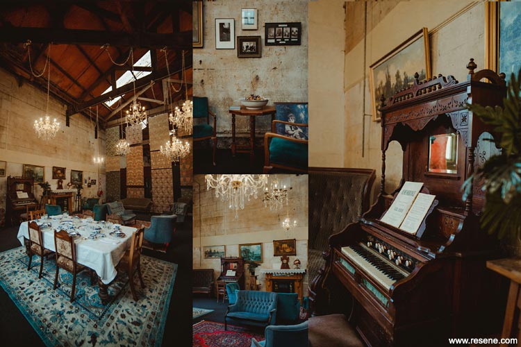
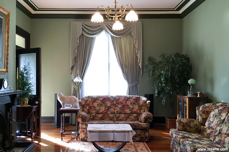
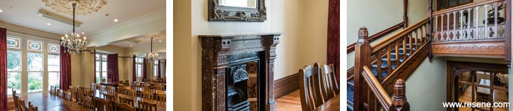
Victorian and Heritage Interior by Flow Colour and Design.
“A classic heritage project, this home has been intricately handled with precise attention to detail. In true Victorian style everything is picked out, but not in the colours you may expect. Forgoing the common neutral or very deep palette you might expect to see, this home embraces contrasting warm colours, with stronger hues to accent. The stronger ceiling colours helps to bring the very high ceilings down and better connects each room space. Architectural elements are detailed in not just one colour, but multiple, carefully placed to get the order just right to bring out the best in the colours.
Appropriate for its era, this home’s colour palette is full of personality yet respectful of tradition.”
This project is finished in Resene Wafer, Resene Vanquish, Resene Olive Green, Resene Quarter Solitaire, Resene Brandy Rose, Resene Half Coriander and Resene Gold Dust.
Find out more about this project
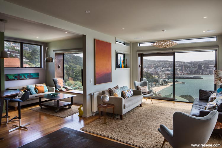
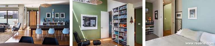
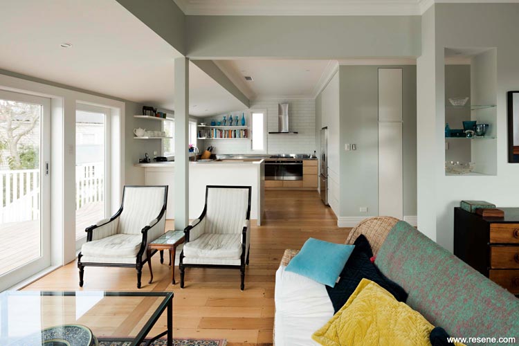
Crescent Home by John Mills of John Mills Architects.
“A lovely palette of soft relaxing colour gently flows through this home. Washed tones and natural inspired hues bring an instant sense of calm, juxtaposed with the natural grain of timber. These weathered colours soften the strong light and provide a haven away from busy city life. Inspired by the elevation and panoramic view, the interior palette brings the outdoors in. Transitional space is dressed with bolder colour, welcoming you in to explore further, without competing with the view.
This is a home of colour that brings the best of nature indoors.”
This project is finished in in Resene Bermuda Grey, Resene First Light, Resene Woodstock, Resene Endeavour, Resene Cut Glass, Resene Half Fossil, Resene Alluring and Resene Crisp Green.
Find out more about this project
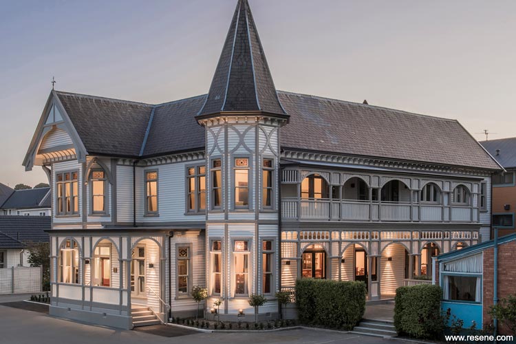
Acland House by Dalman Architects.
“This project is a grand building handled with confidence and beauty. The colours are empathetic to the architecture, yet still appealing to the students that use the space in the modern day so that they too appreciate that heritage is worth saving and has a place in today’s world. The colour palette is thoughtful and respectful of the building, which deserves survival.
With a restrained colour palette, the architecture isn’t just highlighted, it is enhanced.”
This project is finished in Resene Pravda, Resene Half Pravda, Resene Cararra, Resene Half Cararra, Resene Beaten Track, Resene Drought, Resene Half Parchment, Resene Quarter Parchment, Resene Half Wheatfield, Resene Quarter Wheatfield, Resene Alabaster, Resene Colorwood, Resene Polythane and Resene Qristal Clear.
Find out more about this project
Bassett Road Renovation by Emma Morris & Lucy McGillivray.
“Most see neutrals as the easy option, but choosing the right neutral colours can really make a home sing. Interesting shadowing and light in this home play with the neutral palette, adding an extra layer of interest. Your eyes wander comfortably through the space, the perfect backdrop to showcase favourite possessions. Different colours on the horizontal and vertical planes provide a soft contrast.
This home is simply beautiful in neutral – with a soothing and calming ambiance that many homeowners would love to have in their own home.”
This project is finished in Resene Tasman, Resene Half Rice Cake, Resene Eighth Rice Cake and Resene Timekeeper.
Find out more about this project
Victoria University Business School: Rutherford House Redevelopment by Sophie Vial, Athfield Architects Limited.
“Colour interweaves its way through this project, linked back to a purpose of locale. It’s a sensitive use of colour that befits an historical precinct and supports the strong purposeful architecture. The palette invites you in and encourages you to explore and spend time enjoying the spaces. As you move around there are new colour features and areas to discover. It’s a sense that you are gently unwrapping the layers of the building as you experience more of the space.
A textbook use of colour.”
This project is finished in Resene Fast Lane, Resene Karma, Resene West Coast, Resene Wimbledon, Resene Area 51, Resene Como and Resene Wasabi.
Find out more about this project
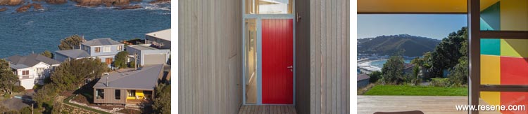
Iwi Toi Kahungunu led by Sandy Adsett in collaboration with MTG Hawke's Bay. Also winner of the Resene Total Colour Nightingale Award.
“Wow! The colours in this installation are striking and sumptuous. Each colour has been coordinate to work with the artwork displayed upon it, encouraging you to stop and truly take in each piece of work. Such was the desire to pair the colour with the artwork that some combinations were changed just prior to the exhibition to ensure each artwork and colour couple were the perfect match. The rhythm of colour slows you, a calming influence on a space you might normally rush through. The warm hues bring the sense this is the interior of a Maori meeting house.
Powerfully intensive colour and artwork, paired up perfectly.”
This project uses Resene Black, with feature colours of Resene Black Marlin, Resene Racing Green, Resene Deep Teal, Resene Sonic Boom, Resene Blackberry and Resene Vanquish.
Find out more about this project
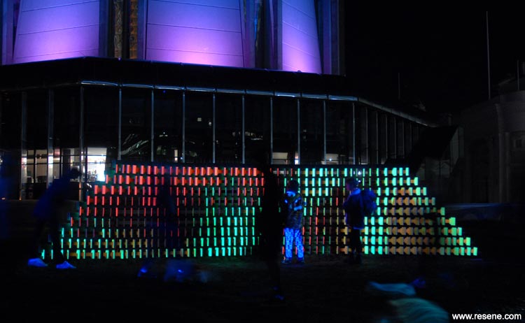
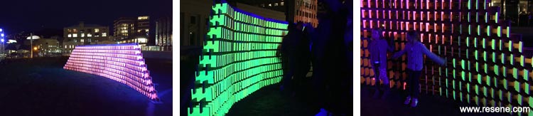
Passing Me By created by Makers of Architecture.
“Created for the LUX festival, this project plays to the darkness. Usually paint colours would be lost to the darkness, but using blacklit fluoro paint, this static installation appears to come to life as the night descends. Using just three colours and a cleverly crafted concave design, the installation seems to flutter. Harnessing a ‘Mona Lisa’ effect curve it gives you the sense you are seeing something different as you move by.
A very engaging installation, you just want to be part of it. A beautiful use of colour."
This project is finished in Resene FX Fluoro Pink, Resene FX Fluoro Green and Resene Black.
Find out more about this project
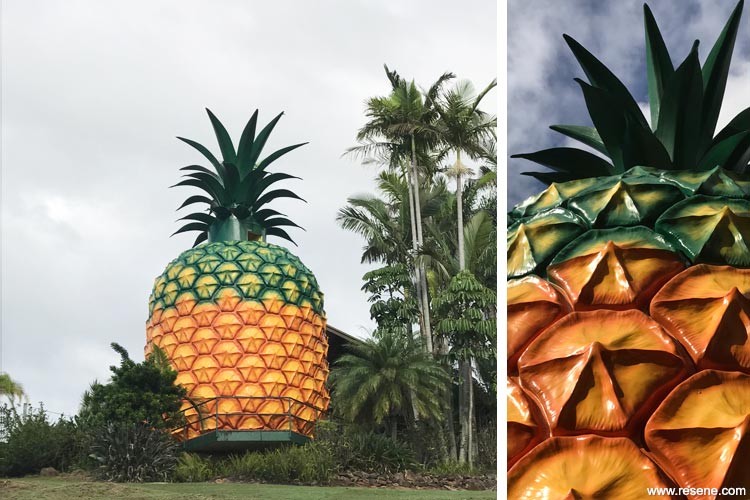
The Big Pineapple by Vicky Pattison of Art of Crazy.
“The sheer scale of this project combined with the attention to detail needed to transform a huge grey shape into an instantly recognisable pineapple is spectacular. This project has been given a new lease of life with a beautiful application of colour and paint technique. Using a limited palette of colours, these have been painstakingly blended piece by piece to recreate a pineapple. With visitors making sure this landmark project is on their ‘must see’ list, there is a huge community vested interest into the colour palette.
It’s an impressively artistic and authentic use of colour on a local icon.”
This project is finished in Resene Turbo, Resene Surfs Up, Resene Havoc, Resene Crusoe, Resene Black and Resene White.
Find out more about this project
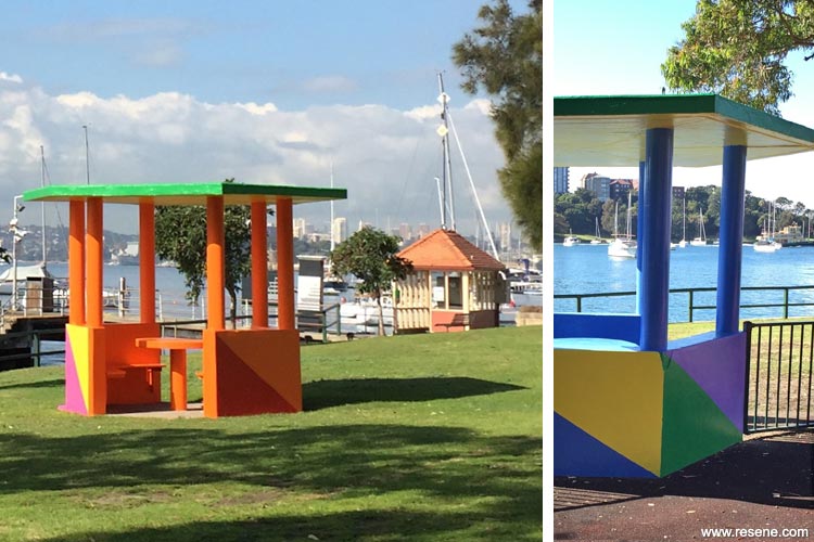
Kesterton Park Community Project by Zena O’Connor.
“Taking inspiration from the environment, this project embraces the colours of international maritime flags to connect the park to the harbour that laps gently at the shore. Like follies in a garden, the bright colours draw you in to picnic and enjoy the spaces. For those passing through they are an uplifting shot of colour to brighten the day.
So often these spaces are left grey and uninspiring, but this project shows they can be so much more with the help of colour.
Glossy and colourful, this project adds a sense of fun and excitement.”
This project is finished in Resene Adrenalin, Resene Havoc, Resene Smitten, Resene Happy, Resene Left Field, Resene Point Break and Resene Fuchsia.
Find out more about this project
Architecture of Wearables by Chae Yun Christine Park.
“An intriguing concept with a very direct and practical use, paint becomes an adornment for everyday wear. Harnessing geometric designs, this project explores how colour and shape can be used to change the mood of the wearer. The palette is related colours, each can be mixed and matched with the others for a new look, a new mood or a new day.
A fascinating insight into how colour and shape can add power to your day and to your mood.”
Havelock North Harmony by Louise Hammond.
“Creating a colour palette for a mixed neighbourhood, each family with its own intricate back story, requires the ability to truly hone into what is important to each homeowner and design a colour palette to suit their lifestyle, their personalities and their home. With three homes side by side to provide palettes for, the colour schemes also need to work in harmony with each other. This project has achieved both, capturing the needs of the individuals and their families, as well as the needs of the neighbourhood.
A careful and in depth exploration of colour, beautifully presented.”
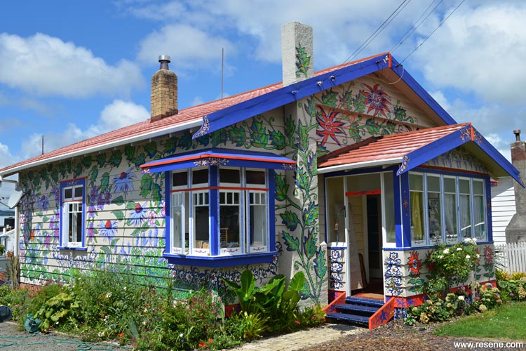
Morningside’s House of Flowers by Brigid Sinclair.
“Charming, enchanted and incredible, this home looks like it has grown out of the garden. Originally started as just a little creativity on the front of the home, with positive feedback and growing confidence, the artwork has grown to cover this home. It’s become a local landmark, a striking addition to everyday suburbia. This home is a conversation starter, bringing the community together to enjoy someone stepping out of the mould, and provoking others to question whether they too can embrace their own personality without worrying about what the neighbours think.
Created with paint alone, it’s a fabulous showcase of the difference you can make with paint, colour and imagination.”
This project is finished in Resene Deep Koamaru, Resene Daredevil, Resene Double Parchment, Resene Japanese Laurel, Resene Nero, Resene Surfs Up, Resene Wellywood, Resene Sassy, Resene Crusoe, Resene Portage, Resene Pursuit, Resene Blue Diamond, Resene Kingfisher Daisy and Resene White.
Find out more about this project
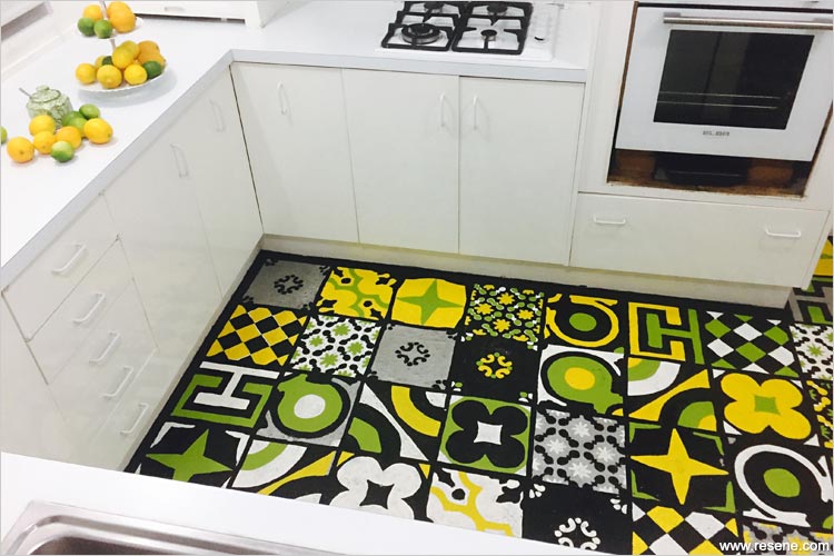
Lemons and Limes in the Kitchen by Sally Pulham.
“What would most of us do with an old floor? Rip it out and start again. This project embraces the age of the floor and uses that to tell the story. Using citrus hues, the zesty colours add a freshness to this floor and kitchen. Each section was carefully painted and left overnight, creating a daily moving maze for this home’s inhabitants to move around.
A labour of love, it’s a reminder to us all, that patience, paint, colour and a creative idea can be transformational.”
This project is finished in Resene Lemon and Resene Citron.
Find out more about this project
“Darryl doesn’t just apply colour to a project, he interweaves it into the design, so that the design and the colour become inseparable. His placement of colour is always so precise, so carefully crafted.
Rather than relying on vast planes of brights, Darryl applies the colours he chooses in such innovative ways that the colour itself is amplified, as are the surrounding materials. Who could forget the impactfulness of the green Resene Impromptu peeking out through the timber batten walls of the Waiariki institute of Technology Health + Science Building?
Darryl won his first Resene Total Colour Award the first year the awards ran with his Youth Centre Project.
We’ve had the privilege of seeing many colourful projects from Darryl Church and we look forward to seeing many colourful more.”
![]() Get inspired ! Subscribe
Get inspired ! Subscribe ![]() Get saving ! Apply for a DIY card
Get saving ! Apply for a DIY card
![]()
Can't find what you're looking for? Ask us!
Company profile | Terms | Privacy policy | Quality and environmental policy | Health and safety policy
Colours shown on this website are a representation only. Please refer to the actual paint or product sample. Resene colour charts, testpots and samples are available for ordering online. See measurements/conversions for more details on how electronic colour values are achieved.
What's new | Specifiers | Painters | DIYers | Artists | Kids | Sitemap | Home | TOP ⇧