Wellington Girls’ College
The brief was to create a colour scheme for all buildings on site that would unify the campus.
Wellington Girls’ College is a large inner city school nestled in the heart of Thorndon, home to nine different buildings including three multi-level buildings and two gymnasia across the 2.5 hectare site.
There is an extraordinary variety of architectural styles from a Victorian house, to a 1940s deco type block with 1950s rooftop addition, a 1960s ‘brutalist’ 6 level block and hall, an example of 1980s ‘post-modern’ style, various prefabs, an old 1940s brick gym, and a new 1970s gym, and the most recent building in corrugated steel from this century. The school site has a permeable boundary and out of school hours offers facilities for use by the wider community both through formal booking and informally as open greenspace.
The brief was to create a colour scheme for all buildings on site that would unify the campus and embody the idea of school as providing a vibrant exciting learning environment as well as provide a neutral but animated canvas for the identity colours and signage to sit against. Size and disposition of the colourful naming panels and components was undertaken as a collaborative process between Neil Pardington Design and McKenzie Higham Architects.
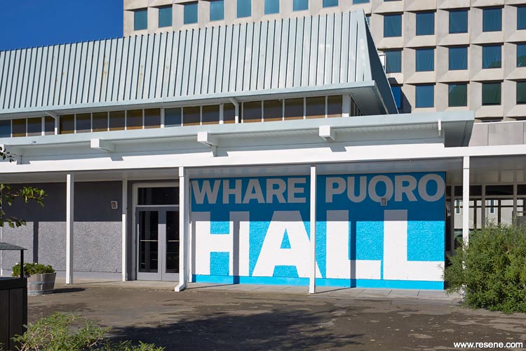
The wayfinding design proposed creating ‘identity’ colours for the buildings or building uses. The wayfinding design also proposed combining the naming of buildings with the identity colours. The new signage embodies the school’s commitment to Te Reo by incorporating both Maori and English into all building naming panels.
Black boards and white chalk have long gone from the learning environment, but like white chalk on asphalt and black charcoal on white paper they have an enduring quality. The core colour selection of three neutral tones, Resene Sea Fog (greyed white), Resene Quarter Fuscous Grey (taupe grey) and Resene Double Foundry (hot charcoal), came from the desire to create interest through pattern and disposition of the selected ‘tones’ as a background to the flamboyant ‘identity colours’.
As a state school project budget is always a significant determinant in selection of design. The team chose large panels, stripes/bands, and blocks of colour in relatively simple areas to meet this requirement. Resene Quarter Fuscous Grey was chosen as a neutral mid-grey that would remain neutral in early morning and late evening light. It was important that it worked with all the identity colours. Combined with the lighter Resene Sea Fog and darker Resene Double Foundry it was possible to articulate aspects of the individual buildings enhancing and respecting their character. The selected colours provide the scope to create high contrast, from Resene Sea Fog to Resene Double Foundry, or reduced contrast (Resene Sea Fog to Resene Quarter Fuscous Grey and Resene Quarter Fuscous Grey to Resene Double Foundry).
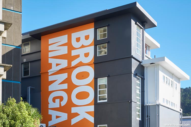
The south east corner of Brook/Manga has three tall elements of varying height which are expressed using the three tones to enhance the deco design. The Resene Hyperactive (frenetic orange) naming panel further reinforces the verticality of the building element.
On the northern wall of Brook/Manga existing horizontal details have been incorporated into wide horizontal bands of Resene Sea Fog and Resene Quarter Fuscous Grey that give some style and exaggerate the horizontality of the long slab building. International House/Te Pae has a Victorian façade which is rendered with Resene Quarter Fuscous Grey and Resene Stack (serious grey) to acknowledge the historical detail and then enlivened with the entry doors in Resene Seance (purple).
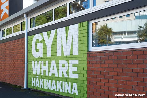
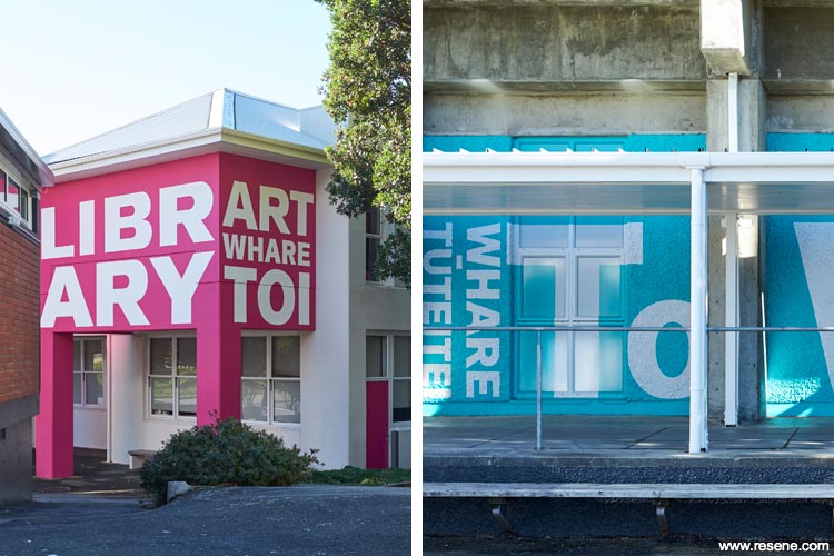
Feature colours are also used on other buildings, with Resene Pohutukawa (spicy rich red), Resene Java (intense turquoise) on Tower/Whare Tuteitei and custom made Resene colours on New and Old Gyms and Pavilion/Whare Hakinakina and Library Arts/Whare Toi. Resene Lumbersider was selected for its excellent adhesion properties to a variety of substrates, superb durability and environmental credentials with Resene Lustacryl semi-gloss waterborne enamel for exterior joinery. Resene Sonyx 101 semi-gloss and Resene Summit Roof were also used, along with Resene Woodsman in Resene Dark Oak (mellow brown).
Due to the age range of the buildings, the variety of substrates to coat was extensive. Work was spread over an 11 month period focused on holiday periods for minimal disruption. This project won the Resene Total Colour Education Post-Primary Award. The judges said: “connecting through colour, the bold colour entry highlights bring disparate buildings together for a sense of cohesion.
Selected carefully the colours are of a similar intensity, bold but not shrieking. Neutral greys and whites clean up the architecture allowing the wayfinding colours to take centre stage. The mix of substrates provides added texture and shadowing. Both powerful and practical.”
Architectural specifier: McKenzie Higham Architects
Client: Julia Davidson, Principal Wellington Girls’ College Board of Trustees
Colour selection: Emma Alcock, McKenzie Higham Architects
Painting contractor: Switched On Property Maintenance Ltd
Photographer: Rex Bultitude, McKenzie Higham Architects
Wayfinding design: Neil Pardington and Joanna Madgwick
Winner: Resene Total Colour Education Post-Primary Award
Project: Resene Total Colour Awards 2018
From the Resene News – issue 1/19
Resene case studies/awards project gallery
View case studies that have used Resene products including many from our Resene Total Colour Awards. We hope these projects provide inspiration for decorating projects of your own... view projects
Total Colour Award winners:
2023 |
2022 |
2021 |
2020 |
2019 |
2018 |
2017 |
2016 |
2015 |
2014 |
2013 |
2012 |
2011 |
2010 |
Entry info
Latest projects | Project archive | Resene news archive | Colour chart archive
![]()
![]() Get inspired ! Subscribe
Get inspired ! Subscribe ![]() Get saving ! Apply for a DIY card
Get saving ! Apply for a DIY card
![]()
Can't find what you're looking for? Ask us!
Company profile | Terms | Privacy policy | Quality and environmental policy | Health and safety policy
Colours shown on this website are a representation only. Please refer to the actual paint or product sample. Resene colour charts, testpots and samples are available for ordering online. See measurements/conversions for more details on how electronic colour values are achieved.
What's new | Specifiers | Painters | DIYers | Artists | Kids | Sitemap | Home | TOP ⇧