Oceans Resort
To decide the colour palette, the building was considered as a blank white canvas observing the parallel lines, rectangles, horizontal elements and shadows.
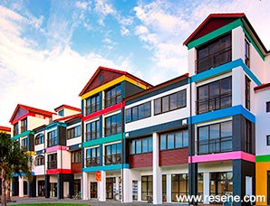
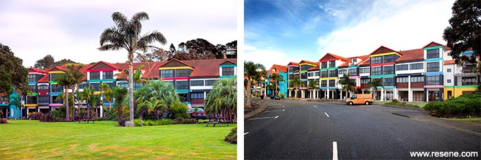
Oceans Resort was 12 years old and due for a major repaint. As a prominent 130 metre long and 13 metre high building, less than 100 metres from the sea, the Body Corp wanted to use the repainting project as an opportunity to make a difference on the coast. The result is certainly ‘different’ complete with its ‘Avant Garde’ title to hint that this is a palette with a difference.
To decide the colour palette, the building was considered as a blank white canvas observing the parallel lines, rectangles, horizontal elements and shadows.
To add an extra challenge into the mix, the resort is a tourist hub so all works had to be completed through winter so as not to affect the hotel, shops and apartment owners.
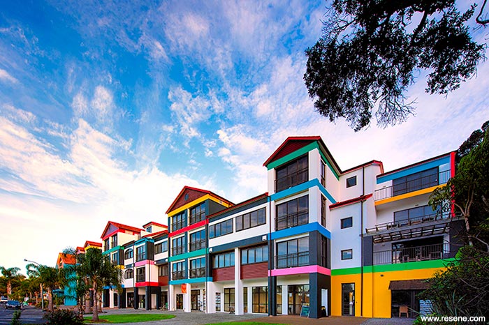
Wall, beam and column colours were chosen to represent colours found in the four seasons of Northland: Black Tree fern – Resene Deep Sea (watery teal), Cabbage tree – Resene Fruit Salad (emerald green), Sky – Resene Havelock Blue (summer blue), Night sky – Resene Cod Grey (deep dark grey), Kowhai – Resene Wazzup (loud yellow), Pohutukawa – Resene Roadster (bright red), Forest – Resene Wild West (adobe clay), Water – Resene Pelorous (porpoise blue) teamed with Resene Alabaster (blackened white) and Resene Deep Blush (warm pink), all finished in Resene Lumbersider low sheen.
Soffits are finished in Resene Alabaster, fascias in Resene Roadster with Resene Clearcoat UVS and cedar weatherboards are stained in Resene Woodsman Cedar (warm red brown).
It’s a palette designed for all weather – providing a bright spot on a grey dull day and an extra hit of colour on a sunny day.
Oceans Resort – Tutukaka by Richard Cranenburgh, On the edge design won the Resene Total Colour Commercial Exterior Colour Maestro Award 2016 Award. The judges thought “The summertime beach theme creates a happy joyful holiday spirit lifting a building that might once have simply blended into the background, into a local talking point.
The colour placement breaks with convention; it’s bright, bubbly, bold and undeniably colourful. Colour can be used to both draw attention and distract attention and this project cleverly does both using the bold pops of colour to draw your eye across the building focusing on the colour highlights, effectively helping to camouflage other elements.
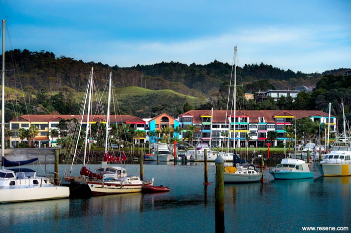
For those arriving from the sea, it provides a colourful backdrop to the Tutukaka marina acting as a colourful welcome home for locals and visiting mariners.”
Architectural specifier: Richard Cranenburgh
Client: Oceans Resort
Painting contractor: Programmed
Property manager: Matt Taylor
Other key contributor: Trevor Griffiths, Body Corp Board Member
Winner: Resene Total Colour Commercial Exterior Colour Maestro Award 2016 Award
Project: Resene Total Colour Awards 2016
From the Resene News – issue 1/2017
Resene case studies/awards project gallery
View case studies that have used Resene products including many from our Resene Total Colour Awards. We hope these projects provide inspiration for decorating projects of your own... view projects
Total Colour Award winners:
2023 |
2022 |
2021 |
2020 |
2019 |
2018 |
2017 |
2016 |
2015 |
2014 |
2013 |
2012 |
2011 |
2010 |
Entry info
Latest projects | Project archive | Resene news archive | Colour chart archive
![]()
![]() Get inspired ! Subscribe
Get inspired ! Subscribe ![]() Get saving ! Apply for a DIY card
Get saving ! Apply for a DIY card
![]()
Can't find what you're looking for? Ask us!
Company profile | Terms | Privacy policy | Quality and environmental policy | Health and safety policy
Colours shown on this website are a representation only. Please refer to the actual paint or product sample. Resene colour charts, testpots and samples are available for ordering online. See measurements/conversions for more details on how electronic colour values are achieved.
What's new | Specifiers | Painters | DIYers | Artists | Kids | Sitemap | Home | TOP ⇧


