Riverview House
Whites and neutrals are always a popular choice for homes, but picking just the right combination isn’t as easy as it might look. This Riverview House in NSW uses a combination of neutrals to create a sanctuary from the city.
This home is nestled into the side of a steep slope. Its previous layout was segmented and many spaces lacked a sense of connection.
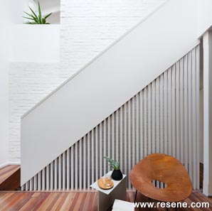
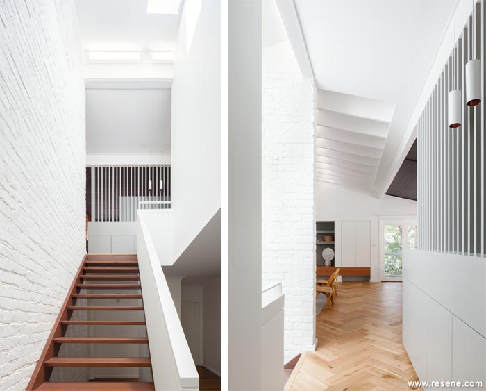
New cut-outs and voids were created to introduce a sense of entry and arrival in the home and to clearly demarcate the public living spaces. The new screen to the kitchen delineates this zone from the general circulation space, but also acts as a focal point, which draws you up from the front door to the main living areas.
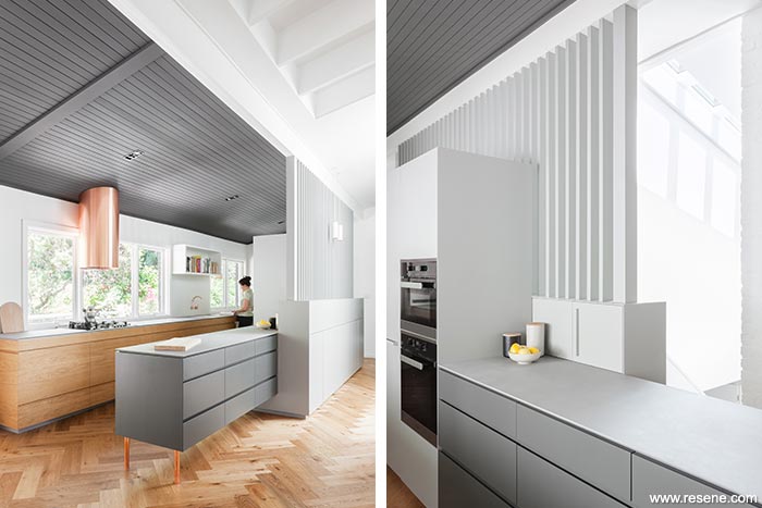
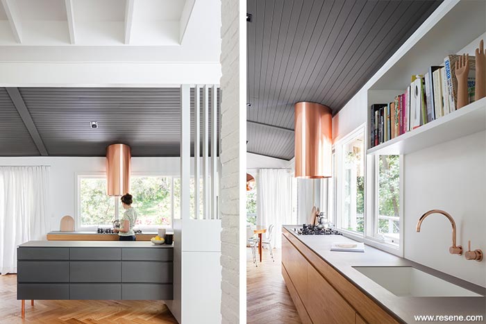
As the new kitchen is very open to the living and dining spaces, the cabinetry has been designed to appear more as pieces of furniture rather than purely a utilitarian space. The freestanding bench is raised off the floor sitting on bespoke copper leg, almost as a credenza unit.
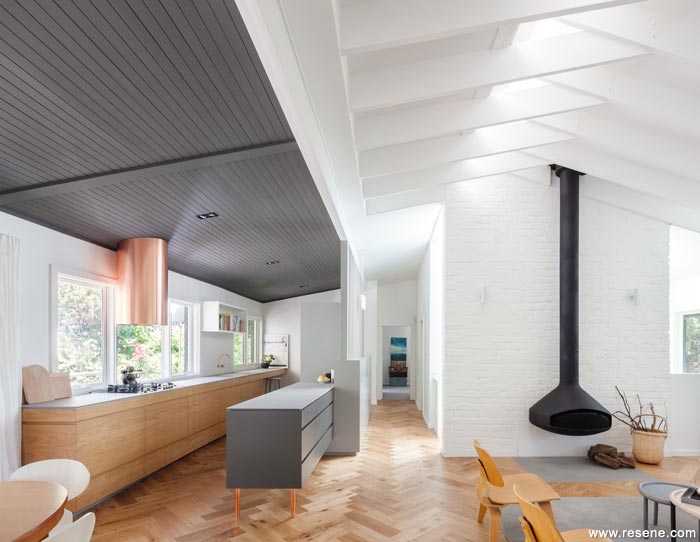
The main living room has very high vaulted ceilings, so it was important to create a contrast to this area and provide a more focused setting. The ceiling of the kitchen and dining were painted a very dark grey – Resene Armadillo (armour grey) – which links these two areas together and differentiates them from the vast volume of the living space. This is joined by Resene Half Tapa (urban grey) on joinery and the entry screen and Resene Quarter Rice Cake (greened neutral) as the backdrop white throughout.
Riverview House won the Resene Total Colour Neutral Award. The judges thought "While neutrals are often seen as a default option, it takes skill and careful consideration to really harness the power of neutrals.
This home carefully plays off dark and light with a well-constructed neutral palette that allows feature lines to show. There is a playful use of textures and detailing to enhance the subtle colour flow, casting light and shadow.
The juxtaposition of the ceiling colour delineates the space with elegance and solidarity. The wooden floor adds warmth and pattern to complete the colour palette.
It's simply beautiful."
Architectural specifier: Nobbs Radford Architects
Building contractor: A. A. Tomkins & Sons Pty Ltd
Photographer: Katherine Lu
Winner: Resene Total Colour Neutral Award
Project: Resene Total Colour Awards 2016
From the Resene News – issue 4/2016
Resene case studies/awards project gallery
View case studies that have used Resene products including many from our Resene Total Colour Awards. We hope these projects provide inspiration for decorating projects of your own... view projects
Total Colour Award winners:
2023 |
2022 |
2021 |
2020 |
2019 |
2018 |
2017 |
2016 |
2015 |
2014 |
2013 |
2012 |
2011 |
2010 |
Entry info
Latest projects | Project archive | Resene news archive | Colour chart archive
![]()
![]() Get inspired ! Subscribe
Get inspired ! Subscribe ![]() Get saving ! Apply for a DIY card
Get saving ! Apply for a DIY card
![]()
Can't find what you're looking for? Ask us!
Company profile | Terms | Privacy policy | Quality and environmental policy | Health and safety policy
Colours shown on this website are a representation only. Please refer to the actual paint or product sample. Resene colour charts, testpots and samples are available for ordering online. See measurements/conversions for more details on how electronic colour values are achieved.
What's new | Specifiers | Painters | DIYers | Artists | Kids | Sitemap | Home | TOP ⇧


