The Opera House, Wellington; Centenary Upgrade
Both clients, Wellington City Council as the building owner and Positively Wellington Venues as the building manager, were insistent in modernising the existing theatre.
The theatre at 111-113 Manner Street, Wellington first opened in 1914, despite the 1913 decal adorning the façade. Since then the theatre has undergone several interior and exterior upgrades, resulting in significant aesthetic changes in both style and colour scheme. The most recent, prior to this upgrade, was in the 1990s.
Both clients, Wellington City Council as the building owner and Positively Wellington Venues as the building manager, were insistent in modernising the existing theatre and requested that the final concept not only acknowledge the ornate features of the building where the prior scheme had not, but also enhance these ornate plasterwork features.
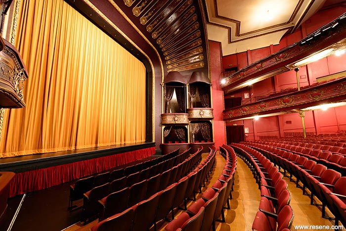
With a highly constricted budget for the intended scope of the works, compromises were made across all aspects of the project. Deductions from a priority list of proposed works was conducted; these decisions were made based on which proposed works were envisioned to make the most visual impact. This process dictated the final project scope. The most notable deduction was within the auditorium itself. Considering the scale of works within the space, it was decided that the greatest impact that could be achieved within budget was to focus the upgrade around the proscenium-arch and the arch boxes adjacent, which frame the stage.
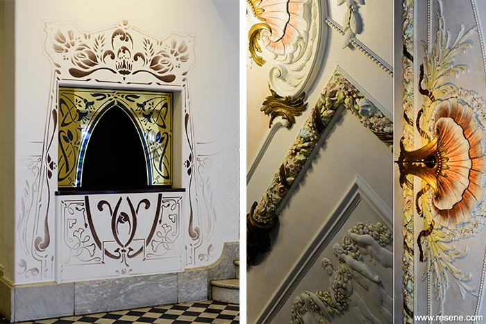
The inspiration for the project as a whole was derived from the photographic imagery taken from the building’s opening day in 1914. Although the images are depicted in black and white, the emphasis on accentuating the ornate plasterwork by way of colour is evident. Other notable features these images inspired were the ticket booth box fronts, stencil dado and the regal treatment of the auditorium’s proscenium-arch.
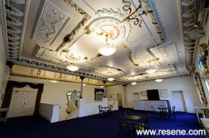
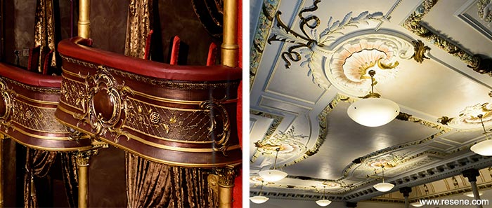
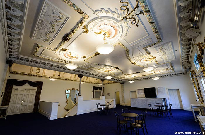
The existing imagery, along with the density of detail found in the retained ornate ceiling plasterwork suggests an intentional progression of detail as the patron transitions from lower foyer, upstairs to the mid-landing, which resides underneath the barrel vault ceiling and finally the main upper foyer entry.
The final colour scheme would reflect this notion by graduating from high definition but minimal colour within the lower entry foyer ceiling to greater colour within the barrel vault ceiling and finally to full colour on the main upper foyer ceiling. The stencil dado would also transition from Resene Bokara Grey (charcoal black), representing the original ornate door frames, fading to Resene Aquaclear gloss over a low sheen Resene Eighth Rice Cake (noodle white) wall colour. This would then be tinted gradually with Resene Alter Ego (cinnabar red) as the stencil dado moves up the main stairwell.`
The only evidence of the original colour scheme was found in the retained stained glass windows located above the balcony doors of the upper foyer. These colours were used in the ceiling’s final scheme, most prominently on the garlands, ‘shell’ decals and moulded bas-relief pictorial. The Resene colours that best matched the stained glass were Resene Alter Ego, Resene Rain Forest (spicy yellow green) and Resene Tiber (deep teal). All ornate features not coloured would be defined by way of a patina effect made up of Resene Paint Effects Medium tinted with Resene Punga (dark ochre) to various ratios to achieve greater depth and definition in the plasterwork.
One of the greatest challenges to overcome on the project was to create a modern interpretation of the building’s original design intent one hundred years ago. The response was vigorous in-situ testing of colour combinations and artistic layering techniques, which in itself aggravated the challenge of meeting a strict project timeframe for wet works. The decision making on the colour scheme was dynamic throughout the project.
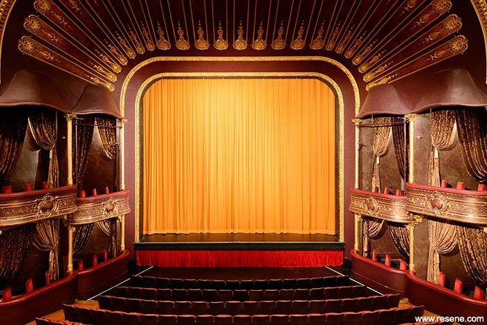
Another consideration that was given to the colour scheme was the necessity for the colour scheme to complement the existing upper foyer carpet as well as the existing auditorium colour scheme and house curtain adjacent to the proscenium-arch, all retained due the budget constraints.
The interior foyers themselves presented a challenge of dimensional proportion where the ceiling height in conjunction with the overall space width and depth disallowed for a sense of grandness. The sense of space was visually increased by the vast use of Resene Eighth Rice Cake on the walls and Resene Rice Cake (sharp yellow white) on the joinery as well as the ceiling base colour.
The use of Resene Pearl Shimmer tinted with Resene Alter Ego to various ratios and applied by way of a plaster brush was to simulate movement to the less detailed and ‘blank’ sections of the ceiling. The use of Resene Aquaclear tinted with either Resene Sensual Red (pink red) or Resene Citrus (acidic green) being applied as a glaze to complete many colour layered artistic details, in both the foyers and auditorium, was to enhance the basecoat colours, reflect against the new foyer uplighting and further strive for authenticity. The auditorium colour scheme’s base colour, Resene Aubergine (deep wine red), was driven by the desire to achieve a royal and rich appearance under house lighting, while also generating a ‘black-box’ effect during a performance. The sponge applied Resene Blast Yellow (copper brass) metallic effect within the arch boxes enabled a sense of the hierarchy that once adorned these spaces while also complementing the new asymmetrical crushed velvet drapes.
To complicate the project further, all wet works had to be completed within a three-week time period over the New Year break that separates the Opera House’s final and first booked show of the respective seasons, with all works to be completed around the building’s 100th anniversary.
The Opera House, Wellington; Centenary Upgrade by Shand Shelton won the Resene Total Colour Heritage Colour Award 2016.
The judges thought: “Breathtakingly beautiful; a monochromatic delicate colour palette has been applied with such care and attention. The subtlety of the colours lures you in; the longer you look, the more you can appreciate the exquisite detailing and the colours as they gently complement each other.
The project has a beautiful delicacy fitting with its history. Elegance is created in circulation areas with a quiet careful restraint. This elegance is the opening act setting the stage for the theatre with its rich related palette of orange, red and burgundy.
Colour leads the way bringing out this building’s beauty.”
Architectural specifier: Shand Shelton
Artist: Tina Rae-Carter
Client: Wellington City Council; Positively Wellington Venues
Painting contractor: Pauls Decorators Wgtn. Ltd
Photographer: Woolf Photography
Winner: Resene Total Colour Heritage Colour Award 2016
Project: Resene Total Colour Awards 2016
From the Resene News – issue 2/2017
Resene case studies/awards project gallery
View case studies that have used Resene products including many from our Resene Total Colour Awards. We hope these projects provide inspiration for decorating projects of your own... view projects
Total Colour Award winners:
2023 |
2022 |
2021 |
2020 |
2019 |
2018 |
2017 |
2016 |
2015 |
2014 |
2013 |
2012 |
2011 |
2010 |
Entry info
Latest projects | Project archive | Resene news archive | Colour chart archive
![]()
![]() Get inspired ! Subscribe
Get inspired ! Subscribe ![]() Get saving ! Apply for a DIY card
Get saving ! Apply for a DIY card
![]()
Can't find what you're looking for? Ask us!
Company profile | Terms | Privacy policy | Quality and environmental policy | Health and safety policy
Colours shown on this website are a representation only. Please refer to the actual paint or product sample. Resene colour charts, testpots and samples are available for ordering online. See measurements/conversions for more details on how electronic colour values are achieved.
What's new | Specifiers | Painters | DIYers | Artists | Kids | Sitemap | Home | TOP ⇧