Henderson Police Whangaia
The space has been reimagined to be warm and welcoming while achieving the flexibility and functions required by the WNPH teams.
Whangaia Nga Pa Harakeke (WNPH) is a shared space between police, local iwi and other organisations. It is designed to be inclusive, open and collaborative to reflect how the organisations will be working together to change the community.
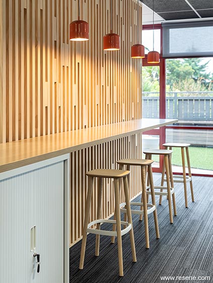
The space has been reimagined to be warm and welcoming while achieving the flexibility and functions required by the WNPH team. Bright splashes of colour alongside timber screens, acoustic treatments, feature lighting and flexible workstations instil the concept of agile workspaces allowing staff to work in an open plan environment while giving them the freedom to choose their type of workspace and be more mobile within the team.
The refurbishment of the staff café was designed to reinvigorate and add colour and delight to the ‘hub’ of the station. A key was enlarging and opening up the space to bring in lots of natural light and allow for future growth. It’s designed to be an informal meeting space and cafe as well as a celebration and relaxation space for all staff to enjoy.
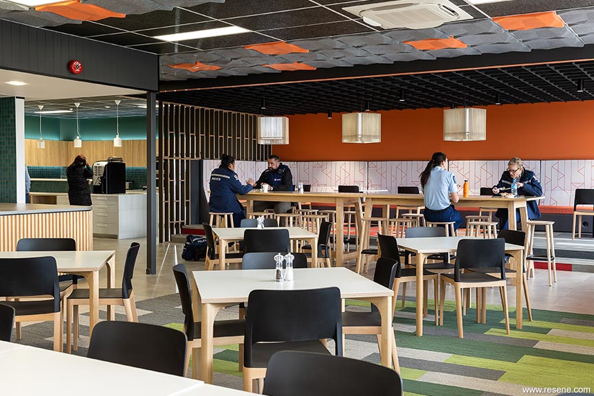
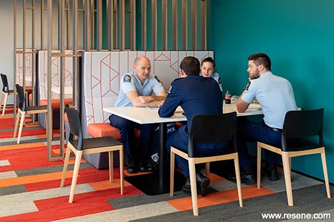
A variety of soft furniture and booths provide comfortable areas for informal meetings and team lunches alongside bar leaners, pod seating, café style tables and armchairs in a colourful palette to enliven the space. The café spills out onto a refreshed outdoor staff terrace creating a better indoor outdoor flow. The space will become the ‘heart’ of the Henderson Police Station, an area for staff to meet, learn and connect.
Working with an existing tired space, colour was used as a hero on this project to bring the space to life. A once grungy area has now become a fresh, light and vibrant space. The staff café was designed to reinvigorate and add colour and delight to the ‘hub’ of the station. Colour was used to clearly distinguish this space from the rest of the building’s interior.
Reds, oranges and greens were used to delineate different seating zones of the café, and as you move around the space there are new colour features and areas to discover. The colour selections were also designed to complement the existing ‘maroon red’ aluminium joinery that features heavily in the space.
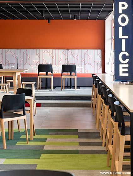
The café is painted in Resene Sea Green (clear blue green), Resene Periglacial Blue (icy blue), Resene Fuscous Grey (charcoal grey) and Resene Stromboli (soft deep green), with Resene Alabaster (blackened white) and Resene Ayers Rock (sunset orange) being used across both the café and the Whangaia. The rest of the Whangaia uses a flow of coastal tones with Resene Port Phillip (lichen grey green), Resene Streetwise (slate blue), Resene St Kilda (mineral blue) and Resene Quarter Mako (mid grey).
Where the ceiling is lowered to compress the space, warm wall and ceiling colours were selected to enhance the sense of enclosure and warmth, with different furniture types selected to suit the mood of each zone.
This project won the Resene Total Colour Commercial Interior Shared Space Colour Maestro Award. The judges said “this project cleverly breaks down the barriers with colour, bringing the police and the community together in a positive environment where all are welcome. The palette deviates from the austerity and formality you might normally expect, using a careful mix of bold and softer hues. United by colour, this colour palette brings togetherness.”
Architectural specifier: GHDWoodhead Creativespaces
Building contractor: Cape Interiors
Client: NZ Police
Photographer: Michelle Weir
Winner: Resene Total Colour Commercial Interior Shared Space Colour Maestro Award
Project: Resene Total Colour Awards 2019
From the Resene News – issue 1/20
Resene case studies/awards project gallery
View case studies that have used Resene products including many from our Resene Total Colour Awards. We hope these projects provide inspiration for decorating projects of your own... view projects
Total Colour Award winners:
2023 |
2022 |
2021 |
2020 |
2019 |
2018 |
2017 |
2016 |
2015 |
2014 |
2013 |
2012 |
2011 |
2010 |
Entry info
Latest projects | Project archive | Resene news archive | Colour chart archive
![]()
![]() Get inspired ! Subscribe
Get inspired ! Subscribe ![]() Get saving ! Apply for a DIY card
Get saving ! Apply for a DIY card
![]()
Can't find what you're looking for? Ask us!
Company profile | Terms | Privacy policy | Quality and environmental policy | Health and safety policy
Colours shown on this website are a representation only. Please refer to the actual paint or product sample. Resene colour charts, testpots and samples are available for ordering online. See measurements/conversions for more details on how electronic colour values are achieved.
What's new | Specifiers | Painters | DIYers | Artists | Kids | Sitemap | Home | TOP ⇧


