Monthly Archives: May 2013

Three colours that will never go out of fashion

Picking paint colours might not have been at the top of your list when you took up your job, but for many people in property manager, motel owner or unit manager-type roles, it is part-and-parcel of the work you do.

If you want an interior design scheme that will never go out of fashion, you can head into your nearest Resene for a chat with the experts in store, or you can have a go with using one of these hues.

Neutrals

This one might seem obvious, but cream really never will age. Neither will your usual whites, beiges and 'off-white' colours. If you’re unsure of cream, opt for a lighter green edged variant like Resene Thorndon Cream.

If you look at the Resene Top 20 most popular paint colours, you’ll notice a good proportion of them fit into this category.

Neutrals will stay looking good on the walls while you occasionally update your decorative items in a room and they will complement anything you put with them.
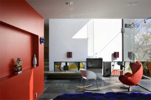
Reds

The colour of love, summer berries and truly great wines, reds will never go out of season.

While a full room of red might be overpowering, reds can be used to liven up any space and complement plenty of other colours, working especially well with neutrals and natural browns. Try Resene Pohutukawa for an ever popular red.

Black and white

If you use black and white together well, you can create an evergreen interior design style. Think Resene Nero meets Resene Alabaster.

While chevrons and checkers in these tones will take you straight to the 80s, this simple but bold contrast can work together for a long-lasting look.

Absolutely any colour can be thrown into the mix with black and white, whether it's lime green (a current trend), or luscious plum such as Resene Aubergine (for an elegant touch), you’ll be able to play up this scheme with small touches whenever you feel like a change.

Continue reading

Posted in DIY/Homeowners Tips and Advice, Paint Leave a comment

The RGB and CMYK difference

Anyone dealing with colour or design in any capacity will have come across these acronyms at some stage.

They are used to describe colour palettes, usually in the printing industry, but are important for paint colour and design too.

The difference between them lies in the fact that what might appear as a deep pine green colour on your computer screen might look like an almost black green when you have a physical representation of the colour. Basically, it means that there can be slight differences when transferring from the digital version of a colour to the physical product. This is because each uses a different way to display colour.

Continue reading

Posted in Paint Leave a comment

Accommodation colour choices for the daring

For many people who choose a paint colour for their hotel, motel or serviced apartment, the choice is all about long term planning.

Picking a paint colour that will stand the test of time is certainly a financially wise investment, as it means you won't have to paint again in the near future.

If you can paint your walls any colour you like, what does that mean for your business?

Many people who frequent these sorts of accommodation options often complain that "the inside of a hotel room always looks the same".

So why not be daring, try something new, and set your business apart with unique interior design?

You don't have to hire a professional to organise every little detail (although you can if you want to or are undertaking major changes), but talking to the expert team at Resene can give you a fresh insight about colour choices that will stand out from the usual beige and neutral tones that you often find in hotels, motels and apartments.

You could choose a deep red for a feature wall. Reds, like Resene Pohutukawa, are popular year in and out and are as safe as neutrals for never going out of style. The warmth and vibrancy will make your guests feel a lot more at home and may help to reduce some of the heating costs as the room will feel warmer through autumn and winter.

Continue reading

Posted in Paint Leave a comment

On trend – citrus tones

One of the newest trends to make its way into homes is that of fresh, bright citrus tones.

These bright colours are turning up in stores and making for great pops of colour in popular interior design trends.

Orange

Unlike the duller orange that was in fashion in the 70s (when it was often paired with chocolate browns), the 21st century oranges are bright colour accents like those you would find in a fruit bowl.

Close cousin tangerine was last year named as the 'colour of the year' by the Pantone Institute in North America.

The reason it works so well is because orange is a dramatic colour that can work in several colour schemes. It will often be paired with greens, creams and whites or deep blues. 

Lime

Lime is another hue straight from the fruit bowl, but not one for the faint of heart.

A splash of lime paint will dramatise any area or room and can be enhanced with lime accents around the house in the form of vases, cushions, fruit bowls, or as part of a curtain colour scheme.

This tone works well with navy blues, other bright colours, natural browns and beiges, or as a dramatic offset to traditional black.

Lemon

Last in the fruit bowl is sunny and bright lemon.

It is said that a lemon scent in the home will make everything seem fresher and cleaner, and the same goes for a lemon colour on the walls.

A crisp, clear lemon can be used in small spaces to great effect as it has the ability to brighten up, and therefore give the illusion of space, to any room.

Sunny yellow tones work well with other citrus tones for an ultra-bright look, or can be used purely as accents next to creams.

Continue reading

Posted in Decorating Inspiration, Paint Leave a comment

A break-down of paint durability

Architects, designers, facility managers and the like have enough to worry about without wondering how long a paint job will last.

The environment conspires against paint lasting for as long as the walls it adorns, with UV light, water, oxygen and heat all working  to break down the paint by a process known as light induced oxidation. Once started the breakdown cannot be reversed.

UV energy excites certain molecules in the paint film and this leads to a chain-reaction, accelerated by oxygen, moisture and heat, to attack and break down the resin system. This gradual breakdown materialises as chalking of the surface and in some cases fading of certain organics pigments.

Continue reading

Posted in Paint Leave a comment