From the What's New archive - August 2007
2007 brings us an optimistic fresh palette of warm clear colours expanding into traditionally cool colour families and neutrals joined by exciting new ways of combining colours to push the boundaries on our coloured environment.
The old colour rules are banished broadening the use and mix of colours with a focus on a palette approach where all colours need to work together in any variation by providing colours and neutrals that span both the hue and value range. Exploration by senses sees colour direction being driven by internal experiences of colour and its effect on the psyche rather than external forces.
Colours become increasingly versatile and genderless with more general appeal and less overtly feminine or masculine hues. Colours transcend the traditional boundaries with men now confident to wear hues once traditionally associated purely with feminine clothing and this confidence translating into home palettes. Multiculturalism and a synthesis of cultural norms adds interest to the palette blending colour tastes of ethnic groups and nationalities and adding spicy undertones to safe colour selections.
Individual choice is key, typically achieved through often quirky personalised colour combinations rather than customised individual colours. It is how one combines the colours to fit lifestyle and taste that drives the individuality and expresses personal style. Intriguing colour, texture, sheen and object combination tells a story about the owner in a way that no one element can in isolation.
Contradiction of colours, textures, sheens and sophisticated whimsy heralds a new style of scheme development, with a desire to inject rarity into a space for interest, whether it be the antique chair in a predominantly modern interior, the quirky coloured refrigerator in the kitchen or the comfortable bean bag in the formal lounge. Accessorising allows us to add character and a sense of history to our homes to reflect the way we experience the world and give others an insight into our persona. Injections of colour into mundane objects, such as kitchen appliances, transform work around the home into experiences. Exotic, sensual, surprising.
Colour is a valuable tool underpinning our experiences, comfortable and pampering rather than spiritually connecting. Activity is reinforced by the use of strong colour while subdued hues accompany our relaxation. This delineation of use is particularly evident in the services industry to ensure the atmosphere of the environment evokes and underpins the service being offered.
We are stepping away from radical changes and focusing on transitioning colours, carrying forward the colours we have loved from the past and combining them with fresh versions to update our colour schemes sympathetically with existing elements, rather than complete makeovers. Balancing colours, work and family, nature and technology. Favouring timeless colour selections to last longer with the selection of safe colour bases and the addition of excitement through more disposable bright coloured accents.
No longer a consumer trend, being green is being incorporated into our consumer lifestyle with downscaling, downsizing and removing clutter becoming more commonplace as consumers, especially Baby Boomers, simplify their lifestyles and living environments. Consumption patterns are changing with impulse purchases of big cars and big houses being offloaded and replaced by fewer but better thought out purchases of higher quality as consumers try to do more with less. Being green and sustainable approaches for living and working are supported conceptually. However many find it difficult to translate this fully into their own lifestyle, with the balance between the environmental friendliness of the ingredients and the longevity of the product sometimes difficult to judge and compare between products.
New icons of sophisticated craftsmanship and rare materials with burnished or highly polished finishes developed to redefine high end luxury, status and sophistication, as the accessibility of extravagance to the masses has downgraded the specialness associated with once rare luxuries. Smaller higher quality homes start to replace expansive residential castles as the emphasis turns to quality rather than quantity.
Yearning comfort, stability and security, authenticity in living and aligning personal values with a professional working life is on the uptrend as successful professionals swap ambitious roles for lifestyle roles or deliver projects fulfilling both personal and professional values within their existing working environment. Handmade items gain in popularity as consumers appreciate the value of craftsmanship but continue in a do it for me, rather than a do it yourself trend.
Light and dark neutrals, such as Resene Talisman and Resene Craigieburn, anchor colour schemes with the prudent assistance of white. Monochromacity emphasises tactility, texture, sheen and natural materials, such as wood, as a means to introducing variety into a predominantly neutral environment. Neutrals continue to be earth influenced and occupy a role of softening and simplifying the palette.
Greens are still alive and well and continuing in popularity to underpin many colour schemes. Becoming less muted and moving through to the serene mid tones, such as Resene Spirulina, as the hues freshen. Nature inspired tones are still popular. Aqueous colours are underscored by pale blue greens, while greens also head to lighter and more citrus yellow greens. Emerging browns, such as Resene Tomahawk, become a versatile, classic and rich hue in their own right and continue as a sophisticated option to black, joined by lighter wood finishes for contrast and blends of coloured woods within the same space.
Greys retain their status as the new neutral but tend towards taupe, such as Resene Perfect Taupe, and away from ice bound predecessors. Blues, while on the wane, are underpinned by classic blue selections, such as navy blue. New blues, such as Resene Space Cadet, are warmed and cleaner without the assistance of yellow.
Oranges, reds and yellows look fresh and cheerful, with coppers becoming reddened oranges, reds saturated and yellows lighter, naturally appealing and warmed with orange. The new direction confirms in a new era of timeless and classic reds, such as Resene Red Red Red. Oranges and yellows will be seen more in objects than interior wall space for more flexibility in positioning and movement. Established reds and oranges branch out into both hot and rich browned variants. Pinks wane in popularity as purples, deep plums and violets, such as Resene Rialto, re-emerge and work well with earthy pinks.
Refined elegant pastels, cooler blue and purple tones, opulent materials and combinations, and vivid darks combine with a more conservative and detailed approach to fashion that is expected to quickly move into the home. Simple straightforward colours that blend easily.
Technology meets nature with the meeting of metallics, such as Resene Bling Bling and Resene Chicane, and predominantly darker woods, while gold and silver, once never seen together, now work in harmony. New materials with smaller ecological footprints fuel innovation in interior design and accessories.
Sheen and reflected light outpaces shine and dazzle as comfort becomes key. Whitened metallics and the softer look of coloured aluminium variants attract consumers away from the more industrial coarse edged blast metallic look. Natural materials, such as wood, warm the palette, while injections of natural fabrics, such as leather, and stone provide a connection back to nature. Translucency continues to fascinate with coloured lighting used for kinetic colour.
Article from Simply You Living magazine – colour trends and inspiration
Spruce up, cool down and bliss out this summer with the whiteer shades of pale
Your summer approach to interiors should focus on serenity, simplicity and spaciousness. Pastel colours provide all of these with aplomb. Serenity is achieved by the low impact that pastels have on your senses and the seeming coolness of the environments they create. Simplicity is realised by how easily pastel shades complement each other and work with darker or lighter hues. And spaciousness results from pastel's low tonal strength: they're close enough to white to inherit its magical ability to expand the bounds of space… more
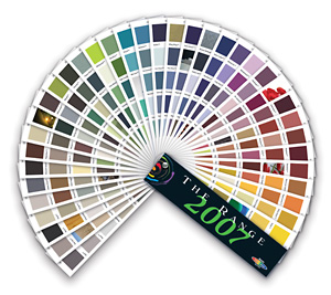
› View swatches of The Range 2007 colours in the Resene online colour library
› View the colour chart archive for past and present colour cues and trends
![]() Get inspired ! Subscribe
Get inspired ! Subscribe ![]() Get saving ! Apply for a DIY card
Get saving ! Apply for a DIY card
![]()
Can't find what you're looking for? Ask us!
Company profile | Terms | Privacy policy | Quality and environmental policy | Health and safety policy
Colours shown on this website are a representation only. Please refer to the actual paint or product sample. Resene colour charts, testpots and samples are available for ordering online. See measurements/conversions for more details on how electronic colour values are achieved.
What's new | Specifiers | Painters | DIYers | Artists | Kids | Sitemap | Home | TOP ⇧


