From the What's New archive - August 2008
A heady blend of colour options inspired by elements of fashion, nature, the economy and the world come together into the 2008 palette. Unusual darker colours find themselves adjacent to moody accents in a palette notable for its seemingly opposing threads of nostalgia, breathing space and vivaciousness.
Continuing the trend from 2007 colours are transitioning slowly, staying current longer, a stark contrast to the short sharp colour bursts earlier in the decade. Seasonless colours are becoming sought after as way to carry forward fashion, with colours being refreshed by cut, texture, pattern and placement rather than a change in the colour. Forecasting is increasingly balancing the fresh new brights with a sense of the traditional, bringing the two together to provide vintage hues freshened by new fashion bolds. Many colours are underpinned by historical hues, comforting in their familiarity.
Just as the distinction between clothing fashion and decorating fashion blurs, so too does the distinction between home and work schemes. As family and worklife increasingly merge at frenetic speed in the same locations, palettes and styles sympathetic to both environments are becoming increasingly common.
We are moving to a borderless existence when work and life, domestic and international blend together. This perpetual connectedness is underpinning a growing sense of responsibility to the globe and the interest in sustainable materials, design and living - not a 'deep' green way of life, but a greener way of living a normal life from minimising packaging to using authentic eco-friendly alternatives as everyday products.
Rooms designed purely for relaxation, meditation and yoga will find their way into new homes as a source of stress release - the modern light on the senses version of the long forgotten quiet, yet highly saturated, reading retreat. While technology developments hasten, the desire for calm balances the urgency and provides breathing space, with homes being decluttered to enable simpler living; less complicated lives with better quality but fewer possessions.
With technology bringing the world to the fingertips and doorsteps of far flung nations, ethnicity continues to drive new colour directions and themes, true to origin colours rather than westernised interpretations. With China hosting the Olympic Games, the Asian influence looks set to increase accompanied by the sari brights of India.
Texture maintains its role as a strong influencer of design, moving towards low maintenance more subdued texture. Equally applicable to metallics, with the shine of stainless steel being replaced in many sectors by more easily cleaned alternatives. Combining metallics with woods, and blending light and dark wood tones within the same environment fits the individual elements into current trends.
In a world of anything goes, selecting one colour is easy - it is combining them together into a satisfying colour scheme that becomes trickier. In lieu of defined colour rules, beauty will be the filter for successful colour schemes. The combination of colours will become key rather than any one hue in isolation.
Surrounding us daily, nature is always a strong influencer on the palette providing endless colour inspiration from earth, sky and sea. The palette is moving increasingly genderless and more elegant than previous years with the shocking brights becoming saturated. The influence of nature and especially ocean bound water brings the palette to a more middle ground.
The palette is warming with a host of warm earth tones, such as Resene Earlybird, joined by rich burgundies and browns, such as Resene Encore and Resene Sofisticata, honey yellows, such as Resene Starbell, and citrus greens, such as Resene Poprock, all lightly cooled with contemporised blues and greens. Organic greens wane as the palette tends towards warmer tones. The purple family with hues like Resene Dancing Queen continues to strengthen as pinks wane, while the yellow family and orange edged yellow follow a similar uptrend reflected in hues like Resene Yellow Submarine. Expect to see the colours of sunset reinvented as relaxing interior backdrops.
Red is back buoyed by Asiatic origins and inspired by the warmth of wood. Warm glowing shades, such as Resene Jalapeno, full of depth. Bright reds, such as Resene Red Hot, will remain popular when maximum impact is a must.
Shadow hues of murky blacks, such as Resene Foundry, provide a background for other neutrals. Plain white is waning in favour of warming mid tones, which provide more comfortable backdrops for furnishings and, like clothing, more practical tones for cleaning and the rigours of everyday living. Off-whites, rich browns and metallic greys, such as Resene Triple White Pointer and Resene Electric, anchor the neutral palette, joined by the soft tones of chalky pastels for broad appeal. Barely there hues will act as visual cleaners.
Metallics and pearlescents become subtle, subdued compared to their dazzling predecessors, yet still commanding in their twinkle and sheen when joined by expanses of pigmented colour. The warm shimmery tones of gold expand to sun warmed pewter complemented by drenched sepia.
Girl power has come of age - the girly cosmetic hues have strengthened and become saturated making a stronger statement. Romance finds favour with younger consumers warming to the bohemian hues, such as Resene Impulse and Resene Memory.
Teal will wane as youthful blue greens, such as Resene Push Play, grow in popularity, while ever popular blue will cement its position with dramatic bolder and moodier shades through to inky and smoky tones, such as Resene Nite Life and Resene Allegro.
Vivid brights are finding their way into homes in unexpected fashion - whether through the funky fun kettle, the bright floor rug or the attention grabbing alarm clock. The unpredictability of placement and combination means that small appliances and accessories once purchased for purely rational features are readily purchased colour first and features second.
Public spaces are play spaces for colour with saturated brights hurrying us through crowded spaces and restful neutrals encouraging a more leisurely speed. Learning these lessons we are translating this to home using the strongest colours in the spaces we spend least time in.
And the trend right colour scheme? It's whatever your sense of colour and style decides it to be! Blend the ultra modern sleek with the handmade traditional or stick to one era - the key is you choose!
Articles from Simply You Living magazine - more colour trends and inspiration
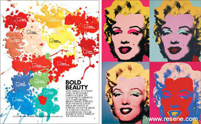
Bold beauty
Andy Warhol got it right when he recoloured Marilyn Monroe. The colour palette is breaking out of safe neutrals; from Simply You Living magazine… more
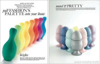
Pull fashion's palette into your home
Mimic this winter's trend for a flash of stand-out bright, subtle pastels or sophisticated smoky basics; from Simply You Living magazine... more
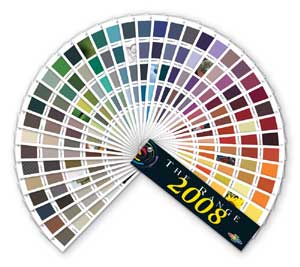
› View the Resene
colour cues for 2008 brochure (PDF)
› View swatches of The Range 2008 colours in the Resene online colour swatch library
› View the colour chart archive for past and present colour cues and trends
![]() Get inspired ! Subscribe
Get inspired ! Subscribe ![]() Get saving ! Apply for a DIY card
Get saving ! Apply for a DIY card
![]()
Can't find what you're looking for? Ask us!
Company profile | Terms | Privacy policy | Quality and environmental policy | Health and safety policy
Colours shown on this website are a representation only. Please refer to the actual paint or product sample. Resene colour charts, testpots and samples are available for ordering online. See measurements/conversions for more details on how electronic colour values are achieved.
What's new | Specifiers | Painters | DIYers | Artists | Kids | Sitemap | Home | TOP ⇧


