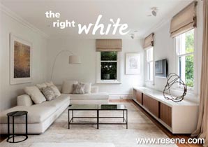
Alabaster, chalk, ivory, cream… which is which? There are so many wonderful Resene whites to choose from.
All whites are not created equal… and that’s particularly true with paint colour. When you’re decorating, you’ll discover a wealth of ‘whites’, with varying touches of yellow, green, brown or grey to turn them into a huge cast of interesting shades. In fact, Resene has hundreds of ‘whites’ in its colour collections.
There are many reasons for choosing white for your walls. White is a timeless colour that allows you to change out your furniture and accessories to ring in the fashion changes. White is an elegant colour, and gives a sense of refinement. It’s a relaxing colour, which can help reduce visual busy-ness.
Do check your motivation though. Is white right for you or are you choosing it because you don’t want to make a mistake with a stronger colour? Paint is inexpensive compared to other decorating options and it’s easy to change. So if you do fancy a bolder colour, then go for it, and simply change it when you tire of it.
Choosing to paint a room in white sounds easy and safe, but you can put just as much time and energy into choosing the right white, than you would with a bolder colour. The best place to start is with the Resene Whites & Neutrals collection, which is home to a host of whites as well as darker neutral colours – greys, beiges and blacks.
The Resene Whites & Neutrals collection is made up of 28 palette cards, with 12 individual colours on each card, often organised into colour ‘families’ or varying strengths of the one colour. Some of the colours have up to six strength variations, which comes in hugely handy when you are building a tonal colour scheme.
White and neutral paint colours are so popular that they dominate the Resene top 20 paint colour list each year. The classics are still going strong, like Resene Spanish White and Resene Pearl Lusta. With their yellow base, these colours have the ability to lift a room and warm it visually.
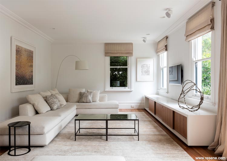
Resene Double Alabaster in a project designed by hungerford+edmunds architects.
More than any other colour, whites and off-whites are influenced by other elements in the room. If you have off-white walls and a lot of green accessories, expect your walls to take on a green look. Use a strong blue rug or furniture, and your walls will pick up on the blue.
You can use this to your advantage. For example if you have a rich reddish timber floor that you find a bit overpowering, then using a cool white on the walls (one with a grey or green base) will diffuse the effect of the floor.
Different parts of the room also reflect light differently. An off-white used under a window will look darker than the same colour used on the opposite wall. An off-white used on the ceiling will look much darker than the same colour on the wall because there is less light reflected. Use a half or quarter strength of your wall colour on your ceiling to ensure the two are well balanced.
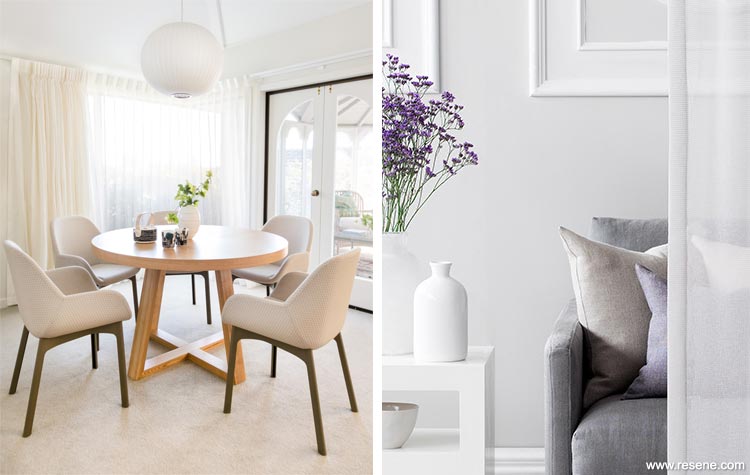
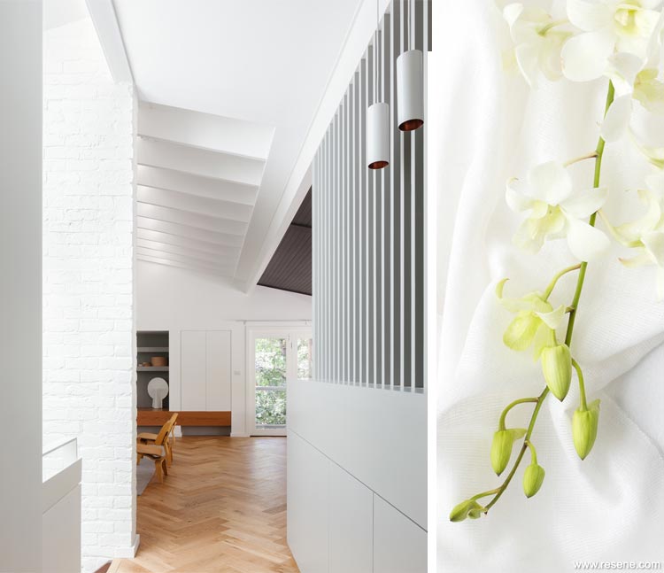
Left: Resene Quarter Thorndon Cream in a project designed by Susie Cropper.
Right:
Ascend fabrics from James Dunlop fabrics with walls in Resene Merino and decorative panels in Resene Quarter Black White.
Whatever type of white you’re after, here’s how to make the best use of the Resene Whites & Neutrals collection by understanding the paint codes.
Beneath each paint swatch is not just the name but a code which starts with a letter. That tells you the base colour of the paint. So Y is for yellow, BR for brown, G for green and N is for neutral (which means black, or rather grey once you put it with white).
Some paint colours cross from one base to another depending on their strength, for example, Resene Half Pearl Lusta’s code starts with a Y but Resene Quarter Pearl Lusta starts with a G. The science of paint is intriguing.
The last three numbers of the colour code tell you where the colour sits on the colour wheel. Imagine red is at 0, then it moves into orange and yellow; green is at 180 then on it goes through blue and purple. So if you have two similar colours and one has 020 on the end and one has 180, this tells you that the 020 one is closer to the red part of the spectrum and the 180 one is closer to the greens. This is important with off-whites, as it’s the subtle undertones that you notice when they are used in a room.
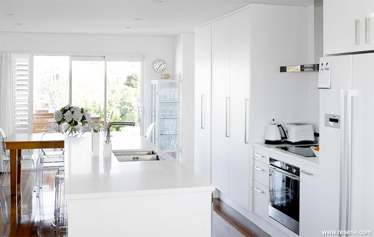
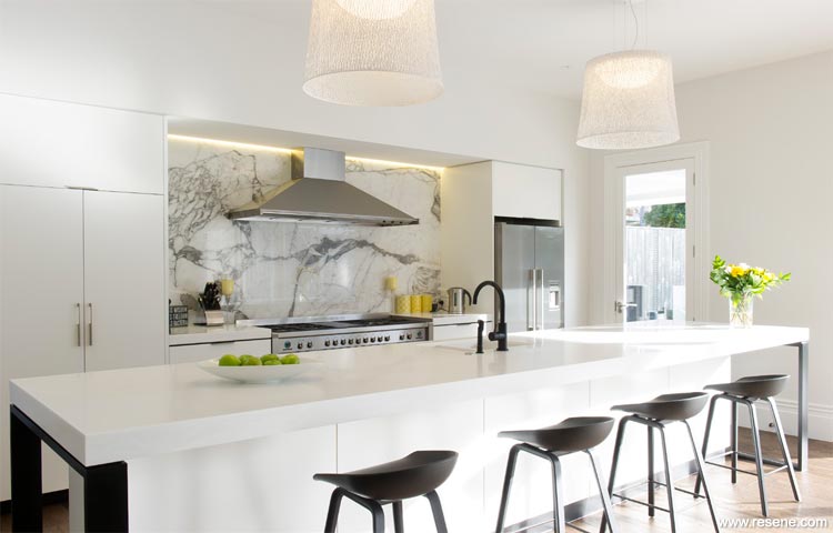
Resene Alabaster in a kitchen created by homeowner Chris England.
You can vary the whites you use in a room but make sure they are all either warm or cool. For example, a bedroom with walls in Resene Thorndon Cream, trims in Resene Merino, a soft wheaten-coloured carpet, and lots of plumpy pillows in antique linen, and ivory coloured sheers on the windows will look delicious and luxurious.
Resene Black White in a bedroom by homeowner Chris England.
Ask yourself if you want the space to feel cooler, crisper, warmer or brighter? Using a cool white or a warm white will give you quite a different feel.
The red, orange, yellow and brown based whites are good for rooms that need warming up, say on the south side of the house, while those with a touch of grey and some of those with green or blue undertones are good for taking the visual heat out of north-facing rooms.
Resene Black White (grey-based) was the darling of the minimalist era for its cool architectural quality and has continued in popularity. Resene Alabaster is a favourite, and as a trim colour goes with just about any other paint colour.
There is also a distinct preference for warm versus cool whites depending on where you live. In warmer, northern areas of the country, grey whites are popular. But in cooler, southern climes, warm yellower whites are more commonly used.
Cool whites tend to suit more contemporary interiors which have lots of windows rather than older homes with smaller windows and less-than-perfect walls.
Resene Quarter Rice Cake in a project designed by Nobbs Radford Architects.
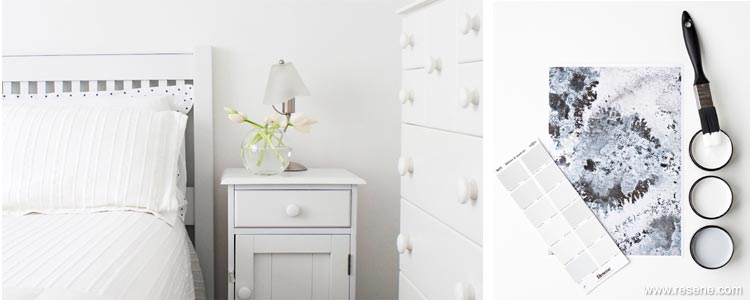
It’s always best to try out a Resene testpot of your favourite colour or colours. Paint two coats on to a large piece of cardboard, leaving an unpainted border around the edge, and move the card around the space to view it at different times of the day and night.
Comparing whites side by side is misleading. You need negative or neutral space to understand the colour in your white, hence the advice to use samples with a paperwhite border around the outside. View the large painted swatches at your Resene ColorShop in the in-store colour library to compare your white options. Place a piece of printer paper between them – this will help your eyes to see the subtle undertones.
The subtle undertones of off-whites combined with your lighting and furnishings can make the colour seem different to the colour chip, even though they are the identical colour. This is because the lighting, the amount of the colour and colour reflections from the furnishings can make your eyes view the colour differently.
We love our grey-edged whites. It seems that every house in the land has walls and trims painted in variations of Resene Alabaster or Resene Black White.
The beauty of these two colours is that they are ‘soft’ whites, so are easy to live with. They are also hugely versatile and complement most other colours well.
Using grey or stark whites doesn’t mean you’ll feel like you’re living in a chilly bin. There are many ways to soften these whites – with texture, furnishings and coloured accessories.
Kitchen and walls in Resene Quarter Sea Fog by Trinity Interior Design.
Or you can be inspired by the trend for Scandi interiors and go a bit darker and choose a pale grey (Resene Triple Sea Fog, Resene Concrete or Resene Quarter Surrender). Some believe pale grey can be too cold for interiors but with the right warm or bright accessories, it looks sensational and sophisticated. Try it with accessories in terracotta or sand colours, or swampy and khaki greens.
Examples of grey whites: Resene Black White, Resene Alabaster, Resene Black Haze, Resene Merino, Resene Sea Fog, Resene House White, Resene Barely There, Resene White Pointer.
Warm or ‘yellow’ whites can range from rich buttery creams to subtle fleecy whites. There are many from the Resene Whites & Neutrals collection that are sophisticated, almost ‘aged’ whites, which can be used to visually warm a room without turning it too sickly or yellow. These are particularly good for south-facing rooms or those with lots of reflected green from trees or plants. Warm and aged whites are often best for older homes with character details and trims.
Warm whites also work well with earthy colours like warm browns, reds and ochres, so if your furnishings comprise warm hues, your paint colours probably should too.
Examples of yellow whites: Resene Pearl Lusta, Resene Spanish White, Resene Eighth Biscotti, Resene Quarter Solitaire, Resene Blanc, Resene Villa White, Resene Orchid White, Resene Quarter Tea, Resene Bianca.
Green-edged whites tend to change with the light quality, appearing warm one minute and cool the next. Because green is made up of blue (traditionally a cool colour) and yellow (a warm one), these green-based whites have the ability to morph with the mood. They suit our often gardenbased or green outlooks too, and our bright light quality.
Examples of green whites: Resene Half Thorndon Cream, Resene Half Titania, Resene Quarter Linen, Resene Rice Cake, Resene Cararra, Resene Quarter Ash, Resene Quarter Joanna, Resene Quarter Wheatfield.
Search Habitat articles
If you have an idea, project or story that you think would suit Habitat plus, we’d love to hear from you. Please drop us an email with your details and include photos if submitting a project.
Habitat plus are not mailed directly. They are available free from Resene ColorShops and resellers while stocks last and available for viewing online.
![]() Get inspired ! Subscribe
Get inspired ! Subscribe ![]() Get saving ! Apply for a DIY card
Get saving ! Apply for a DIY card
![]()
Can't find what you're looking for? Ask us!
Company profile | Terms | Privacy policy | Quality and environmental policy | Health and safety policy
Colours shown on this website are a representation only. Please refer to the actual paint or product sample. Resene colour charts, testpots and samples are available for ordering online. See measurements/conversions for more details on how electronic colour values are achieved.
What's new | Specifiers | Painters | DIYers | Artists | Kids | Sitemap | Home | TOP ⇧