From the Resene colour inspiration – latest looks gallery
If you’re drawn to a particular hue, you should use it in your home – regardless of what anyone else might say or think...
Designing a master bedroom where both masculine and feminine energies have been captured and brought into balance isn’t the always easiest design challenge to overcome, but when it’s done well, you’ll be left with a space that can be equally loved and enjoyed by both its occupants – no matter what gender they identify as. And it all starts with breaking down some antiquated interior decorating ‘rules’ that should have been tossed out the window long ago. But first, let’s try and understand where this old-fashioned rationale came from in the first place.


Throughout the course of history, the ‘powers that be’ have done a belaboured job of dividing each and every decorative element into two major categories: ‘this for boys’ and ‘this for girls,’ without much rhyme or reason for it. In fact, barely more than a century ago, the hues that many now consider most girly (pinks) and boyish (blues) actually used to be reserved for the opposite sexes – pink was for boys, and blue was for girls. They’ve even gone so far as to gender shapes, with anything curved or round labelled as feminine while angular shapes are said to be masculine. This then was extrapolated to all kinds of furniture and furnishings – to the benefit of absolutely no one.
Along with what many have come to assume as the typical decorating standards for ‘bachelor’ pad design – decking out a space with bar signs and bean bag chairs, visually ‘heavy’ furniture items clad in pintucked leather or other thickly woven textiles, plaid and striped patterns, or even a general level of mismatching and disorder – many also wrongly believe that men don’t take an interest in interior decorating. Sometimes, this is because other people have led them to incorrectly believe decorating to be ‘women’s work’. Because of this, companies who produced interior decor up in the 20th century knew that it was mainly women who made the choices, and they designed products in an attempt to ‘appeal more’ to women by following those aforementioned conventions – that women only like flowers and pink and delicately curved and fragile shapes and couldn’t possibly pass up something shiny. And thus, many interiors ended up being overly ‘feminised’ due to a lack of alternative options.
But today, things are different. The feminist movement has made impressive ground in starting to equalise and correct some of the things that have long been broken through binary thinking. Plus, the home décor options available to us are more varied than they’ve been at any other point in history. There has never been a better time for anyone to get excited about interior decorating – and our homes will be happier and more beautiful places for it.
More than any other room in your home, when it comes to your master bedroom, it’s important to pick your home décor out together. Just like with many other things you need to come to an agreement on in a relationship, there may end up be compromises. However, when all is said and done, you should both end up with items you love in your space that are representative of your individual personalities, and your history together as a couple.
But if you’ve never had the pleasure of decorating a space collaboratively before, it can be difficult to know where to start. Rather than fast-forwarding to picking out bedding and furniture, start with the one thing you’re more likely to come to an (eventual) agreement on – your paint colours.
Neutral hues are among the most accessible paint choices around. They are easy to live with, lend themselves well to being teamed up with a wide range of different accent colours and are usually amiable to everyone – but, they sometimes carry the risk of being boring. To keep things interesting, choose a neutral hue with subtle undertones that injects it with a little extra energy as opposed to your typical run-of-the-mill white, grey, beige, brown or black – and choose more than one.
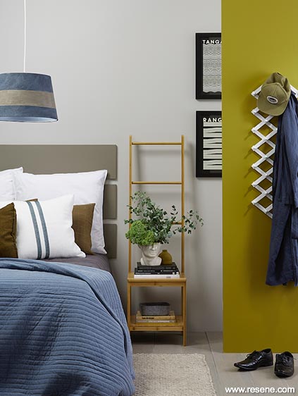
One idea is to try multiple strengths of a single neutral to use on different walls or surfaces within your space, then team them up with black, white and one or two fun accent colours. Resene Eighth Stonehenge, seen on the back wall of this gender-neutral master bedroom is a hue that most certainly falls into the category of ‘character neutrals’ – those which have a little extra life to them. A clever and infinitely changeable muted grey, it works well with everything from complex and moody purples like Resene Revolver to deep masculine maroons like Resene Spitfire.
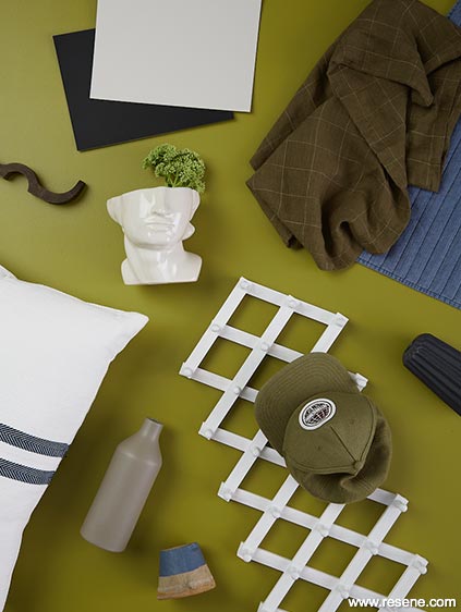
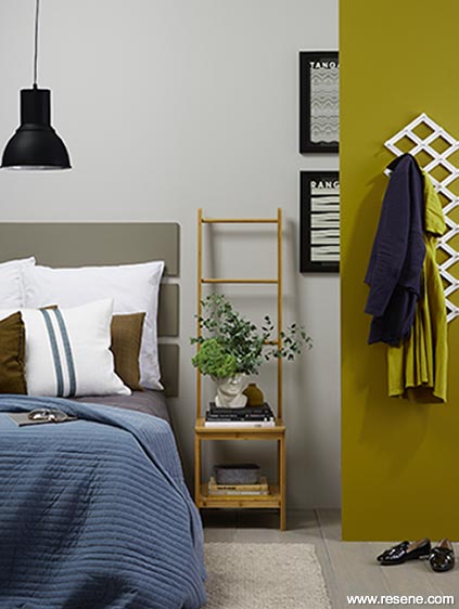
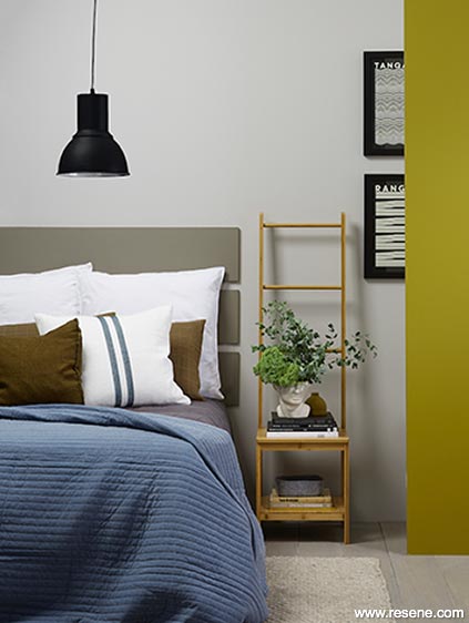
Choosing a strong accent colour is another great way to bringing more life to your neutral-based colour scheme. While a striking colour like Resene Stinger – an old-fashioned brandy ochre that exists outside old-fashioned gender norms – could be overpowering in large quantities, it’s one that can work magic in the right quantity and setting. Seen here on a small accent wall at the right, its balanced out by the main wall in Resene Eighth Stonehenge, the slatted headboard in Resene Double Stonehenge, the hook rack in Resene Half Barely There and the floor finished in Resene Colorwood Greywash timber stain.
It’s the other finer finishing touches – especially those that contrast sharply – that really seal the look. The black picture frames and artwork play off of the Resene Nero pendant lamp while the olive hued bedding ties the green undertone of the Resene Stinger accent wall and the small vase on the bedside chair, which is also painted Resene Stinger. The stripes on the main accent cushion echo the lines in the artwork as well as those created through the stitching on the quilt. And by sticking to simple shapes and lines, it’ll be easy to mix in personal items that are special to each of you.
And if you still find yourself falling into those age-old classic gender-normative design pitfalls, know that you’re not alone – these are likely thoughts that have been engrained in you since birth. But let this also be your permission that all colours are for everyone to enjoy. And if you’re drawn to a particular hue, you should use it in your home – regardless of what anyone else might say or think.
Accessories: Bamboo Chair, Concertina Wall Hooks, Rug, Grey Felt Basket from Kmart; Navy Linen Robe, Face Vase and Denim Quilted Bedspread from H&M Home; Sove Linen Duvet Cover in Pepper, Pillowcases, Grid Linen Pillowcases in Seaweed from Citta; Charcoal Quilt and Cushions from Collect Living; Tangiroa and Ranginui art prints by Oslo from endemicworld; All other props are stylist’s own.

Styling by Kate Alexander. Photography by Bryce Carleton. 2020
Colour inspiration - latest looks gallery
Get inspired with colour and the latest decorating and colour trends! Select just the right look and mood for your space.
Filter: kids & teens | greens | blues | yellows | neutrals | oranges/browns | pinks/reds | greys/blacks | violets | pops-of-colour/multi-colour
Shared style
Decorating a shared kid’s room doesn't have to be hard...
Palette pops
This relaxed reading nook with its grown–up English country look...