From the Resene colour inspiration – latest looks gallery
For a dining space that’s filled with energy and whimsy, pair pretty pastels with bright fruity hues on a crisp white backdrop.
Pastel coloured hues are having a moment. Not in a soft, sorbet overload, but rather in a whimsical, contemporary approach when paired with more saturated and striking hues. This new take on gentle pastels brings them in to a more contemporary setting for an energetic, playful dining area.
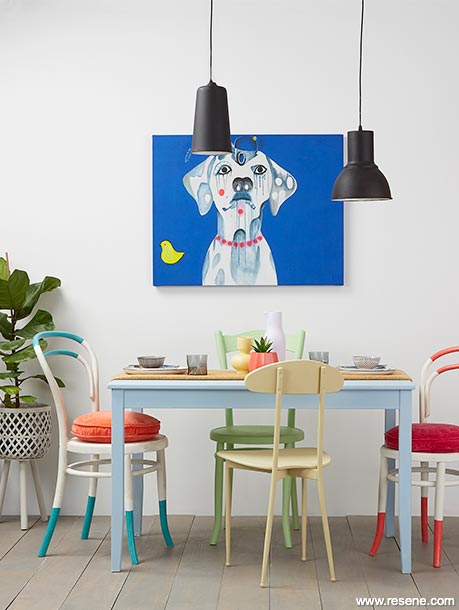
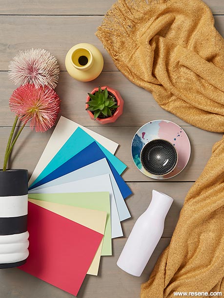


In this room the wall in the crisp shade of Resene Double Alabaster and floorboards in Resene Colorwood Mid Greywash provide the perfect neutral base for the brighter hues to play. Keeping the walls white also allows the colours to look clean and modern.
Sorbet hues feature on the table, which is painted in Resene Frozen, a cool grey-blue, and the chairs, which are painted in the fresh spring green of Resene Anise and the yellow-toned beige of Resene Yuma. Vases on the table hero pretty pastels. The jug in Resene Blue Chalk provides a delicate, romantic touch of pale lilac.
While there are quite a few different accent colours used throughout the space, they are more strategically chosen than they first appear. The powdery blue and soft yellow and green pastels balance the more vibrant brights in the space, such as the frenetic pink of Resene Rapture and the bold blue green of Resene Maestro on the hoop back chairs.
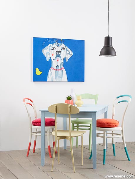
These hoop chairs provide two points of contrast for the room. Firstly, through their pops of bright, saturated colour on the legs and back. Secondly, through the different, slightly warmer white painted on the body of the chair, which stands out against the crisp white wall behind. This creamier white has been achieved with a base of Resene Alabaster finished with a distressed effect by dry brushing a thin layer of Resene Bubble White over top.
If you have a similar range of chair styles in your home, paint them in different colours to help introduce some cohesion to your space. Bring in repetition by either using the same design (as we have done on the two hoop chairs), or by using similar colours.
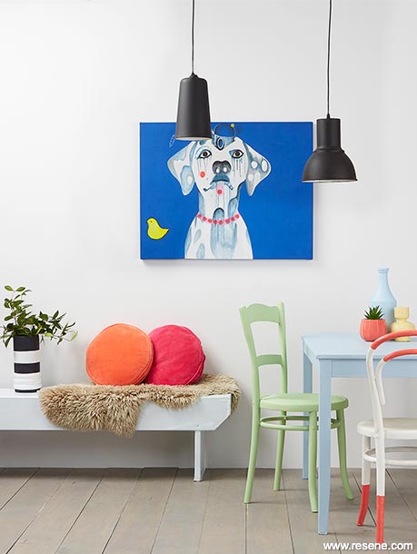
In this room even brighter pops of colour are brought in through the soft furnishings and art. The round cushions feature the popping hues of Resene Daredevil (a fluoro orange) and Resene Vibe (a clash of pink and red). The dalmatian artwork on the wall provides a splash of cobalt blue, which when paired with the striking black pendant lights, brings a contemporary edge to the space. A tall striped black and white vase painted in Resene Double Alabaster and Resene Nero also adds to this modern, graphic look.
To bridge the gap between soft, subtle pastels and striking, fruity hues, bring in natural elements such as the round jute rug and beige sheepskin. These will provide balance, texture and tie in with the softly coloured floorboards.
Project by Annick Larkin. Images by Bryce Carleton. 2021
Colour inspiration - latest looks gallery
Get inspired with colour and the latest decorating and colour trends! Select just the right look and mood for your space.
Filter: kids & teens | greens | blues | yellows | neutrals | oranges/browns | pinks/reds | greys/blacks | violets | pops-of-colour/multi-colour
Green light
Bring in some fresh colour for your finest dining yet
1 outdoor look, 2 ways
An extension of your internal living space