On the surface, white might seem like the simplest paint colour to choose for decorating your open plan living and dining space. However, it is the hue that likely has the most perceivable nuances and undertones – and there are many variations to choose from.
Suddenly, white isn’t just white: it’s snow white, bone white, chalk white, ivory white, dutch white, vanilla white or antique white, to name just a few. Of course, it only gets more complex when you factor in different finishes and how the shade in question will fare in the glow of your room’s unique natural and artificial lighting.
Some people choose to decorate their homes in white because they see it as a timeless choice. However, just like other colours, the whites that are considered to be on trend shift and change as time passes. While this doesn’t happen as quickly as with other hues, over the course of five or ten years, it can become much more pronounced. So even if your walls are already some shade of white, they aren’t immune to looking dated. Even worse, decorating in white runs the risk of being boring. So what’s a neutral-loving homeowner to do?
The key to combating this conundrum is choosing classic Resene whites that have stood the test of time and finding contemporary ways to use them. For starters, you may notice we used the word ‘whites’ – plural, not singular. That’s because the modern way of decorating with white isn’t to take a one shade everywhere approach. Instead layer multiple whites and mix up your finishes and texture to create enough interest to hold the look together.
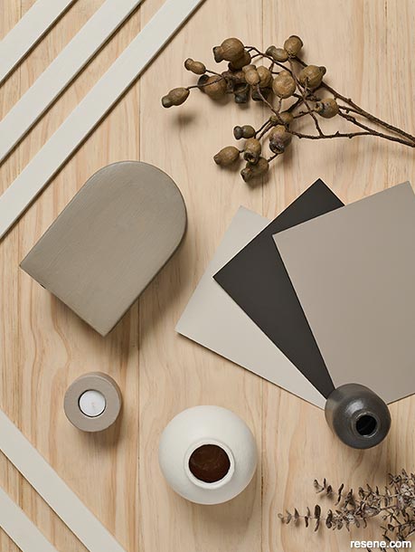
By sticking to just cool whites or warm whites – like we have here – it becomes much easier to find different shades that will work well together as both base and accents colours. Much of the hard work has already been done for you: look to the colour cards from the Resene Whites & Neutrals Collection and limit yourself to tones taken from one to three different swatch strips. These shades have already been curated by Resene Colour Experts to give you confidence with using them together.
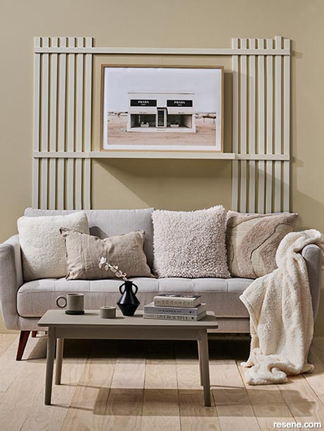
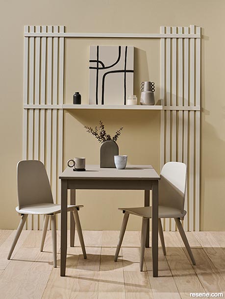
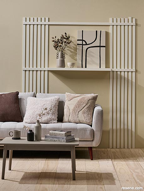
Resene Spanish White is about as classic as whites come and has long been among the most popular hues year in and year out because it strikes the ideal balance between warm creaminess with greyed dustiness. Not only is its level of warmth ideal for colouring your main living space in terms of avoiding the starkness, glare and iciness of truer whites, this type of white is very much on trend. Leveraging it in its multiple strengths and using them on different surfaces in your space, such as Resene Triple Spanish White on your walls, Resene Quarter Spanish White for your ceiling and full strength Resene Spanish White for key pieces of furniture, is a great place to start building out your white tonal palette. This effect could be used multiple times in the same space to break up large, long walls and add height to the wall profile – which will in turn create shadows and texture.
Hues like Resene Tea, Resene Stonewashed and Resene Napa are beautiful picks to add in as accent colours to a tonal scheme based on Resene Spanish White. These hues can be used across your furniture and accessories, such as picture frames, vases, bowls, coffee tables, chairs and your dining table, and also be referenced when picking out soft furnishings like sofas, armchairs, throws and cushions. But you will still want to be cognisant of adding visual texture to your space. Our timber flooring has been finished with Resene Colorwood Whitewash to lighten its inherent hue, but the look is subtle enough to still allow the texture and beauty of the wood’s natural grain to show through and maintain its visual interest. We also used thin strips of timber to create a batten-based wall feature that showcases a shelf and creates a focal point, much in the way a fireplace or mantelpiece would.
Mixing up the sheen levels in your finishes helps provide additional variety to your look. Even though you might be working with the same hue or very similar ones, Resene Lustacryl semi-gloss battens, shelving and furniture will reflect back more light than your Resene SpaceCote Low Sheen – giving your space more shape, texture and depth. Adding a touch of contrast to your white space is also critical to help break up the similarities of your layered shades. We relied on deep Resene Ironsand and used it on the pendant lamp, a couple of vases and a DIY minimalist artwork to bring a point of difference.
Styling by Vanessa Nouwens. Photography by Bryce Carleton. 2022
Colour inspiration - latest looks gallery
Get inspired with colour and the latest decorating and colour trends! Select just the right look and mood for your space.
Filter: kids & teens | greens | blues | yellows | neutrals | oranges/browns | pinks/reds | greys/blacks | violets | pops-of-colour/multi-colour
Pattern play
Simple strategies for pattern mixing
Different strokes
Fluid designs and vibrant colours
![]() Get inspired ! Subscribe
Get inspired ! Subscribe ![]() Get saving ! Apply for a DIY card
Get saving ! Apply for a DIY card
![]()
Can't find what you're looking for? Ask us!
Company profile | Terms | Privacy policy | Quality and environmental policy | Health and safety policy
Colours shown on this website are a representation only. Please refer to the actual paint or product sample. Resene colour charts, testpots and samples are available for ordering online. See measurements/conversions for more details on how electronic colour values are achieved.
What's new | Specifiers | Painters | DIYers | Artists | Kids | Sitemap | Home | TOP ⇧