Architecture NZ x Resene Colour Collab
A director at Auckland-based practice Moller Architects, Craig Moller, alongside his father Gordon, heads a team of 15. The studio's work is wide-ranging, from the Sky Tower to chocolate factories, boat-building sheds, houses and hotels.
How did you end up in the world of architecture?
Clearly, architecture had always been around me growing up but, from when I was young, I really wanted to design something. First, it was cars, until I realised I'd have to go overseas to do that. Then it was yachts, until I spoke to a yacht designer in Wellington who seemed to do everything intuitively and I thought I could never do that. Product design (industrial design back then) seemed to be an option but I passed on that. I wasn't confident in my artistic ability or talented enough so that left just one last option – architecture. I graduated from the University of Auckland and worked briefly at Manning Mitchell and Craig Craig Moller. I then headed to Yale for a two-year master's, followed by six months as a bicycle courier in New York: both experiences equally educational.
The projects which come out of your practice are hugely varied. Does colour play a large part in them?
Some, yes, such as the orange façade on the Te Atatū Peninsula Community Centre and Library or the red spiral stair and colourful seating in the ASB Waterfront Theatre, and the blues and yellows within the J.H. Whittaker & Sons factory. At our home, every downstairs room is a different colour: a donkey brown, a dusky blue, a blush pink and a soft grey. Colour transforms a space and usually for the better.
What inspired your colour collab?
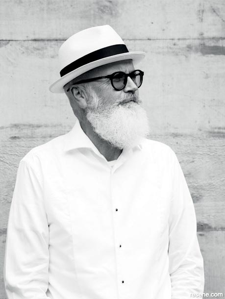
I've taken up using watercolours again in the past few years. In 2017, the University of Auckland School of Architecture was celebrating its centenary and wanted to show student work over the decades. I retrieved some old drawings from my student work and rediscovered the use of watercolour in those drawings, and have since re-engaged with watercolours. My drawings are largely ‘building people'; many are of me, as evidenced by the beard and the glasses, while others are of family and friends or things that are happening around me. I've had the odd commission and been part of a group show in Cambridge but I tend to give my drawings away. The collab is essentially one of my drawings, deconstructed.
Your ‘building people' are often defined by long shadows. Is this to depict a certain time of day?
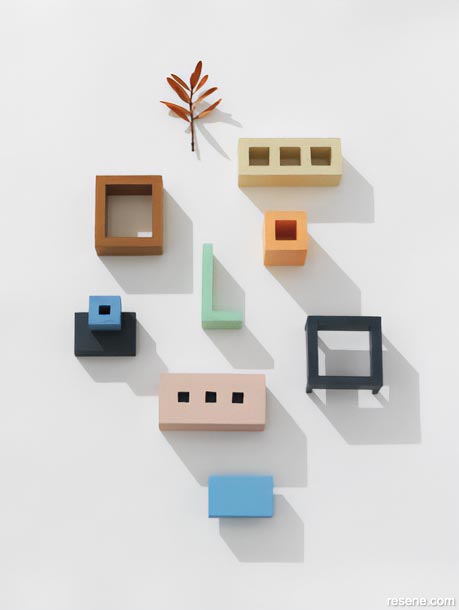
The shadows are a reference to the Italian painter Giorgio de Chirico. He founded the scuola metafisica art movement, which influenced the surrealists. His landscapes, loggias and buildings were quite melancholy, with long autumnal shadows. There is also a reference to the drawings of Italian architect Aldo Rossi. And then you might get a bird or two flying by, which refers to the architect's peculiar habit of feeling the need to include flocks of birds in their renders.
What led to your colour choices?
Watercolours come in a relatively limited palette and I tend to use the classic earthy tones I used as a student: burnt and raw sienna, burnt and raw umber, Venetian and Indian reds. I also like what I call “Architect's Green”, the colour of bathroom tiles in the '80s and Frank Gehry's kitchen but also what I recall was the trouser colour of my teachers, Mike Austin and David Mitchell. Blue is also a favourite for architects, at least in their choice of sky colour for a photoshoot or a render. It also reminds me of the Caran d'Ache crayons used extensively in the '80s. The Resene Rajah, Resene Dark Buff and Resene Trout all hark back to the warm autumnal colours of my student drawings and remind me of Tuscan landscapes and towns in Italy. The Resene Chinook and Resene Polo Blue provide a sharper focus and offset the warmth.
Architecture NZ. June 2022
Expert inspiration
Get inspired by colour and design professionals!
Discover architecture, art, design and colour! Browse through articles from the following magazines: Architecture NZ, Good, NZ House & Garden, Style, Life & Leisure and BlackWhite.
![]() Get inspired ! Subscribe
Get inspired ! Subscribe ![]() Get saving ! Apply for a DIY card
Get saving ! Apply for a DIY card
![]()
Can't find what you're looking for? Ask us!
Company profile | Terms | Privacy policy | Quality and environmental policy | Health and safety policy
Colours shown on this website are a representation only. Please refer to the actual paint or product sample. Resene colour charts, testpots and samples are available for ordering online. See measurements/conversions for more details on how electronic colour values are achieved.
What's new | Specifiers | Painters | DIYers | Artists | Kids | Sitemap | Home | TOP ⇧


