Architecture NZ x Resene Colour Collab
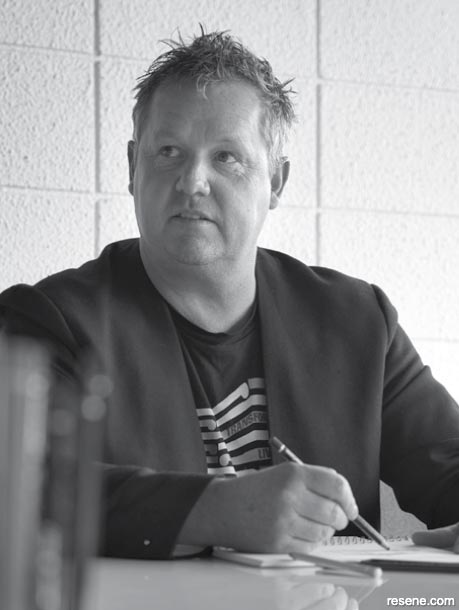
Founder of Rotorua-based design practice DCA Architects of Transformation Darryl Church discusses nature, context and the process of integrating colour into the studio’s projects rather than merely applying it.
The Rotorua landscape is very evocative, with the natural beauty of the thermal pools, the lake and the magnificent Redwood trees. Does that environment influence your choice of colours on a given project?
I think a lot of our colour schemes, locally, have definitely kicked off from the environment and the context they’re in. In terms of colour, probably one of our more colourful buildings was one we designed for Toi Ohomai Institute of Technology here: its Health and Sciences Centre, which is located right on the doorstep of Kaingaroa Forest. There is a lot of wood and green surfaces in the building. The association of timber with green hues mimics the harmony in nature. It won a Resene Total Colour Award and was a finalist in some international awards.
Is nature something you try to incorporate into your work, in terms of design?
Yes, absolutely. One project that comes to mind, which talks to the point of colour being so much more than something that is simply applied but, rather, something that is integrated, is when we did the Redwood Visitor Centre toilets here in Rotorua. They are in a national park of significant heritage value – the trees of the Redwoods Grove were planted in memory of the fallen soldiers of World War I. So, we wanted to be really sensitive about how we put toilets into a landscape. The toilet shrouds, or cylinders, harmonise with the natural landscape palette, which was very much keeping in mind a colour, even if it’s the result of rusting steel. The genesis behind the idea was the question of how to make something that fits and works in harmony with nature: not trying to be nature but being respectful to nature. The random placement of the toilets echoes the random layout of the giant Californian Redwood trees.
Your collab here with Thomas Cannings portrays colours in nature. Where did you draw your inspiration from?
The British sculptor and land artist Andy Goldsworthy uses nature to create site-specific artworks. He rearranges natural forms to enhance rather than detract from their beauty and then documents his work through photography. The composition of these colours and shapes in the landscape creates a depth and shadow and light; it’s both natural and dynamic.
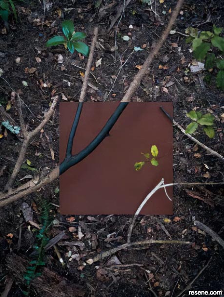
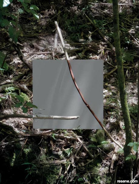
How did you choose the colours for this collab – Resene Stack, Resene Uhi, Resene Hinau and Resene Merino?
They were influenced by a project that we completed recently, which was a commercial office building. A few years ago, the Rotorua Council adopted a range of colours for use in the CBD, which were specified as cultural and heritage colours. It was a limited colour palette, and not something that you’d go to normally, because they were mainly muted tones. But we were able to work with that colour palette. And the resulting colour scheme of the building – we integrated those colours into digital print onto glass Māori taniko patterning – was, in fact, colourful, in that there was a lot of depth and a layering and patterning of colour that came through. Initially, I would have thought it was a difficult palette to work with and I guess I just wanted to prove that maybe it’s not.
Tell us more about that building.
We call it the Fenton-Pukaki building. And, on this particular project, we were referencing the namesakes of people in our history here in Rotorua. In 1877, Ngāti Whakaue gave pukaki (a large carving representing their ancestory) to Judge Fenton, the town planner, as a seal of trust, as permission to develop the city of Rotorua. The building intercepts the two streets, each of which has a history, and so one elevation references Fenton and the colonial period and one references Pukaki and Ngāti Whakaue. The elevation that faces Fenton Street is quite colonial and white and picket-like, and the Pukaki Street elevation is made up of softer greys, browns and blacks.
Architecture NZ. December 2021
Expert inspiration
Get inspired by colour and design professionals!
Discover architecture, art, design and colour! Browse through articles from the following magazines: Architecture NZ, Good, NZ House & Garden, Style, Life & Leisure and BlackWhite.
![]() Get inspired ! Subscribe
Get inspired ! Subscribe ![]() Get saving ! Apply for a DIY card
Get saving ! Apply for a DIY card
![]()
Can't find what you're looking for? Ask us!
Company profile | Terms | Privacy policy | Quality and environmental policy | Health and safety policy
Colours shown on this website are a representation only. Please refer to the actual paint or product sample. Resene colour charts, testpots and samples are available for ordering online. See measurements/conversions for more details on how electronic colour values are achieved.
What's new | Specifiers | Painters | DIYers | Artists | Kids | Sitemap | Home | TOP ⇧


