From Habitat magazine - issue 16
How strongly does personal style cross the boundary between fashion and interiors?
So you love the colour blue. In fact, many of the clothes you wear are blue and… you've just painted your bedroom a soothing pewter blue. Your home is a peaceful haven of creams and stone shades… and, yes, you tend to wear white shirts with khaki trousers. Apparently the colours we like will turn up on our walls, and in our wardrobes.
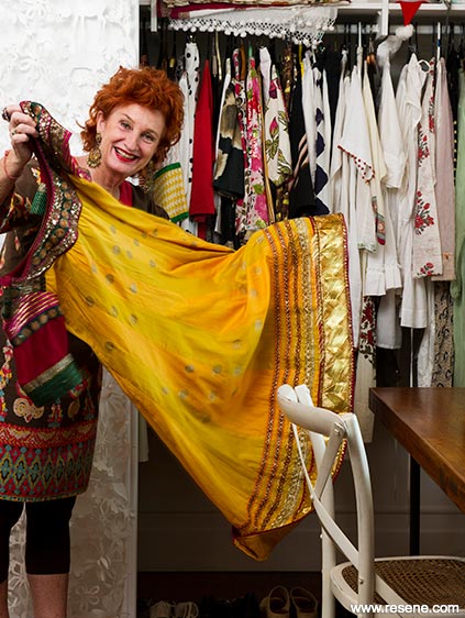 Foodie Peta Mathias
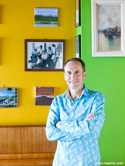 Architect John Mills
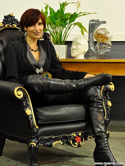 Christchurch mayoress Jo Nicholls-Parker
There's a lot of truth in the premise 'you are what you wear', according to stylist Angela Stone of Styleyou. She believes that if a person is in tune with their own personal colour spectrum, chances are their dress sense will reflect the colours on their walls of their home and vice versa.
"It's quite amazing. I walk into people's homes, especially their bedrooms – as that's where they keep their wardrobes – and I think without them even consciously being aware of it, the colours they have in their bedroom are usually 99% of what they are, or should be, wearing. There's a very intuitive process that takes place when people get dressed or add colour to their homes."
Though Angela sees this relationship most vividly in people's bedrooms, she also sees it throughout the rest of their home in their walls, rugs, cushions and art. Which is why she suggests people look at the colours around them when making clothing choices.
Fashion often dictates what people wear, but when people are confident, different personalities tend to override the popularity vote, which gives some of us a strong sense of individuality.
Habitat has taken a peek inside the wardrobes of some distinctive dressers to see how their dress sense relates to their walls.
Well-known for her vibrant, sometimes outrageous dress sense, it's a surprise that foodie Peta Mathias has chosen to paint most of the walls of her tiny Auckland villa white. In the hurly burly of her life, she says white is restful. Her one concession to colour is her hall, painted her favourite colour yellow.
"Colour makes you so happy. It alters your mood. If it were a bigger house, I might have indulged myself more." Instead, she accessorises her house in colour; a pink sofa, chandeliers and big bunches of peonies.
Peta travels extensively and is just back from a tour to launch her latest book. Wherever she goes, she is captivated by hues: the shocking pinks, the cobalt blues and the bright oranges in places like Morocco and India.
"In the Langue d'Oc where I live in France six months of the year, it's very chic. There are lots of white houses decorated in dove grey, biscuit and off-white."
Colour even surfaces in her book,'Beat Till Stiff', which is all about life's transformations and in which she unravels a tale around the history, the mystery and power of red – a metaphor loaded with connotation for this flamboyant red-head.
Mills Among the Wellington design fraternity, black clothing is almost uniform garb. But award-winning Wellington architect John Mills is not afraid to stand out in pink shirts or colourful patterns. "My look is quite eclectic," he says, "depending on my mood."
However, it's the weave, the textures and tailored design detail that interests him most. "I've bought a few shirts recently where one cuff is different from the other. I like tailored details, the different ways buttons can work and things like that."
And it's the same for his architecture where he seizes every opportunity to explore the powerful effect colour, texture and detail can have on our lives. John likes the way colour has the ability to change our perception of space. "Every time you put a different colour in a room, you think of what it reminds you of; it has associations." For John, intense colours remind him of his travels to India when he was young.
Walls in his own home incorporate a base of hand-made plaster where the trowel marks are visible and there are many hues, though never more than two or three in one room. Here, he is photographed against Resene Spotlight (yellow) and Resene Christi (green).
A living area is painted in Resene Ashanti, a clear soft sky blue – "the sort you get on an autumn day… if you use your imagination or you've just had the right cocktail," says John, "you can look outside and the walls of the lounge just disappear. The ceilings replace the sky as your blue."
Joanna Nicholls-Parker (Jo) is known for her public role as Christchurch's mayoress but also for her inspired individual style. And while many of us habitually saw her in orange jackets, leather and denim in the days following the devastating earthquakes, that is not her usual look.
Jo currently wears a lot of locally designed clothes. She's often to be found in boots, moody colours, rich accents and finely tailored pieces with a certain quirky edginess. The same goes for the New Yorktype loft apartment in the city warehouse where she and husband Bob Parker plan "lots of cool tones of greys and whites mixed with timber finishes plus a rich red carpet." Behind her is Resene Quarter Fuscous Grey with Resene Half Milk White.
Jo finds value in differing styles of architecture and dress. She believes that quality examples of both will thrive and survive, and so become timeless.
Jo says she'd hate her clothing or interior design choices to be confined to what's deemed most fashionable. She believes that architectural spaces bring with them their own imperatives, based on their qualities and merits.
Jo favours large industrial, minimalist spaces which require attention to texture, and inspire thematic lighting.
words: Vicki Holder, Liesl Johnstone
pictures: Mark Heaslip, Nicola Edmonds, Juliet Nicholas
Search habitat magazine stories
Printed copies of habitat highlights are available from late March 2024 at Resene ColorShops and resellers, while stocks last. You can view back issues of habitat magazine online.
Specifiers:
If you have an idea, project or story that you think would suit habitat, we’d love to hear from you. Please drop us an email with your details and include photos if submitting a project.
Sign up for a DIY card and Save! Australia | New Zealand
![]() Get inspired ! Subscribe
Get inspired ! Subscribe ![]() Get saving ! Apply for a DIY card
Get saving ! Apply for a DIY card
![]()
Can't find what you're looking for? Ask us!
Company profile | Terms | Privacy policy | Quality and environmental policy | Health and safety policy
Colours shown on this website are a representation only. Please refer to the actual paint or product sample. Resene colour charts, testpots and samples are available for ordering online. See measurements/conversions for more details on how electronic colour values are achieved.
What's new | Specifiers | Painters | DIYers | Artists | Kids | Sitemap | Home | TOP ⇧


