From Habitat magazine - issue 17
Three key influences come together in the new Resene The Range fashion colours fandeck.
The world seems to be moving ever faster. Downtime is becoming a luxury. Our reaction is to surround ourselves in weathered and washed hues, that feel familiar and lived in. Earthy, neutral tones continue to be part of this trend, showing our growing appreciation for the earth and its resources. Beiges and browns are offset by a soft golden metallic shimmer. Antique and aged oranges meet smoky neutrals, smoky greys and dusty hues, such as Resene Triple Truffle, Resene Triple Rakaia and Resene Half Innocence, which seem to have traversed the passage of time.
Texture is a key element, says interior designer Amanda Neill of Designworx, for example, using either high gloss or translucent chalky paint finishes. In products and design we are seeing flights of fancy and the whimsy. The re-use and recycle theme is still strong – pots made into light shades, or lights made from recycled cardboard.
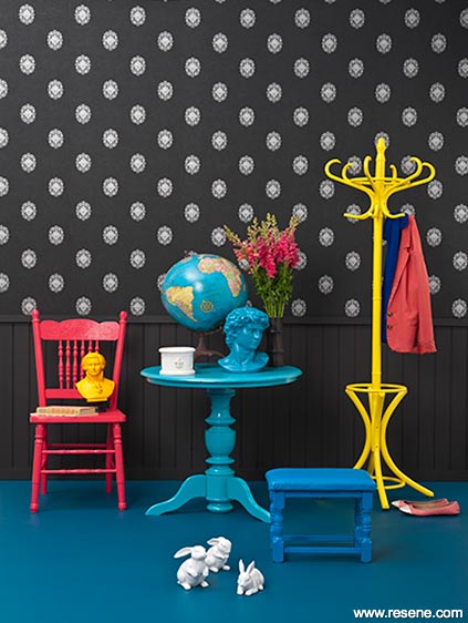
Seeker
Accessories: Tongue-and-groove dado wall in Resene Blackjack; wallpaper is The Gardens of Amsterdam 46150 from Resene; floor in Resene St Kilda; table in Resene Seeker; coat rack in Resene Southern Cross; chair in Resene Knock Out; footstool in Resene Captain Cook. Globe, David, Mozart, Bunny Set, all from Macy Home, 09 361 3388 or www.macyhome.co.nz.
The cocooning trend also comes through in this second palette with a range of soft pastels, says Resene residential colour consultant Carolyn Atkinson. Slightly retro in mood, nostalgic, simple and honest, it’s about our homes being a haven, epitomised in scrap booking, slow cooking, knitting, holidays at the bach and handcrafts.
Life is fast and hugely pressurised and looking ahead can be scary, says Carolyn. Colour makes everyone feel good. Call it ‘mood medicine’ but it works!
The neutral palette has turned away from beiges towards cleaner white, greys and black. Pale neutrals have subtle undertones while darker neutrals have greater depth and intensity. Greys are complex, says Carolyn. “Think colours that remind you of silvery, cool metals and the semi transparency of smokey glass and misty winter skies.”
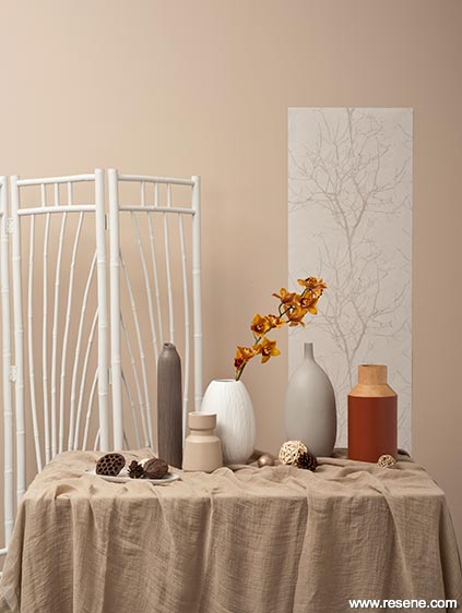
Resene
Accessories: Wall in Resene Double Biscotti; screen in Resene Double Merino. From left to right: tray in Resene Tea; tall thin vase in Resene Quarter Lignite; short vase in Resene Double Drought; oval textured vase in Resene Double Barely There; small round ball in Resene Treasure Chest; tall oval vase in Resene Triple Truffle; wooden vase in Resene Desperado. Aurora Wallpaper AO 16710 from Resene.
Pastels may fill the void but bright colours give us energy. As Amanda Neill explains. “2012 has seen some strong colour trends emerging with a kaleidoscope of brights in rainbow colours bringing a light bright boldness to the recession years. We have seen bright yellows jump into the palette like a ray of sunshine, and thrown together with reds, oranges, blues, pinks and greens in a mix up of pattern and colour, and as blocks.”
Says interior designer Debbie Abercrombie: “We are looking for colour that will give us a lift without shouting at us. The more intense colours aren’t used in large quantities but in details – a decorative insert in a kitchen bench or a shelving unit with blocks of colour in small splashes.” This trend also reflects our desire for dark rich colours that create warmth, intimacy, magic and slightly forbidden pleasures, says Carolyn. Says Amanda: “There is also an uber-luxury look arriving with gold and metallics.”
Amanda says that the future for these brighter colours will be more subdued – bold rather than bright. Reds are already heading towards deep maroons like Resene Red Earth and Resene Madam M. Purples will be blue kissed, and yellows are antiqued and mustard, like Resene Bittersweet. Greens will shift from emerald to mid toned mossy and olive. Oranges are spicy and burnt; greys and neutrals are warm and natural.
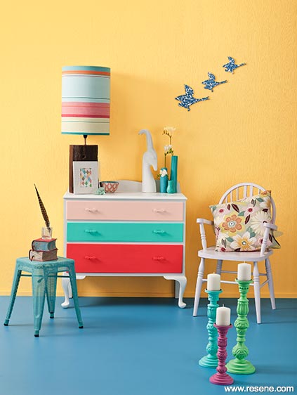
Accessories: Retro drawers in Resene Rapture (bottom), Resene Renew (middle) and Resene Sentimental (top) with legs and top in Resene Double Bianca. Chair in Resene Bambina, wall in Resene La Luna over anaglypta wallpaper (Rasch Wallton 173017 from Resene). Floor in Resene Hemisphere. Lampbase, and shade, Tolix Stool, Dinosaur Designs vases, books, feather and bottle, from Madder and Rouge (09 522 1062). Jonathan Adler Gazelle, from Askew (09 378 1414). Rice candle holders, from Allium (09 524 4242). Mariee Guinbert Vintage Wallpaper Flying Ducks, from The Poi Room (09 520 0399). All other props stylist’s own.
Layering colours is becoming popular as a way to add interest to interiors. Neutrals become the perfect vehicle to carry high-voltage ‘feel good’ brights. Adding a fun edge to our décor, they can be easily painted over when we tire of them, says Carolyn.
Rather than one paint colour in an area, imagine stripes or blocks of your favourite hues decorating your walls, kitchen drawers each painted a different but complementary hue and brightly painted internal doors, each an infusion of unexpected uplifting colour.
Says Amanda: “Our world is upside down and often does not make sense. We will see this sense of the odd with, for instance, scale being blown out of proportion, or imagery that makes us think, that bemuses and amuses.”
styling: Lisa Morton
pictures: Tony Brownjohn
Search habitat magazine stories
Printed copies of habitat highlights are available from late March 2024 at Resene ColorShops and resellers, while stocks last. You can view back issues of habitat magazine online.
Specifiers:
If you have an idea, project or story that you think would suit habitat, we’d love to hear from you. Please drop us an email with your details and include photos if submitting a project.
Sign up for a DIY card and Save! Australia | New Zealand
![]() Get inspired ! Subscribe
Get inspired ! Subscribe ![]() Get saving ! Apply for a DIY card
Get saving ! Apply for a DIY card
![]()
Can't find what you're looking for? Ask us!
Company profile | Terms | Privacy policy | Quality and environmental policy | Health and safety policy
Colours shown on this website are a representation only. Please refer to the actual paint or product sample. Resene colour charts, testpots and samples are available for ordering online. See measurements/conversions for more details on how electronic colour values are achieved.
What's new | Specifiers | Painters | DIYers | Artists | Kids | Sitemap | Home | TOP ⇧


