From Habitat magazine - issue 19
A new kitchen takes inspiration and colour from an earlier era.
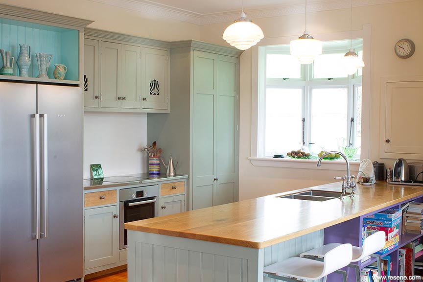
Converting a 'rabbit warren' of tiny rooms into one streamlined space mightn't be rocket science, but where Cheryl Farthing and Jon Kirk's recently completed kitchen and family room stands out is in the way they have repurposed the original design features of their 1920s bungalow… but with modern manufacturing techniques and interesting colour combinations.
"Doing what you see here was to create a workable living space for everybody," explains Cheryl, "but just because the original layout didn't work, we didn't want to discard everything that was good about it at the same time."
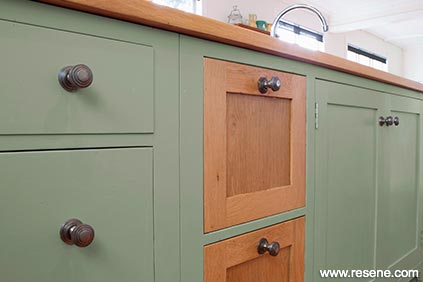
Honouring the past may have been central to the renovation but so was being environmentally friendly for the future good of the planet. The renovation limits the use of potentially harmful glues and industrial additives, and for this reason Cheryl was happy that kitchen-makers Opus Libero specialise in traditional cabinet-making and joinery techniques, including using timber rather than sheet material for their cabinets.
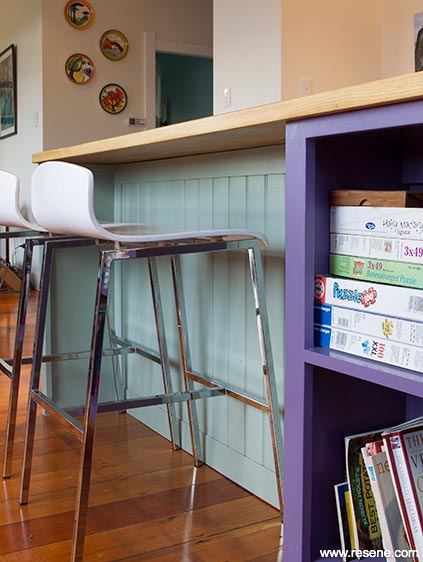
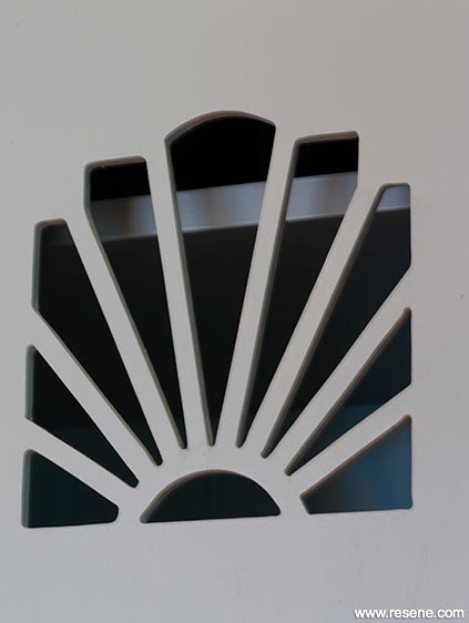
Pine was used for the doors and cupboard carcasses, and American oak for countertops and drawer fronts. Opus Libero was unfazed by Cheryl's wish to use the sunburst motif from the original stained glass windows as a design feature. It was copied and laser cut onto the cupboard doors to add period interest, while the dimensions of the concentric rings on one of the 1930s light fittings was used to detail the cornices.
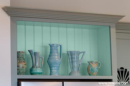
The cupboard doors and carcasses were painted (by hand, of course) in the retro-esque tones of Resene Washed Green with small areas of arresting contrasts inspired by the colours in Cheryl's Art Deco vase collection. A happy turquoise, Resene Scandal, sings in the display alcove behind the vases, while the tongue-and-groove bookcase that sits under part of the breakfast bar is a strong mid purple, Resene Centaurian. Cheryl chose the colour scheme herself but also took advice from Janette Anderson from the Resene ColorShop in Devonport who was "amazing. I'd go in there with these bonkers ideas and she'd come up with the answers every time."
Janette suggested using Resene's fly deterrent additive in the Resene Alabaster cornices and ceilings. "It's worked really well right through last summer," says Cheryl, while the warm neutral of Resene Buttery White is used on the walls.
"When we bought the house one of the neighbours told us it was originally built in 1922 for a music teacher and her plasterer husband," remembers Cheryl. "So it seems right somehow that the beautiful ceilings are still here and so too is her music room. And by using colours that were popular at the time we've managed to blend the two eras and retain the best of both.
Top tip: Minimise fly spots on ceilings with Resene Fly Deterrent. Designed to discourage flies from sitting on the painted surface, it reduces the appearance of unwanted fly spots.
Accessories: Lights: Circa 1930. Applicances: Bosch. Cabinetry: Opus Libero. Colour advice: Janette Anderson, Resene ColorShop, Devonport. Get the look with Resene SpaceCote Low Sheen Kitchen & Bathroom (walls) and Resene Lustacryl (trims and joinery) tinted to Resene Alabaster.
pictures: Frances Oliver
words: Catherine Foster
Search habitat magazine stories
Printed copies of habitat highlights are available from late March 2024 at Resene ColorShops and resellers, while stocks last. You can view back issues of habitat magazine online.
Specifiers:
If you have an idea, project or story that you think would suit habitat, we’d love to hear from you. Please drop us an email with your details and include photos if submitting a project.
Sign up for a DIY card and Save! Australia | New Zealand
![]() Get inspired ! Subscribe
Get inspired ! Subscribe ![]() Get saving ! Apply for a DIY card
Get saving ! Apply for a DIY card
![]()
Can't find what you're looking for? Ask us!
Company profile | Terms | Privacy policy | Quality and environmental policy | Health and safety policy
Colours shown on this website are a representation only. Please refer to the actual paint or product sample. Resene colour charts, testpots and samples are available for ordering online. See measurements/conversions for more details on how electronic colour values are achieved.
What's new | Specifiers | Painters | DIYers | Artists | Kids | Sitemap | Home | TOP ⇧


