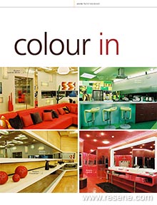
From Habitat magazine - issue 01
We see them every day, right there in front of us. On the road, on the pavement and in the shopfronts. On the television and in the pages of the magazines.
In clothes, on cars, on cellphones. In textiles, in paints, in furniture and fittings. They’re this season’s colours, but what are they?
We see them every day, right there in front of us. On the road, on the pavement and in the shopfronts. On the television and in the pages of the magazines. In clothes, on cars, on cellphones. In textiles, in paints, in furniture and fittings. They’re this season’s colours, but what are they?
According to the experts, the summer season in fashion will be one of fresh colours, with the emphasis remaining on the femininity we’ve enjoyed over the last couple of seasons. It’ll be a time of greens, pinks and aquas, of pastels, metallics and the glacial tones you find in the edge of cut glass.
This will flow through into interiors, complemented by chocolate, which will also remain big, but moving off towards espresso and cinnamon; and rich berry colours – aubergine, grape and plum – will warm up minimalist modern homes. The earthy shades will still be there, but it’s uncertain how long they’ll stay. And, overall, keep an eye out for the resurrection of pattern to complement an ongoing fascination with texture.
The thing is, how do the experts know all this? Many point out that we take our lead in questions such as colour from current European trends.
“We keep an eye on a wide range of design industries – from fashion to automotive – and draw on colour predictions from Europe and America,” says Dianne Connell from Resene, explaining how the paint company develops its ongoing colourways. “However, while we are influenced by overseas markets, we add our own final touches. We have to live with colour in our own environment, so it’s inevitable that we customise international trends for New Zealand and Australia.”
Atelier Textiles’ Rebecca Bowering agrees.
“We look to Europe, but tend to do our own thing. Take dark colours, for example. In some homes, they’re being used to accent taupes and traditionals, whereas in others they’re being used with strong, vibrant shades. Overall, we like neutrals and use colour for accent, rather than taking on colour on the scale popular in Europe, but having said that, people are becoming braver. We’re seeing a lot of interest in how Indian colours are put together, as well as in the African themes that were popular last year and still continue strongly. There’s also a leaning towards combinations such as burnt orange and chocolate that have almost a Pacifika flavour.”
Roy Lissiman, of Lissiman Design, sees two key trends taking place at the moment, one giving way to the other. On its way out is the last of the Mediterranean phase, with its terracotta, warm cream and sand, accented by blue. He sees this being superceded by a local version of minimalism – a move towards pale, uncluttered interiors, with contrasting surfaces and metallic finishes. He links this to an increase in apartment living, and points out that it runs a risk of becoming cold and impersonal without the use of colour. And it should be fresh, clear colour, he says – smaller living spaces can become claustrophobic in warmer climates if very dark colours are allowed to prevail.
Amidst all this choice and all this informed speculation, we shouldn’t lose sight of one thing. Colour is emotional. Take a look at the next season’s colours as they unfold, take on board what’s relevant to you, and use it in a way that suits you too.
Social and environmental factors, such as those observed by Roy Lissiman, are two key elements in INVISTA’s colour forecasting. In Asia Pacific, this job falls to Judy-Lea Engel, who takes an analytical approach to predicting future trends.
“We tend to look at 10 trends when we’re assessing likely colour directions,” she explains. “Five of them are trend indicators and we look to these repeatedly for colour direction. The other five are emerging trends that are having an effect at the moment, but may fade away in the future or may become permanent indicators. The thing to remember is that colour evolves – it doesn’t just turn up from year to year. Some colours hang around, change and then fade away; others are enduring, but almost all move through the design spectrum, starting with fashion and accessories, and moving to interiors and housewares.”
That’s why fashion is the first of her key indicators. What’s more, it incorporates not just colour itself, but also texture, transparency, layering and the myriad other elements that this industry brings to the home design market.
Her second key indicator is entertainment. Really?
“Look at the impact Austin Powers had on the popularity of retro influences, bright colours and bold shapes,” says Judy-Lea. “Look how the success of The Matrix drove the shape of Ray Ban glasses. We’re also seeing whole colourways in makeup being designed around prominent actresses. We’re seeing orange coming through in interiors, and Nemo is orange…”
Thirdly, there’s the socio-economic indicator. She uses as an example World War II. For the duration of the war and its immediate aftermath, khaki and grey, in simple shapes, were prevalent. Following the declaration of peace, the reappearance of nylons drove hemlines up, and masses of fabric appeared in skirts in a display of excess that was a direct reaction to the years of deprivation. She saw the same thing happening after 9/11, when interior colours and design gravitated back to neutral, zen palettes as people sought peace within themselves.
The fourth indicator, and one important to local colour charts, is sustainability. This is something of which we are becoming increasingly conscious in terms of materials and practices, and she feels it drives our preferences for greens, blues and sunshine golds. Finally, she lists technology, which drives the way we operate. It dictates to a great degree our surroundings and the way we interact with them, and the way we perceive and communicate colour. It also affects the creation of colour itself, and she raises heat-sensitive colours, and the popular iridescents and metallics, as cases in point.
Foremost among the five secondary indicators, Judy-Lea ranks globalisation, pointing out that this may well join the group above in the near future. “Our awareness of and interest in other cultures is growing rapidly, and is influencing decisions such as colour almost daily. You can see the native textile influence coming through at the moment in our bright and mid-tone palettes,” she says. “A few years ago, we were drawing our colours from Asia – China and Japan – now we’re seeing Mexican and Salsa inspirations coming through. The world is growing smaller and that affects our colour inspiration.”
Also important is an influence she labels instant gratification; the pleasing of the individual that has developed as a reaction to years of mass-production.
“People are starting to want what they want, when they want it, and they want it tailored to them. This starts to have quite an influence on colours and colour schemes, with people aiming for individual combinations to ensure their look is unique. For a company like Resene that already offers a huge range of colours, this means the introduction of additional services like colour matching to exactly meet the demands of the individual.”
The other three secondary indicators are bio-engineering, spirituality and the growing refusal of generations to conform to stereotypes. This last means that people are choosing certain colours regardless of their age.
One key factor in all this, says Judy-Lea, is the necessity of going back – as a colour forecaster – each season and seeing if, in light of all the trend evidence, you were right after all. The other important consideration, even in the face of all this data, is not being afraid to do your own thing.
“We live in a unique place and lead a lifestyle of our own,” she says. “Why should we depend purely on following external influences? Why shouldn’t we add into our colourways the lush greens of our fauna, the brilliant blues of our sea, the depth of colours we see around us every day under our strong light?
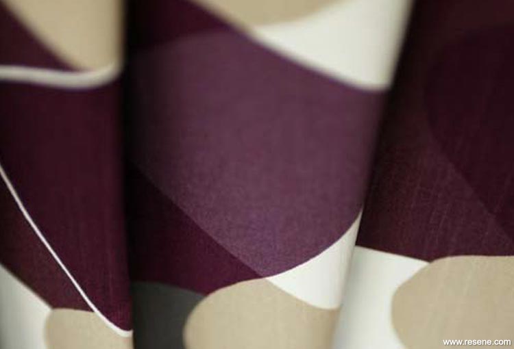
Boras Cotton, Malaga, from Atelie
When buying paint, remember the more there is of a colour, the darker it looks. It pays to try your colour with a testpot to make sure it looks right.
Colours are influenced by adjacent shades. Use a grey isolator (get one free from your Resene ColorShop) to isolate your colour, so that you can evaluate it against a neutral backdrop.
Exterior plaster finishes should generally be coated in a paint with a reflective value of more than 40% – 100% is highly reflective (such as white), while 1% is the least reflective, darker colours.
When it comes to developing a colour scheme, there are suggestions of what goes with what on the back of each chip in the Resene The Range fandeck to get you started. The colour wheel is also useful for inspiration, and many Resene ColorShops have Resene Colour Professionals in-house – just ask. Resene EzyPaint virtual painting software is also a great way to see what your scheme might look like. Simply download the software then, try painting more than 2500 colours onto more than 230 gallery images or your own project.
This New Zealand firm mixes Resene paints into its polyurethane to tint its wide collection of cork tiles.
“From our point of view, it is invaluable that the Resene colours are so sophisticated and so accessible,” says Pat Hadlee of Cork Concepts. “We can tell customers to stop in and look through the Resene colour chart, and then we can produce exactly the shade they choose for their floors.”
The company exports a considerable amount of product to the United States, where the colours – especially the metallics – are extremely well received. In fact Washington’s Umqua Bank recently specified Cork Concepts tiles in Resene Black Pepper woodstain for a prototype interior fitout, which – if all goes well – will see it specified for 45 bank sites in California. Perhaps another homegrown success story in the making!
Search habitat magazine stories
Printed copies of habitat highlights are available from late March 2024 at Resene ColorShops and resellers, while stocks last. You can view back issues of habitat magazine online.
Specifiers:
If you have an idea, project or story that you think would suit habitat, we’d love to hear from you. Please drop us an email with your details and include photos if submitting a project.
Sign up for a DIY card and Save! Australia | New Zealand
![]() Get inspired ! Subscribe
Get inspired ! Subscribe ![]() Get saving ! Apply for a DIY card
Get saving ! Apply for a DIY card
![]()
Can't find what you're looking for? Ask us!
Company profile | Terms | Privacy policy | Quality and environmental policy | Health and safety policy
Colours shown on this website are a representation only. Please refer to the actual paint or product sample. Resene colour charts, testpots and samples are available for ordering online. See measurements/conversions for more details on how electronic colour values are achieved.
What's new | Specifiers | Painters | DIYers | Artists | Kids | Sitemap | Home | TOP ⇧