From Habitat magazine - issue 07
Do our natural surroundings influence the shades and hues we choose to decorate our homes? Anya Kussler finds out which colours tickle our fancy – and why.
Ever wondered whether painting your bathroom turquoise blue had anything to do with the fact that you’re living in a country surrounded by water? Or whether you chose green cushions for the living room because your favourite bush walk is thick with nikau and ponga?
Judy-Lea Engel is the colour and design manager at Invista, one of the world’s largest fibre-manufacturing companies. She firmly believes that our environment has a great deal to do with how we perceive colour – especially the kind we bring into our homes.
“Kiwis are daring and exuberant in their interior colour choices,” says Judy-Lea. “We’re quite similar to many Asian countries, such as Thailand,but also to California, in that we like strong reds, yellow greens and bold blues.”
She says our vegetation and the ocean, in particular, affect our sense of colour.
“We grow up surrounded by sea, fresh grass and native forests. We have beautiful reds – pohutukawas, and warm, natural timbers like rimu and totara – and all that shines through in our bold use of colour. We’re surrounded by nature and we’re not afraid to use it.”
There are many public spaces in New Zealand where an edgy, naturally inspired colour approach is evident. One is the Ministry of Economic Development’s funky inhouse staff café fed@med in Wellington, where powerful greens, Pacific blues and reds in bold, geometric shapes dominate the fitout. Similarly, Jasmax jazzed up Westpac by extending the orange-red of the bank’s logo throughout the interiors, giving it a modern, crisp and contemporary look.
However, not everybody likes it hot. Europeans and Australians, for example, prefer more sedate colours, like beiges, greys and pale shades of green, says Judy-Lea. Again, it seems the environment (grey in Europe, desert in Australia) could be a contributing factor.
“In Australia, they have an aversion to yellow greens like lime – it’s too strong for them. They prefer subtle nuances, like jade and eucalyptus.”
Another element that may explain why colour preferences differ from country to country is natural light. In New Zealand, the light is clean, clear and bright, compared with highly populated and industrialised countries, with their polluted atmospheres, where more sedate palettes are generally more popular.
Our colour sense is also inspired by our Polynesian connection, which is intrinsically earth-bound and features strong, colourful designs. Tupu Youth Library in Otara is a beautiful example of a Pacific-inspired interior, featuring Polynesian artworks on the walls, woodcarvings, desks covered with tapa cloth, and a blue carpet with a Pacific design.
The New Zealand psyche is another key factor in shaping our colour perception, Judy-Lea says.
“We are friendly, open and laid back. We tend to walk up to people and chat to them. We also like to entertain at our homes. In Europe, the mentality is different. There, people tend to be a bit more reserved and keep their homes private.”
So, what about the environmental movement that’s taken the world by storm? Does our quest to preserve our natural resources make us inclined to use even more greens in our homes? Judy-Lea says that while the eco-enthusiasm probably doesn’t have much bearing on our colour preferences, it definitely has an impact on whether the products we use to decorate our homes (including our paints) are ecologically sustainable. And switching to sustainable products, such as eco friendly light bulbs, which emit a brighter light than conventional light bulbs, might indeed affect the interior colours we choose!
There are various other, less obvious – but nonetheless key – drivers that help determine our perception of colour. Technology and the fact that computer graphics now enable us to manipulate colours is one such tool. Political events are another. Take 9/11, which Judy-Lea says has sparked a surge of calming aqua blues in interiors around the world, not to mention a so-called global cocooning effect; a tendency for people to entertain at home, rather than to socialise in public.
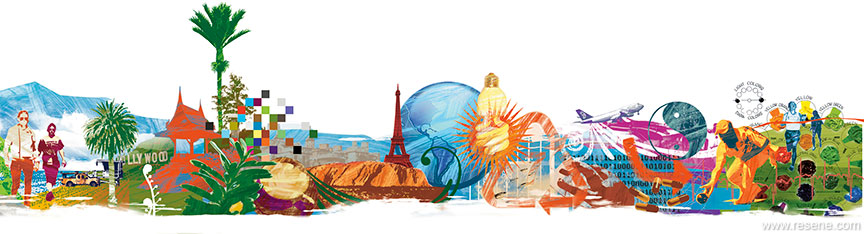
Globalisation, too, affects our choice of colour. It is now easy for people to travel anywhere in the world, and glean inspiration from the designs and colours of other cultures. In fact, we don’t even have to travel to another country in person to become inspired by it, or to bring those ideas into our homes. If we like spice-coloured Moroccan fabrics, we’re likely to be able to buy them over the internet.
The fact that we are living longer is also challenging and changing the rules that used to mean we behaved a certain way at a certain age. For example, it is not uncommon today for 70-year-olds to run marathons or remain in the workforce, while many of our teenagers have no qualms about joining a bowling club. How does this affect our colour choices? Well, for one, it is not expected of people to wear muted colours or have their homes painted in pastels once they reach a certain age and stage.
Finally, Judy-Lea reiterates that because it is driven by so many factors, interior colour doesn’t change abruptly from season to season like fashion trends.
“I like to think of it as a colour evolution that happens gradually,” she explains. “Interior colour is also very subjective, so it’s important not to get too hung up on a trend – rather go with something that you’re happy with. Paint is the easiest thing to have fun with. If you don’t like the colour you’ve painted your dining room wall, well, just change it. Never be afraid to experiment!”
A heady blend of colour options inspired by fashion, nature, the economy and the world come together in the 2008 palette.
Continuing the trend from 2007, shades are staying current for longer, a stark contrast to the short sharp colour bursts earlier in the decade. Seasonless colours are sought after as a way to carry forward fashion, refreshed by cut, texture, pattern and placement rather than a change in shade. Forecasting is increasingly balancing fresh new brights with a sense of the traditional, bringing the two together to provide vintage hues freshened by new fashion bolds.
Surrounding us daily, nature always strongly influences the palette, providing inspiration from earth, sky and sea. Colours are becoming increasingly genderless and more elegant than previous years, with the shocking brights becoming more saturated. A host of warm earth tones is joined by rich burgundies and browns, honey yellows and citrus greens, all lightly cooled with contemporised blues and greens. The purple family continues to strengthen as pinks wane, while the yellow family and orange-edged yellow follow a similar uptrend. Red is back, buoyed by Asiatic origins and inspired by the warmth of wood. Expect to see the colours of sunset reinvented as relaxing interior backdrops.
Murky blacks provide a background for other neutrals. Plain white is waning in favour of warming mid-tones, while off-whites, rich browns and metallic greys anchor the neutral palette, joined by the soft tones of chalky pastels for broad appeal.
Metallics and pearlescents become subtle, compared to their dazzling predecessors. The warm, shimmery tones of gold expand to sun-warmed pewter complemented, by drenched sepia.
Teal will wane as youthful blue-greens grow in popularity. At the same time, ever-attractive blue will cement its position with dramatic bolder and moodier shades through to inky and smoky tones.
The Range 2008 is available from Resene ColorShops nationwide.
words: Anya Kussler
illustrations: Dean Proudfoot
Search habitat magazine stories
Printed copies of habitat highlights are available from late March 2024 at Resene ColorShops and resellers, while stocks last. You can view back issues of habitat magazine online.
Specifiers:
If you have an idea, project or story that you think would suit habitat, we’d love to hear from you. Please drop us an email with your details and include photos if submitting a project.
Sign up for a DIY card and Save! Australia | New Zealand
![]() Get inspired ! Subscribe
Get inspired ! Subscribe ![]() Get saving ! Apply for a DIY card
Get saving ! Apply for a DIY card
![]()
Can't find what you're looking for? Ask us!
Company profile | Terms | Privacy policy | Quality and environmental policy | Health and safety policy
Colours shown on this website are a representation only. Please refer to the actual paint or product sample. Resene colour charts, testpots and samples are available for ordering online. See measurements/conversions for more details on how electronic colour values are achieved.
What's new | Specifiers | Painters | DIYers | Artists | Kids | Sitemap | Home | TOP ⇧

