From Habitat magazine - issue 09
In a project its owner describes as “lunacy, from a number of perspectives”, two old homes have been expertly melded into one.
It’s an ambitious renovation project that has kept the neighbourhood guessing for six years. David Melrose and Bronwen Allen took two adjacent houses on one of Auckland’s busy main roads and made them into one.
David calls it his ‘anti-property development’, project. But despite his claims of lunacy, the result is a spectacular home and studio complex that has fulfilled his expectations, is perfect for the family’s current lifestyle and which reflects the passion and vision with which it was conceived.
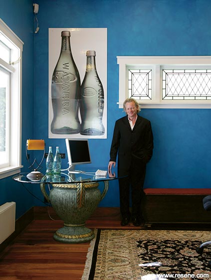
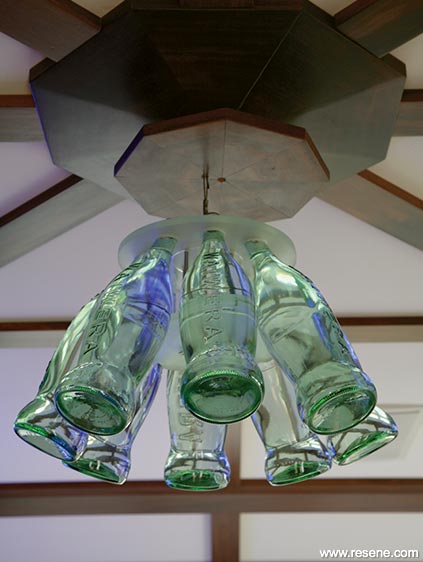
As an inventor, David is best known for the objects he creates, particularly in his specialty area of bottle design. He is responsible for the curvy fluidity of the award-winning Waiwera water bottle, the Anchor milk bottle and the Powerade sports drink bottle in North America, among many others, as well as the technology behind them. With a creative mind that just doesn’t stop, it has always been more practical for him to work from home - or next to home, as was the case for many years. He and Bronwen lived in one of the Balmoral Rd houses with their two sons Harrison and Campbell while David ran his studio from the house next door.
After searching down long, leafy driveways for the perfect home and work property, David concluded that his business needed the main road presence it already had in Mt Eden. So he set about convincing Bronwen that joining the two houses together would be a good idea.
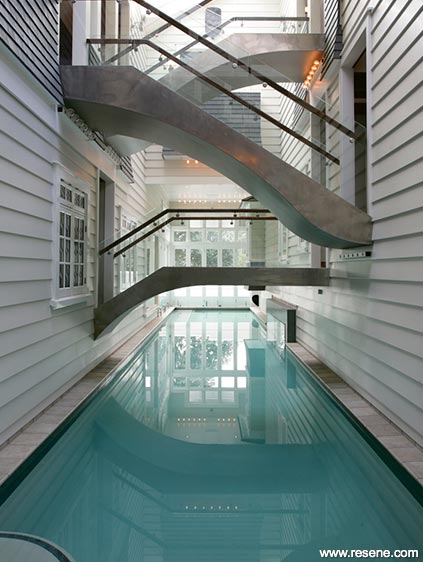
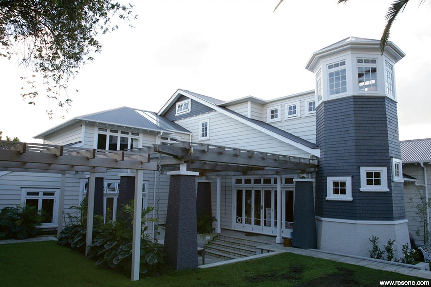
In David’s mind, the houses had to retain their 1910-20 character, but the end result had to look like it had always been one house. He didn’t want to actually move the original houses however, so has ended up with eight split levels, most notable when you stand at the end of the stunning lap pool that runs between what was the original houses.
Says David: “Traditionally suburbs like this had all of their grander homes set out along the main roads. This house is part of that philosophy. Having a commercial aspect to it just made it easier to justify as a business needs to be visible.”
He also has a future vision for the house as a boutique accommodation lodge, tailored to overseas business people and business groups. Hence its nickname of Hotel California, referring not only to its lodge potential, but also to its Californian bungalow origins. “We called the houses ‘bungarillas’ because they were a mix of bungalow and villa features.”
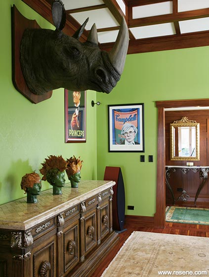
Some of the rooms also have an almost rock star quality, helped by David’s love affair with neon signs – “one of the things I do like about America is the neon signs everywhere, in every bar.” This house has many - in the bar, the living room, the studio and there’s a red Coca Cola version in one of the bathrooms. They’re used like night-lights, shining out into the dark through the windows and copping surprised second looks from passing motorists.
The couple spent the first year of the project designing the house with architect and bungalow specialist Ron Dijkman. “He thought it was a stupid idea, which is exactly why I hired him,” laughs David.
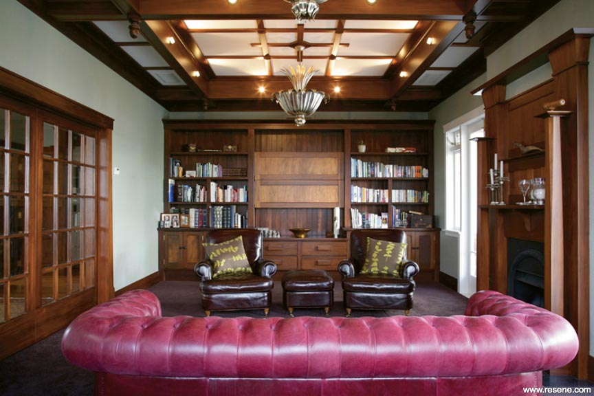
While the structure of the original houses and basic layouts have been retained, just about everything else is new, from the foundations to the rich timber paneling and complex beam and batten ceilings.
“No one builds bungalows anymore because they cost too much in terms of the time and skill involved,” says David. He credits the result to a team of specialists, overseen by builder Geoff Davies – “he’s exceptional”.
Despite “clearly biting off more than I could chew”, David’s commitment to the project was obviously contagious as everyone who has worked on the project speaks of it with pride.
At more than 1160m2, the house is huge, yet there are no cavernous spaces. “A house this size does have to have one large space though, and for us that’s the atrium over the lap pool.” One side of the building is still very much a work space with various reception rooms and a studio, while the other side contains bedroom suites, a lounge/reading room, kitchen and dining areas, and other design preparation rooms as well as storage. There are numerous bathrooms, a sauna, media room (with windows that look below the water level of the pool), a board room, gymnasium, a professional dark room and a turret with a spiral staircase to the master suite.
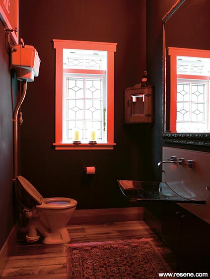
This moody bathroom with its striking Coca Cola neon sign is actually painted with Resene Blackboard Paint.
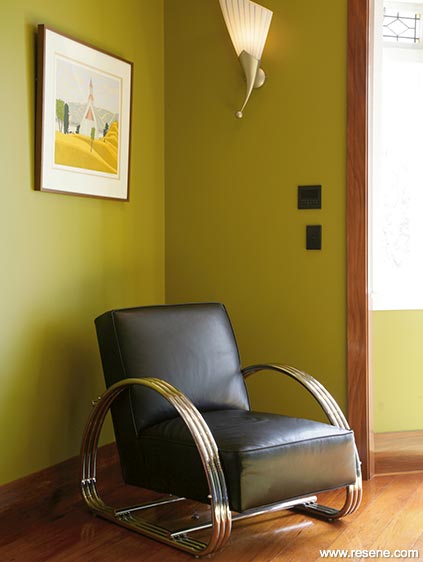
The intimacy of the areas is helped by the colour selections. “We could have painted everything cream and it would have looked stunning, but I spend so much time here, I need spaces with different moods.”
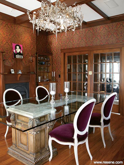
There are various shades of green, including fresh lime, acidic chartreuse and pale sage. The gallery hall is a deep plummy purple; the studio is turquoise; the kitchen cabinetry cobalt blue; the bedrooms more demur in traditional neutrals and the gymnasium is black.
Most of the colours have a story, like the green room (Resene Mantis) which was originally painted by a good friend who was dying of Aids. “Everyone needs a green room, a low-tech place where you can have a calm mind,” says Dave.
Because the project took so long, decisions could be given time to develop. “You make better choices when you have more time,” says Dave. He added the corner turret quite late in the planning, purely for aesthetic reasons. And when he and the architect were discussing drainage, they made an on-the-hoof decision to run a tunnel under the pool to connect the lower levels, which is now also a wine cellar.
“Once you have made a decision you have to stand back and be honest with yourself. If you don’t love it immediately, chances are it’s wrong. You tend to spend a period of time justifying the decision to yourself, but you’ve got to be brutal and change it.”
Hence the reason the turquoise studio was rag-rolled four times (“the strawberry crush version looked terrible”) and is now a paint-effect by Artifications using various Resene colours in combination. “I hate compromise.”
That adherence to quality and the overall vision for the house kept the project going these past six years. It’s still not quite finished, claims David. A mature phoenix palm was planted in June and there are still some curtains to decide on. “I like change, so there will always be some things I do again, like the paint colour in the TV room.” But for now, with a thriving business to manage, David and Bronwen can relax in their very unique home.
a restful scheme uses texture and accessories for interest
A designer suggests this alternative solution:
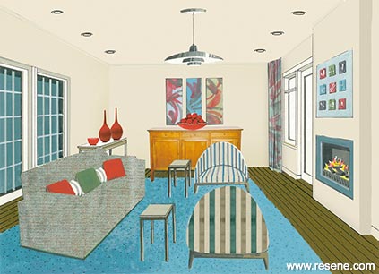
Natural light has been maximised by painting out the dark woodwork and covering the ceiling beams. The dark carpet has been removed and the rich tones of the original floorboards have been exposed and polished. The original fireplace has been replaced with a gas fire for efficient heat. The colour scheme is restful and neutral, with vibrant accent colours inspired by The Range 2009. A variety of textures, accessories and abstract artwork create visual interest and contrast. A modern classic pendant light and furniture with curved rather than angular lines looks contemporary but timeless. Seating is arranged around the fireplace for winter while french doors either side of the fireplace open for outdoor entertaining in summer.
Accessories: Townhouse side tables, three-door sideboard and console table in standard finish, from Willett’s. Whitford sofa by David Shaw in Hero, colour Reef, from James Dunlop. Designer’s Guild Cocktail chairs, from Allium, in Elliot Stripe by GP & J Bakercolour teal/taupe, from Mokum Textiles. Louis Poulsen pendant light, from Bromhead Design. Ceramic bowls and bottles by Peter Collis, from Eon Design.
a light scheme gives the room a more informal look
Christine Hudson of Architecture Lab, Wellington, offers this alternative solution:
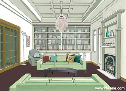
This is a wonderful room with its generous proportions and high-quality craftsmanship, however, the heavy wooden paneling can be a little dark and formal. For this scheme, I have tried to lighten the room a little and create a more informal, comfortable look, while still maintaining some continuity through to the adjoining room. By painting the ceiling and fire surround in a warm off-white, the period features of the room haven’t been compromised, and the custom-designed built-in bookcase offers a practical storage solution.
email: christine_hudson@xtra.co.nz
Accessories: Sofa in Grange fabric: colour Sand, from Textilia. Lovara, colour 1525: Romanie collection by Harlequin, from Malcolm Fabrics. Verner Panton Fun pendant light: in Mother of Pearl, optical floor lamp by Palluco Italia, from ECC Lighting. Sofa cushions: Vogue, colour Pear, from James Dunlop. Milo coffee table, from Apartmento.
words: Sharon Newey
pictures: Emma Bass
illustration: Bruce Bryant
Search habitat magazine stories
Printed copies of habitat highlights are available from late March 2024 at Resene ColorShops and resellers, while stocks last. You can view back issues of habitat magazine online.
Specifiers:
If you have an idea, project or story that you think would suit habitat, we’d love to hear from you. Please drop us an email with your details and include photos if submitting a project.
Sign up for a DIY card and Save! Australia | New Zealand
![]() Get inspired ! Subscribe
Get inspired ! Subscribe ![]() Get saving ! Apply for a DIY card
Get saving ! Apply for a DIY card
![]()
Can't find what you're looking for? Ask us!
Company profile | Terms | Privacy policy | Quality and environmental policy | Health and safety policy
Colours shown on this website are a representation only. Please refer to the actual paint or product sample. Resene colour charts, testpots and samples are available for ordering online. See measurements/conversions for more details on how electronic colour values are achieved.
What's new | Specifiers | Painters | DIYers | Artists | Kids | Sitemap | Home | TOP ⇧


