Wellington
Our aim therefore was to create a space that was ‘cool in a conservative industry’, and to present a fresh and smart appearance to the client’s many visitors.
Catalyst was engaged to design a new office environment in new premises for Crombie Lockwood, a NZ Insurance Brokerage. Crombie Lockwood had recently acquired another brokerage so an increase in staff numbers and recent rebranding created an opportunity to upgrade their office layout and brand presence with a fresh new look in a new location.
A key element in the brief from the client was to brush off any perception that insurance brokers are boring. Our aim therefore was to create a space that was ‘cool in a conservative industry’, and to present a fresh and smart appearance to the client’s many visitors.
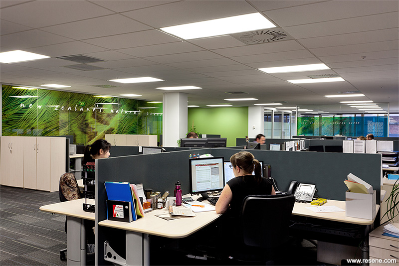
The fit-out needed to reflect the new corporate branding as well as enhance the culture of interaction among staff, and between staff and clients. The relocation allowed all staff to move into open plan with only glazed screens to divide and define spaces that gave individual business units a certain level of privacy from the adjacent teams. The Crombie Lockwood story is strong on its ‘New Zealandness’; the old branding of paua, kiwi and fern frond imagery was updated with close up images of native bird plumage and fresh and contemporary colours inspired by the plumage of our unique birds: Hihi (yellow), Korora – Blue Penguin (blue), Kakapo (green), Takahe (turquoise – blue), Kea (red), Weka (orange) and Kiwi (brown).
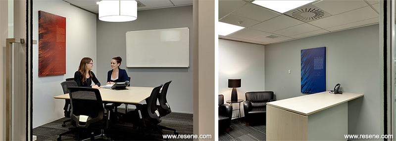
An emphasis was placed on the reception and meeting areas, including boardroom, client meeting rooms and a fun, social breakout space. In these spaces the layout, colours, wall finishes, aluminium framed glass sliding doors, graphics, joinery and furniture selections were the key components used to express the company culture and brand.
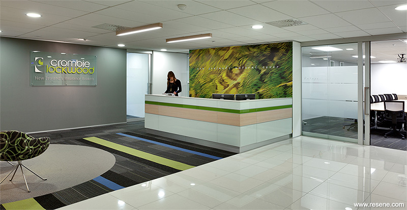
As the visitor steps out of the lifts they are greeted by a crisp and friendly reception and get a great sense of the organisation’s personality. The lobby area is defined with white porcelain tiles. This leads onto the main reception space with bold accent carpet tile design, a reception counter featuring back painted glass and timber, and the waiting seat area defined by a large carpet circle and black glossy pendant lights above.
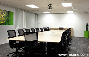
Aluminium frame glass sliding doors open from the reception to the board room and meeting rooms, while frameless glass doors lead to the open plan office beyond.
While the open plan office space enjoys prime views of the city, other areas such as the boardroom lack appealing views. The design of the boardroom included replicating the size and location of perimeter vertical slot windows on the internal wall opposite. The new internal slot windows were frosted and given chunky frames, to give the same look as new frosted glass panels overlaid on the exterior windows. These windows allow natural light into the room while concealing the view beyond and add another dimension of interest to the room.
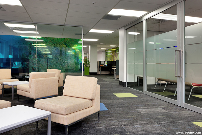
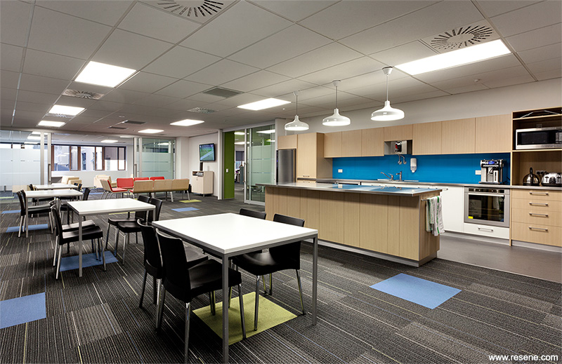
A large staff breakout area with a kitchen island bench encourages team interaction and creates a social atmosphere. A variety of seating styles allows the room to serve multiple functions and double sliding aluminium framed glass doors in a glass wall at the end of the room allow the room to be opened up for larger staff gatherings.
Crombie Lockwood has since implemented some key design elements including reception counter, carpet tiles and paint colours, from this Wellington fit-out into other sites throughout New Zealand as they come up for refurbishment.
The new brand imagery was showcased throughout the fit-out with the use of the colourful graphics and inspirational stories as graphic film applied to the glazed screens. The brand imagery was such an integral part of the design that it informed the choice of other finishes. Carpet, upholstery, furniture and wall paint colours all took their cue from the graphics but needed to complement rather than outshine them.
We selected colours to work with and complement these graphics while being suited to an interior environment and to bring a vibrant feel to the space with the modern ‘cool’ feel the client sought.
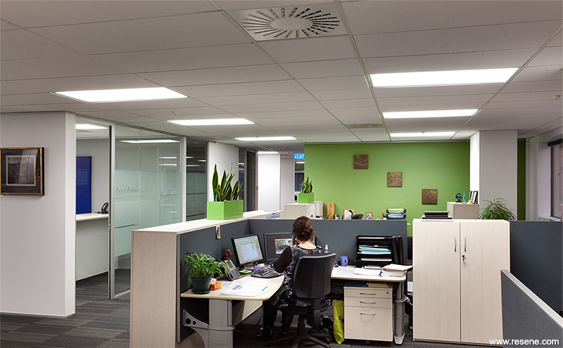
Near new existing workstations and storage units were reused so the colours selected around the office had to also consider these existing elements. The carpet tile was selected for its grounding neutral charcoal tonings with a modern linear pattern to give interest to the large open plan areas. Highlight ‘threads’ in Crombie Lockwood’s main colours of green and blue fitted the brand perfectly and also cued the use of contrast insert carpet tiles picking up on the green and blue.
Resene Triple Alabaster (Resene Half Sea Fog) a neutral, white colour was selected for the main walls to create a fresh and clean background for the colourful elements of the fit-out. This allowed the colourful plumage and feature colours to stand out.
Resene Condor, a dark grey, was used for the background to the main signage in keeping with strict signage requirements, in other areas this grey was softened to Resene Half Stack as a feature colour on larger walls in open plan areas, where a more vibrant colour would have been overpowering. Resene Koru, an iconic green, was used as the main feature wall colour in the open plan area to reinforce Crombie Lockwood’s main brand colour and to link with plumage graphics on adjacent glass walls.
Vibrant aqua, with Resene Imperite tinted to Resene Bowie, was used on the kitchen splashback to give a fresh and energised feel to the breakout space. Timber finish Melteca joinery added warmth and texture to contrast the bold splashback.
Timber finishes also feature in the reception, boardroom and meeting room, a lighter grainy timber to bring in the texture and feel of ‘natural’ against the crisp and shiny finishes of the polished porcelain floor tiles, back painted glass and black gloss pendant lights. Three green-onblack patterned fabric waiting chairs add another layer of colour and texture to the reception area.
The client’s entire range of brand graphics had to be used throughout the fit-out which presented a challenge to avoid too much overpowering colour. As such, additional colours were used sparingly and carefully. The project had to deal with existing site defects such as unlevel floors, and damaged existing surfaces. We also had to integrate the fit-out works with landlord base build requirements.
Architectural specifier: Catalyst Consulting
Client: Crombie Lockwood
Painting contractor: Le Prou Decorators
Photographer: Grant Heighway Catalyst Consulting
Project: Resene Total Colour Awards 2013
Resene case studies/awards project gallery
View case studies that have used Resene products including many from our Resene Total Colour Awards. We hope these projects provide inspiration for decorating projects of your own... view projects
Total Colour Award winners:
2023 |
2022 |
2021 |
2020 |
2019 |
2018 |
2017 |
2016 |
2015 |
2014 |
2013 |
2012 |
2011 |
2010 |
Entry info
Latest projects | Project archive | Resene news archive | Colour chart archive
![]()
![]() Get inspired ! Subscribe
Get inspired ! Subscribe ![]() Get saving ! Apply for a DIY card
Get saving ! Apply for a DIY card
![]()
Can't find what you're looking for? Ask us!
Company profile | Terms | Privacy policy | Quality and environmental policy | Health and safety policy
Colours shown on this website are a representation only. Please refer to the actual paint or product sample. Resene colour charts, testpots and samples are available for ordering online. See measurements/conversions for more details on how electronic colour values are achieved.
What's new | Specifiers | Painters | DIYers | Artists | Kids | Sitemap | Home | TOP ⇧