Palmerston North
It was decided to warm up the scheme to be in line with the lovely warm timber floors and doors, the furniture they have amassed, and also the trinkets collected both in New Zealand and on their overseas travels.
This project came about after the owners recently purchased the property. They loved the site, its outlook and the layout, but the colour scheme left them cold. The grey scheme was not them at all.
It was decided to warm up the scheme to be in line with the lovely warm timber floors and doors, the furniture they have amassed, and also the trinkets collected both in New Zealand and on their overseas travels. They asked for texture and warmth. The scheme had to tie in with the aluminium joinery colour of silver pearl, a silvery grey, which permeates all rooms.
A soothing scheme for the busy couple to relax in has resulted with the initial suggestion of wallpaper, and then paint colours to accentuate the mood and scheme requested.
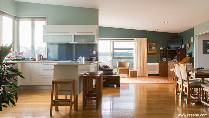
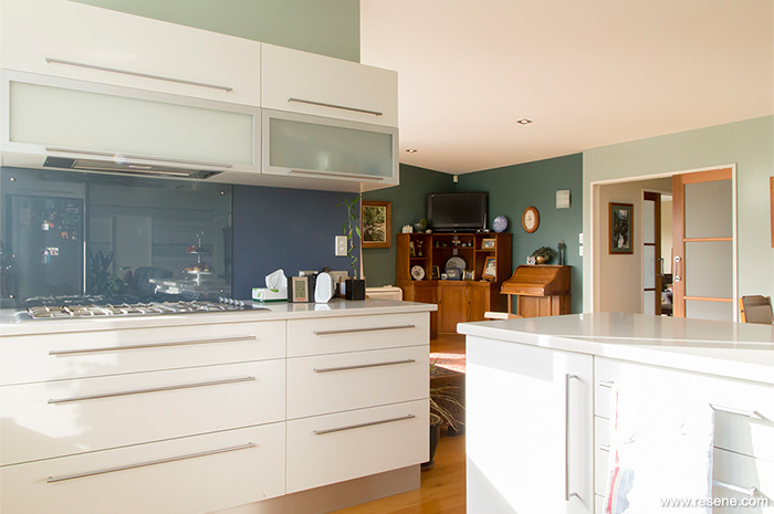
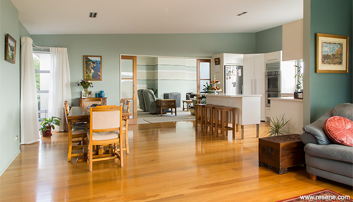
In the main living areas, that receive abundant light and face north, slightly cooler colours in blues and teals have been used. The bedrooms are in warm neutrals, with the study and bathrooms, on the cooler side of the home, receiving a shot of warm terracotta.
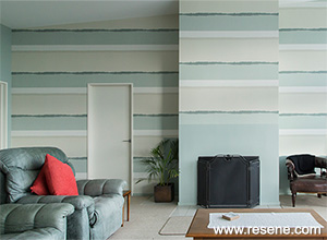
The inspiration came from a wallpaper range seen in a magazine, from which the final paper was chosen for its striking colour combination and pattern. The colours chosen complement this, and decorative objects displayed in the room.
Resene Robin Egg Blue was chosen as the main colour, to match the main colour of the wallpaper, with accents of Resene Avalanche and Resene Green Meets Blue to complement the decorative objects; all were painted in Resene SpaceCote Low Sheen for its desirable low sheen and durability. Resene Lustacryl in Resene Triple Rice Cake was applied to doors and architraves with Resene Alabaster on all ceilings.
A number of challenges were faced in this home. Firstly, the colour of the joinery, a cool dull colour, did not inspire the clients at all. But as it is a main component of the home and impacts visually on all the rooms, it needed to be considered. In the warmer north facing areas a brighter cool colour was used. This also helps cool these areas on very sunny warm days, along with the sun filter blinds that were installed.
Another challenge was the high and sloping ceiling. The space seemed very cavernous before, but the use of vertical striped wallpaper brings the dimensions into scale.
With lots of glass the new scheme does not outshine the wonderful outdoors and the long distance view of green pastures and blue sky.
Building contractor: Peter Vining, Vining & Harrall Ltd
Client: Robynne and Harvey Ebbett
Interior designer: Sandra Carroll, Colour & Design Group
Painting contractor: PTP & Sons
Photographer: India Bartlett
Project: Resene Total Colour Awards 2014
Resene case studies/awards project gallery
View case studies that have used Resene products including many from our Resene Total Colour Awards. We hope these projects provide inspiration for decorating projects of your own... view projects
Total Colour Award winners:
2023 |
2022 |
2021 |
2020 |
2019 |
2018 |
2017 |
2016 |
2015 |
2014 |
2013 |
2012 |
2011 |
2010 |
Entry info
Latest projects | Project archive | Resene news archive | Colour chart archive
![]()
![]() Get inspired ! Subscribe
Get inspired ! Subscribe ![]() Get saving ! Apply for a DIY card
Get saving ! Apply for a DIY card
![]()
Can't find what you're looking for? Ask us!
Company profile | Terms | Privacy policy | Quality and environmental policy | Health and safety policy
Colours shown on this website are a representation only. Please refer to the actual paint or product sample. Resene colour charts, testpots and samples are available for ordering online. See measurements/conversions for more details on how electronic colour values are achieved.
What's new | Specifiers | Painters | DIYers | Artists | Kids | Sitemap | Home | TOP ⇧