Auckland
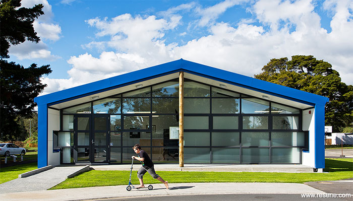
The design aimed to reflect the school’s existing branding, thus the external blues and whites picked up on this theme and provided a point of difference from the surrounding environment, which is a collection of wonderful natural tones and hues.
Kereru Park Campus is set in a wonderful location. Nestled behind playing fields and a stand of native trees, the existing administration and library are hidden, almost unseen from the road. The school wanted to engage with the wider community and create a new building that would give the school a presence that could be seen from the street and that students would want to visit.
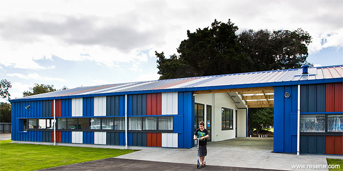
The building is split into three parts, an administration building to the west adjacent to the vehicular access, a library building to the east, which is closer to the teaching spaces within the school and between the two, a covered central canopy space.
The central canopy space provides an area where students can take shelter on rainy days, enjoy shared lunches served from the adjacent kitchen and participate in events and exhibitions that open out on to the fields. The roofing here is transparent, allowing light to waft through the innermost sections of the administration and library.
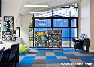
Along the northern and southern facades, all the windows are located at a student’s eye level. This is to provide a high level of engagement for the students – to remind them that the function of these buildings is for them. This window height also subtly engages with staff and parents, encouraging them to consider the world from the perspective of a primary school student, as for an adult they are situated at eye level while seated.
The design aimed to reflect the school’s existing branding, thus the external blues and whites picked up on this theme and provided a point of difference from the surrounding environment, which is a collection of wonderful natural tones and hues.
The staff at Kereru Park also wanted to get the students involved in the design – something particularly exciting for the project architects. They provided a series of options to the school with different colours to complement the blues and whites. The options with a collection of red hues were the ones that grabbed the attention of the students and ultimately one of these was selected to join the blues and whites, creating the striking bands that wrap the building.
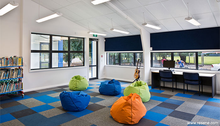
The students got a real buzz from being included in the process. This is a particularly important level of engagement given that the library plays such an incredibly important role in a school even as we move into a new age of learning through technology. The project team wanted the buildings to be fun and in turn emphasise the fun in reading and writing.
The enthusiastic colours are carried through to the internal colour selections too. The collection of coloured carpet tiles, five different types in all. These carry the school branding, while giving a cool, calm and fresh feel to the internal spaces – perfect for encouraging focus while learning.
But enthusiasm, both as a characteristic in people and in colour, needs to have a level of contrast, to emphasise the enthusiasm and not be overpowering. This is where the Resene Double Alabaster applied internally to all the wall and timber portal surfaces provides the final piece of the puzzle.
› Download a PDF of this article
Architectural specifier: Rajan Hira & Paul Raven, Stephenson&Turner
Building contractor: Canam Interiors
Client: Ministry of Education
Photographer: Paul McCredie
Project manager: Iain Pearson, Greenstone Group
Principal: George Ihimaera, Kereru Park Campus
Project: Resene Total Colour Awards 2014
Resene case studies/awards project gallery
View case studies that have used Resene products including many from our Resene Total Colour Awards. We hope these projects provide inspiration for decorating projects of your own... view projects
Total Colour Award winners:
2023 |
2022 |
2021 |
2020 |
2019 |
2018 |
2017 |
2016 |
2015 |
2014 |
2013 |
2012 |
2011 |
2010 |
Entry info
Latest projects | Project archive | Resene news archive | Colour chart archive
![]()
![]() Get inspired ! Subscribe
Get inspired ! Subscribe ![]() Get saving ! Apply for a DIY card
Get saving ! Apply for a DIY card
![]()
Can't find what you're looking for? Ask us!
Company profile | Terms | Privacy policy | Quality and environmental policy | Health and safety policy
Colours shown on this website are a representation only. Please refer to the actual paint or product sample. Resene colour charts, testpots and samples are available for ordering online. See measurements/conversions for more details on how electronic colour values are achieved.
What's new | Specifiers | Painters | DIYers | Artists | Kids | Sitemap | Home | TOP ⇧