In Turuturu: Fingers, Feathers & Fibre, design and colour are used to provide deeper meaning and context to the Taonga on display.
Turuturu: Fingers, Feathers & Fibre was developed by MTG Hawke's Bay and guest curator Nigel How. The exhibition showcases the breadth of woven Taonga in the museum's collection and the materials and techniques used to create these precious works of art.
Turuturu are weaving pegs used to keep a garment off the ground when it is being made and represents the mana of Te Whare Pora – the knowledge-bank of the art-form. The peg itself upholds the mana of the growing garment and it spiritually connects the maker to the world of thought and concentration. Knowledge of how to prepare materials, use them and create Kakahu (cloaks), Kete (bags) and Tatua (belts) is the true taonga of Te Whare Pora. If the knowledge is lost, there is no way more can be created.
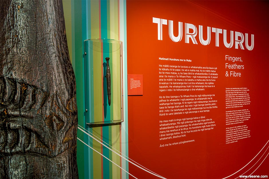
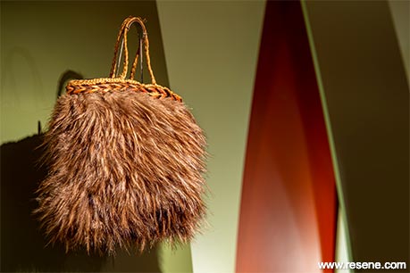
Woven Taonga in the exhibition contain a wealth of knowledge when observed carefully. All the pieces in this exhibition are hand-made. Fingers are the main tools. With skill and dexterity, materials are prepared then manipulated. Feathers are used to artistic effect. Natural fibres are what links all of these Taonga together. The results are pieces of function and beauty.
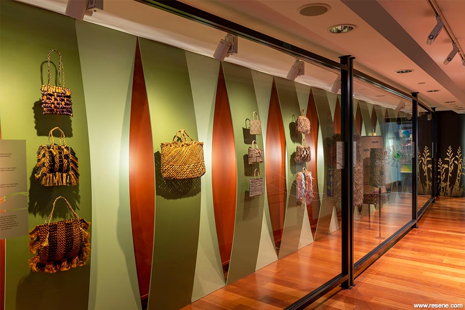
The exhibition is installed in a long narrow gallery which required creative ingenuity to achieve the aspiration of the designer. The harakeke plant, the woven structure of a kete and the concept of weavers as knowledge holders all inform the design and when combined with a confident use of colour, a space is created that honours the beauty of the objects, the materials and techniques used and above all the makers themselves.
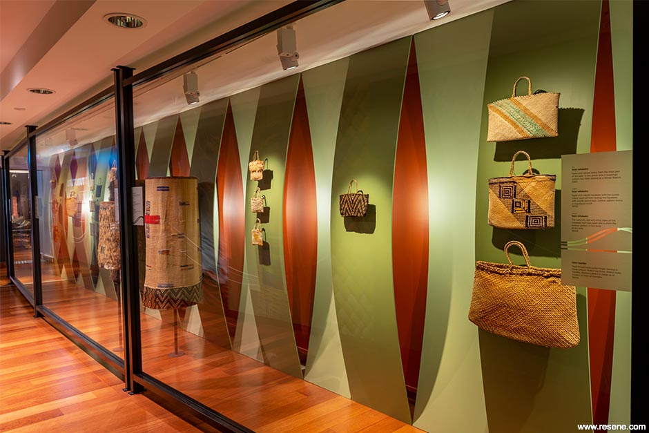
In Turuturu: Fingers, Feathers & Fibre, design and colour are used to provide deeper meaning and context to the Taonga on display.
The exhibition design draws on a combination of three elements:
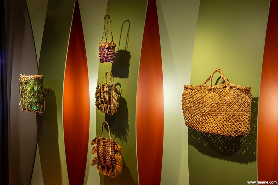
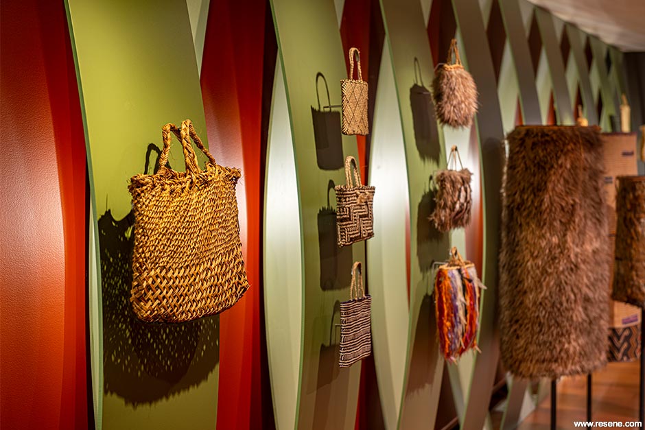
Muka or harakeke fibre is present in the majority of the objects on display. The convex and concave alternating curves behind the kete and cloaks represent the outer harakeke leaves (Tupuna) – these leaves naturally curve and are the only leaves cut by weavers. The parent leaves (awhi-rito) are left to protect the young child (rito) leaves.
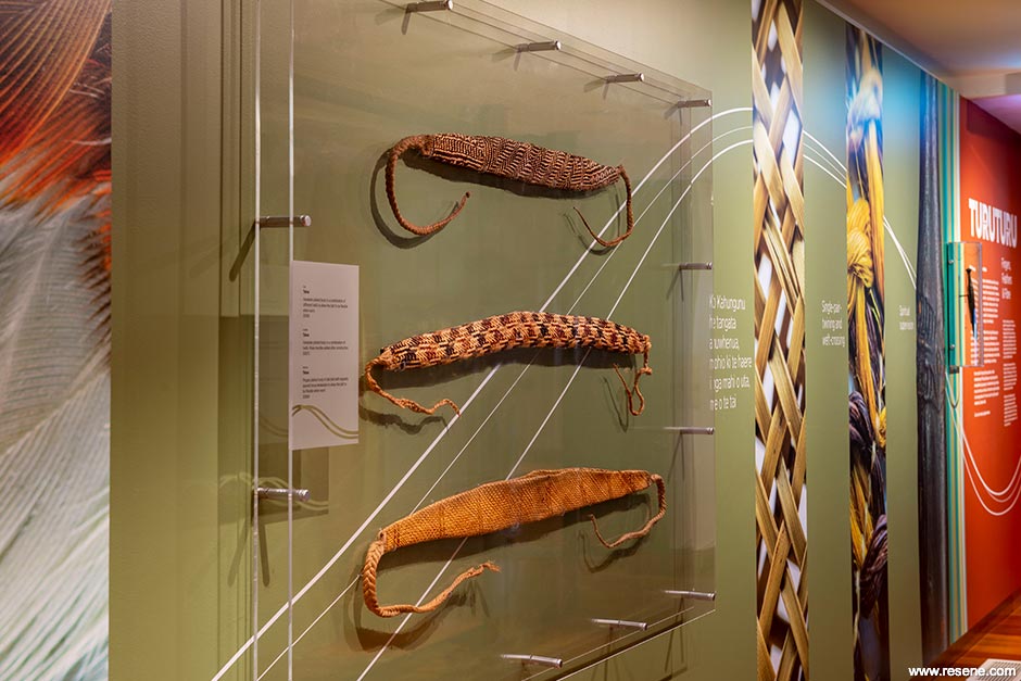
The brighter green convex curve using Resene Cross Country represents the front of the leaf and the grey/green concave curve in Resene Flax the back of the leaf. The greens chosen complement the objects and reference the harakeke leaves in their natural state.
The orange/red wall behind the curves using Resene Mustang is taken from the colour on the outside edge of the harakeke leaf and also the colour of the flower.
The dark charcoal brown of Resene Black Magic is used on the side walls and is taken from the colour of the harakeke stalk.
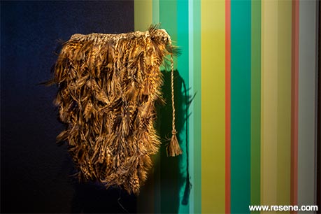
Stripes of 14 bold colours – Resene Serenity, Resene Opal, Resene Petite Orchid, Resene Kalgoorie Sands, Resene Caper, Resene Nirvana, Resene Chelsea Cucumber, Resene Origin, Resene Contessa, Resene Rose Of Sharon, Resene Flourish, Resene Bay Leaf, Resene Aqua and Resene Area 51 – at either end of the gallery are based on the variations of colour on some harakeke leaves and add a contemporary feel.
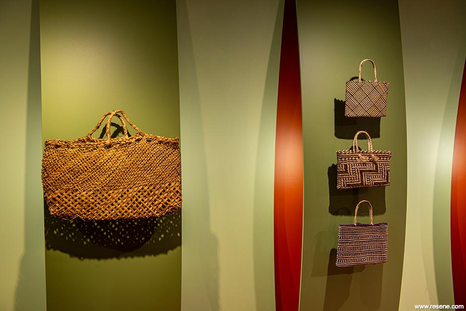
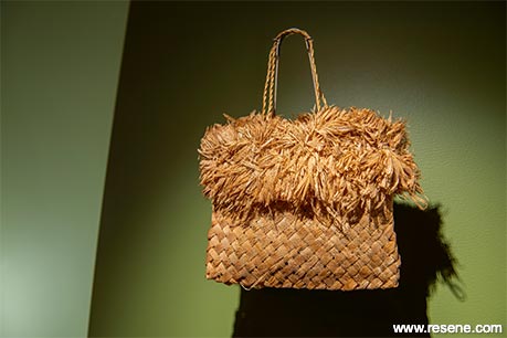
The open, woven structure in the body of Kete Parareka influenced the design of the structure in the exhibition – at first glance a humble looking kete used to carry kumara and potatoes. This kete has a Harakeke plaited body in taki-taki. Splitting of the harakeke whenu a quarter of the way up creates a finer plait. Gaps in the plait are intentional to allow dirt to pass through and for air to circulate around the potatoes.
A powerful symbol representing providing sustenance for yourself, family and community from your own labours and is a direct symbol of Kahungunu, known as the great provider. The convex and concave woven structure in the exhibition mimics an extreme detail section of the open woven structure in the body of this kete. The alternating convex and concave curves frame the objects, create light and shadow and give a sense of rhythm and movement. The vertical curves also give an illusion of height in a low ceiling gallery space.
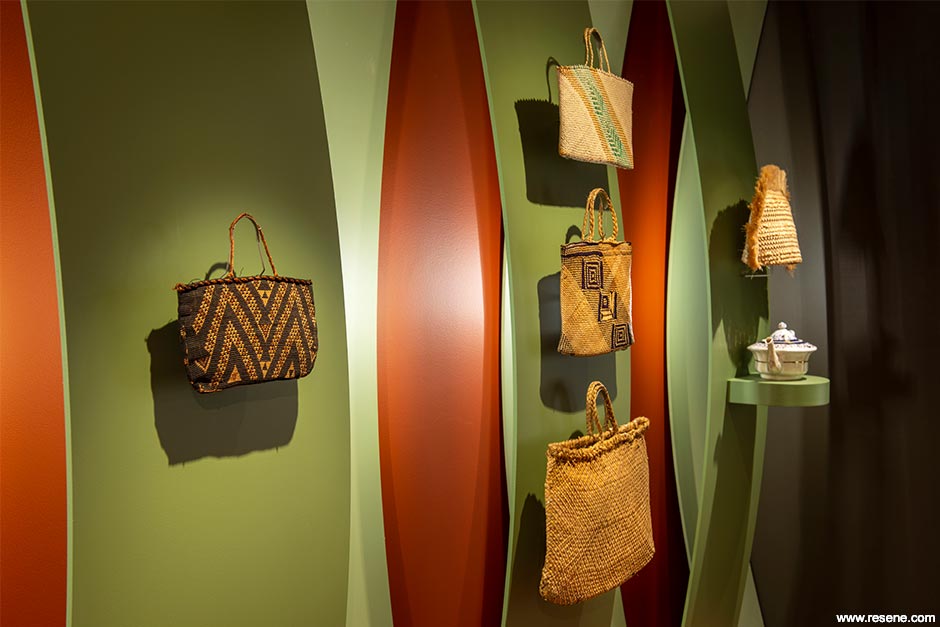
Weavers are knowledge holders, passing on their knowledge from generation to generation. The curved structure in the gallery represents this through the use of light as a metaphor for knowledge. All of the curves are vertical and represent the Whenu – vertical threads or warp of a woven taonga. The Aho – horizontal thread or weft, is a word for connection and connects the Whenu. Without the Aho, the Whenu would not hold together. Within the woven structure in the exhibition, the Aho is portrayed in light with a short strip of led light behind each convex curve creating a band of horizontal light through the centre of the concave curves, connecting everything together. This band of light is a metaphor for knowledge.
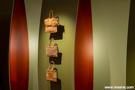
Light is also used in the silhouette of the flax bush and flower stalks on the end wall. This is a visual reminder of a proverb based on the Harakeke plant which speaks of the older outer leaves of the flax bush protecting and developing the younger shoots in the centre so they can grow and develop. Again, light is used as a metaphor for knowledge passed on to the younger generation.
Hutia te rito o te harakeke
Kei whea to kōmako e kō?
Kī mai ki ahau
He aha te mea nui o te Ao?
Māku e kī atu,
He tāngata, he tāngata, he tāngata
If the heart of the harakeke was removed,
where would the bellbird sing?
If I was asked what was the most important thing in the world
I would be compelled to reply,
it is people, it is people, it is people
Research from all 3 elements – the harakeke plant, the woven structure of a kete and the concept of weavers as knowledge holders, interconnect to create a cohesive design where colour is essential for achieving a harmonious and meaningful space.
Resene Zylone Sheen is the preferred paint for these exhibits due to the flexibility offered by the extensive range, the unobtrusive low-sheen finish and the low or no added VOCs in enclosed spaces and around sensitive artworks and Taonga.
The project brought with it some interesting challenges:
To create an environment that referenced the two green tones of the harakeke plant yet be warm and inviting and to complement a range of colours found within the objects on display. To achieve this, a large number of Resene A4 drawdown colour sample cards were tested in the space alongside the objects, test curve structures and approximate final lighting conditions to aid selection of the ideal paint colours. To enhance the warmth of the space, a red/orange colour was chosen for the wall behind the curves which also worked well with the colour of the Harakeke plant flower.
Another challenge was to select colours that gave a fresh, contemporary feel to the space and objects on display which were all created over 100 years ago. Having a contemporary feel was important to emphasise that the art form of weaving is still practised today by many Maori artists. Using bold stripes of colour helped achieve this and also referenced the striped leaves of some flax plants. Again, many Resene A4 drawdown colour sample cards were needed to get the mix of colours right. The bold colours selected also needed to be in balance with the desire to show respect to the age and importance of the Taonga on display.
Structural elements also proved to be challenging – creating the convex and concave forms required many experiments to get the thickness and length of the curves right so that they provided good light and shadow, appeared thin like flax leaves yet had enough support for the objects and LED strip lighting and had a dynamic degree of curvature. Protection of the objects from touching also needed to be considered without compromising visibility and the solution was to use large oversize acrylic shields housed in aluminium mullions to provide a strong framework and maximum visibility. To cater to visitors' natural tendency to want to touch, a small contemporary feathered cloak sample was included in the exhibition which aided visitors' understanding of how cloaks are constructed.
It took a large number of green Resene Drawdown colour sample cards (60-70) to find the two perfect green colours for the convex and concave curves. The greens needed to accurately represent the two greens found on the front and back of the Harakeke leaf and also work well with the colours of the objects on display. The green selected for the concave curve needed to be a grey/green colour to match the green found on the reverse of the harakeke leaf. After testing many samples and choosing the perfect match, we were very happy to see the name of the colour was called Resene Flax – Resene had created the perfect colour for this project!
Local Maori weavers attended the opening of the exhibition and were overwhelmed with the sensitive and meaningful way the Taonga had been displayed. Many said they had never seen kete displayed so beautifully and with such a stunning use of colour and form.
This project won the Resene Total Colour Installation – Experiential – Product Award. The judges said "the colours are so carefully woven into this project it is almost difficult to see where one colour ends and the next one begins. This careful related selection means not only are the hues sympathetic to the curated collection, but they relate equally well to each other. Inspired by nature's unerring mastery of colour, this palette layers the best of nature's inspiration with a flaxen twist. A natural winner."
Architectural specifier: James Price
Building contractor: MTG Exhibitions & Facilities Team
Client: MTG Hawke's Bay
Curator: Nigel How
Photographer: David Frost
Winner: Resene Total Colour Installation – Experiential – Product Award
Project: Resene Total Colour awards 2020
Resene case studies/awards project gallery
View case studies that have used Resene products including many from our Resene Total Colour Awards. We hope these projects provide inspiration for decorating projects of your own... view projects
Total Colour Award winners:
2023 |
2022 |
2021 |
2020 |
2019 |
2018 |
2017 |
2016 |
2015 |
2014 |
2013 |
2012 |
2011 |
2010 |
Entry info
Latest projects | Project archive | Resene news archive | Colour chart archive