Johnsonville
The aim was to brighten the place up with something eye-catching and distinctly different to what was already there, but also something that was fitting to the Compassion Centre and what they stand for.
![]()
In 2015 part of the Soup Kitchen exterior was rebuilt for earthquake strengthening, leaving a blank space on the front of the building. The rest of the building has other artwork on it, which has been there for some years, so the new wall stood out immediately as a blank canvas.
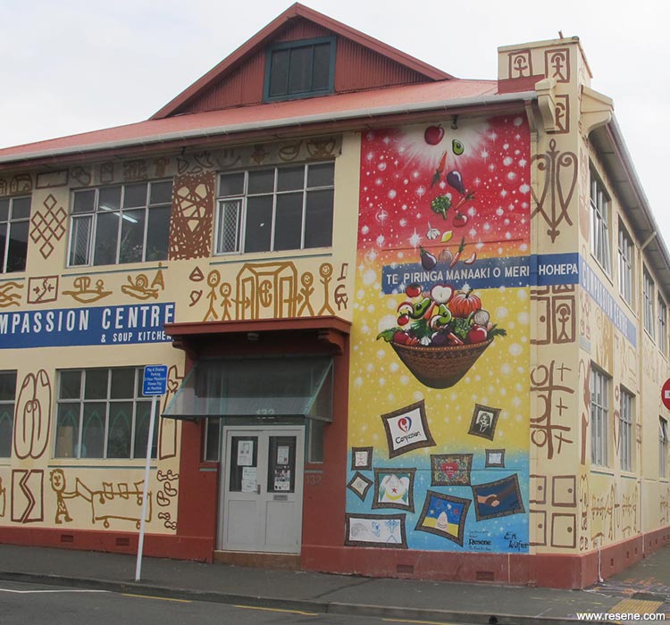
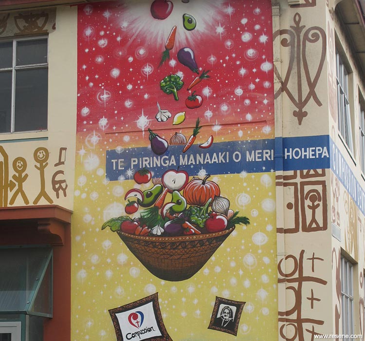
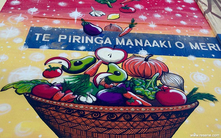
The aim was to brighten the place up with something eye-catching and distinctly different to what was already there, but also something that was fitting to the Compassion Centre and what they stand for. Originally the design was on a dark blue background, but after discussion with the CEO and the Sisters of Compassion a lighter and more colourful background with blended colour and stars using Resene Lumbersider in Resene White, Resene Wet N Wild, Resene Energy Yellow and Resene Candy Floss with accents in Resene Black, Resene Gold Dust and assorted Resene testpots was considered a more uplifting option.
Rather than create the mural with an artist alone, after meetings and discussions it was decided to involve the guests. This turned the project from a simple mural on the side of the building into a community project that resulted in each guest contributing something to their building that they could be proud of.
The food falling into the Kava bowl represents not only the meals at the soup kitchen, but the other support they provide to the guests and their whanau. The first two frames – a stencilled image of Suzanne Aubert (original founder of the Compassion Centre in 1901) and the Compassion Logo – acknowledge the heritage of the organisation and what they stand for, while the Maori/Pasifika koru designs on the bowl and all the frames represent the multicultural aspects of the compassion centre. This is also a way of acknowledging Suzanne Aubert and her dedication to her work with Maori.
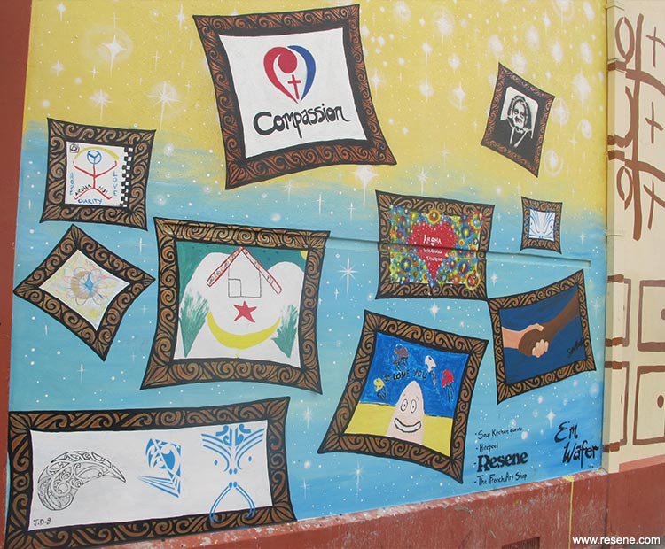
The lower frames were for the guests to fill in with their artwork, as a way for them to leave their own mark on a place that is an incredible source of support and community for them.
Working on the lower third of the mural, while the artist, Em Wafer, was decorating the frames with Koru designs, the guests were filling them in. Em helped with colour mixing suggestions and answered any questions, but didn't suggest too much as she wanted to see what they came up with on their own as that is what the beauty of art is about – no-one can really tell you what is the 'right' way to do something. The frames were a way of giving the guests complete artistic freedom while still being able to give the staff a realistic idea of what the final product would look like because each space was contained, and each frame is a separate artwork in itself. Once fully painted, the mural was then coated in Resene Concrete Clear.
Through the process, being with the people who visit regularly and hearing first-hand all the positive things they say about the organisation has given the artist new appreciation for just how much the staff there do for the people in the city who need it the most.
Artist: Em Wafer
Client: Suzanne Aubert Compassion Centre
Other key contributor: Hirepool Wellington; Soup Kitchen staff and guests
Project: Resene Total Colour Awards 2016
Resene case studies/awards project gallery
View case studies that have used Resene products including many from our Resene Total Colour Awards. We hope these projects provide inspiration for decorating projects of your own... view projects
Total Colour Award winners:
2023 |
2022 |
2021 |
2020 |
2019 |
2018 |
2017 |
2016 |
2015 |
2014 |
2013 |
2012 |
2011 |
2010 |
Entry info
Latest projects | Project archive | Resene news archive | Colour chart archive
![]()
![]() Get inspired ! Subscribe
Get inspired ! Subscribe ![]() Get saving ! Apply for a DIY card
Get saving ! Apply for a DIY card
![]()
Can't find what you're looking for? Ask us!
Company profile | Terms | Privacy policy | Quality and environmental policy | Health and safety policy
Colours shown on this website are a representation only. Please refer to the actual paint or product sample. Resene colour charts, testpots and samples are available for ordering online. See measurements/conversions for more details on how electronic colour values are achieved.
What's new | Specifiers | Painters | DIYers | Artists | Kids | Sitemap | Home | TOP ⇧