These colours give a sense of warmth and visual interest to the spaces, creating a colour connection through zones.
Originating in Amsterdam, the Spaces concept was created with a drive to redefine the way work is done. Spaces co-working offices offer tenants a unique work experience through creative working environments with a unique entrepreneurial spirit. Spaces offices worldwide live by the same set of values and drivers – they appeal to professionals, with modern taste, who want to impress their clients and make their staff feel at home in inspiring, high quality environments. A focus on design distinguishes them from the competition – colours, materials, furniture and accessories.
Hierarchy Group performed a design build delivery. The Spaces office fit-out allows small companies to lease an individual office within a larger office complex, with Spaces providing facilities such as reception, meeting rooms, café and relaxing areas.
This required the design team to not only fulfil the needs of the client but also Spaces' individual tenants. Flexibility was needed within the fit-out so a tenant could take several offices to combine them into one space, or create smaller spaces within a larger room.
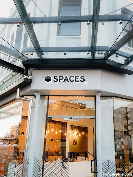
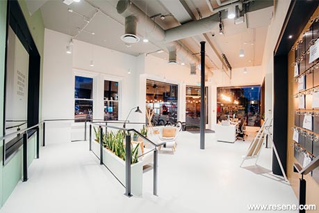
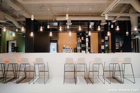
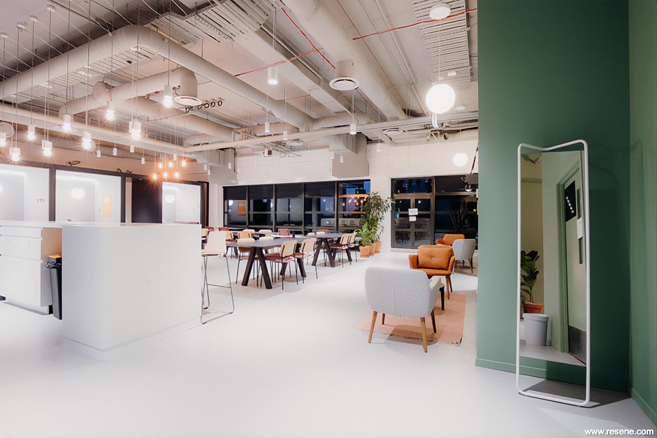
Drawing inspiration from Spaces fit-outs around the world, the design is simple, clean and elegant. Walking in through the entrance you leave behind the smart historic façade and emerge into a crisp, modern, semi-industrial reception space with high exposed ceilings and painted floors. Large openings allow glimpses of meeting rooms and the café/casual workspace beyond, all connected through a warm, earthy colour palette that leads you on a journey through the space.
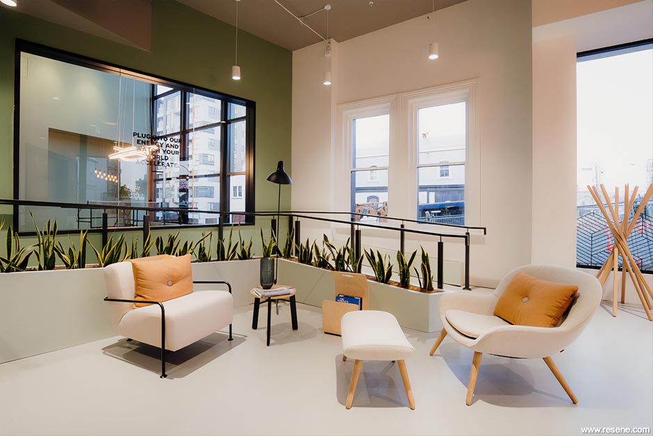
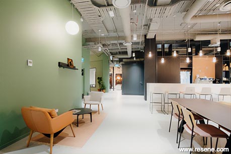
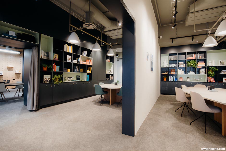
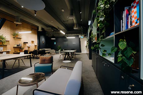
The materials palette is fresh and neutral. Timber veneer and light laminated surfaces are used for loose furniture while textured upholstery fabrics and feature walls provide pops of colour and interest to each space. The design is stylish but pared back, allowing people to populate and bring the spaces to life through the way they utilise them. Accessories and greenery are used to complete the look. Feature lighting is functional yet stylish and also plays an important role in the overall design look of each space.
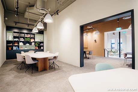
With the main colour palette taking its cue from European trends, the design is anything but boring. The main interior wall colour is fresh and simple – off white walls in Resene Half Alabaster and contrasting charcoal trims in Resene Cinder reflect the simple yet striking colour scheme selected for the heritage building exterior. A small palette of accent colours – earthy tones of Resene Xanadu, Resene Half Cougar, Resene Triple Canterbury Clay and Resene Pristine Lavender add pops of colour and complement fabric choices for upholstery and furniture finishes within the larger co-working and public spaces. These colours give a sense of warmth and visual interest to the spaces, creating a colour connection through zones.
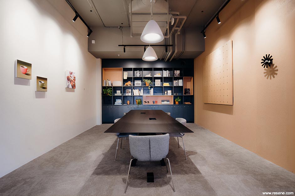
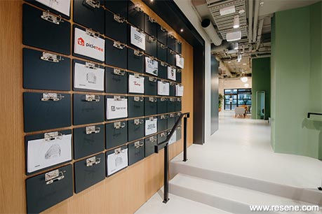
The strong feature wall colours also work well with the joinery which is predominantly finished in Resene Lustacryl semi-gloss waterborne enamel in Resene Cinder with accents of Resene Quarter Cararra, Resene Kandinsky and Resene Kalgoorie Sands.
Resene Half Cobblestone – a warm mid grey – has been used on the exposed ceilings to blend all exposed services and give an industrial/warehouse look to the public spaces but without creating a heavy and imposing ceiling. The same colour has also been used on the floor providing warmth.
The site was made up of several two storey 1885 double brick buildings and a newer precast concrete building. Floor heights between all the buildings varied so creating connections between the buildings and through two storey double brick walls without compromising the integrity of the architecture was challenging and expensive.
The various architectural features of each building needed to be considered within the overall design to create a cohesive environment. Many of the original interior features of the 1885 buildings were retained, such as fireplaces and exposed brick walls which created a lovely juxtaposition with the fresh new interior spaces and add character to many of the perimeter office spaces. A new skylit hallway within the centre of the space is a surprise feature flooding the interior circulation space with natural light.
Because we drew inspiration from other Spaces fit-outs internationally we needed to be able to compare paint colours easily. Resene was the obvious choice for this as the website allows easy colour matching through inputting colour codes. This way we could ensure our colour palettes worked with the brand internationally.
The project entailed painting of a significant range of materials including exposed ceilings, new plasterboard ceilings and partitions, existing internal and perimeter walls, exposed steel trusses, timber doors and trims. The painters recommended Resene premium acrylic coatings for all areas, with Resene Zylone Sheen on new walls for its low sheen durable finish and low odour which meant the space could be used immediately without the delay of having to ventilate the space.
This project won a Resene Total Colour Commercial Interior Office Award. The judges said "colour defines this workspace with a thoughtful and restrained use of colour. With a myriad of people to appeal to, the palette is universally appealing and instantly welcoming to all. The softened hues are light on the senses for easy concentration to support those busy at work with just the right amount of energy and liveliness to encourage convivial collaboration."
Architectural specifier: Hierarchy Group
Building contractor: Hierarchy Group
Client: Spaces
Painting contractor: Competitive Painters Ltd
Photographer: Amanda Thomas
Winner: Resene Total Colour Commercial Interior Office Award
Project: Resene Total Colour Awards 2020
Resene case studies/awards project gallery
View case studies that have used Resene products including many from our Resene Total Colour Awards. We hope these projects provide inspiration for decorating projects of your own... view projects
Total Colour Award winners:
2023 |
2022 |
2021 |
2020 |
2019 |
2018 |
2017 |
2016 |
2015 |
2014 |
2013 |
2012 |
2011 |
2010 |
Entry info
Latest projects | Project archive | Resene news archive | Colour chart archive
![]()
![]() Get inspired ! Subscribe
Get inspired ! Subscribe ![]() Get saving ! Apply for a DIY card
Get saving ! Apply for a DIY card
![]()
Can't find what you're looking for? Ask us!
Company profile | Terms | Privacy policy | Quality and environmental policy | Health and safety policy
Colours shown on this website are a representation only. Please refer to the actual paint or product sample. Resene colour charts, testpots and samples are available for ordering online. See measurements/conversions for more details on how electronic colour values are achieved.
What's new | Specifiers | Painters | DIYers | Artists | Kids | Sitemap | Home | TOP ⇧