Queenstown
This existing building was one with rich history.
It had been a venue of trade in Queenstown for years and the brief from the client was to refurb the shopfront and interior space so it was a warm, comfortable destination for Queenstown locals and visiting guests to the town. The existing space had a dark, dingy feel to it, so it needed lightening and brightening while still retaining the warm feeling of a home lounge.
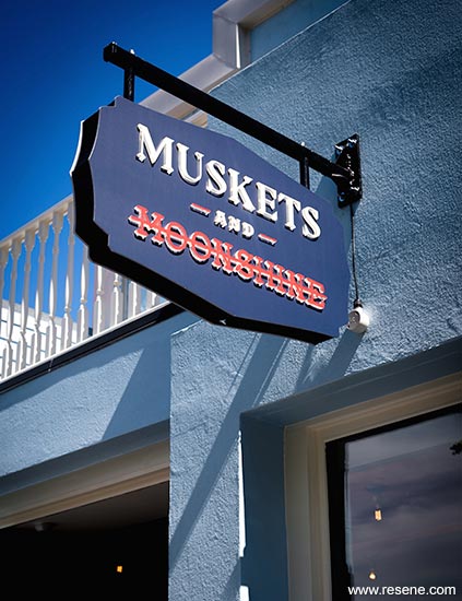
Nobody in history was more straight up and down than Queenstown’s early settlers. These were men and women who were there to work hard, seeking their fortune in gold from the Shotover River. Thanks to this rush of industry and growth in population, from 1862 onwards Queenstown sprang into life, and along came the traders of goods and providers of services… like publicans. It was only natural that this was where the design team found inspiration for the interior and graphic design of muskets and moonshine. The response to the brief was to make use of colour, texture and materials that made the space feel warm and related to the local surroundings.
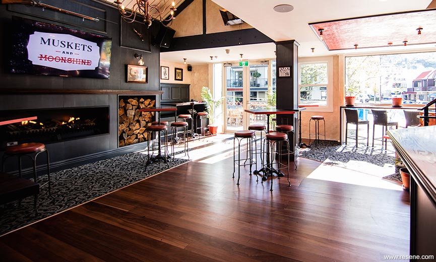
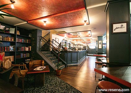
The large bookshelves lining the walls, artwork and fireplace provide a relaxing, comfy spot for food, drinks and catch ups. This venue is the kind of place where you can have a business meeting, pop in for coffee and a snack, enjoy a casual after work drink or bring the family for dinner.
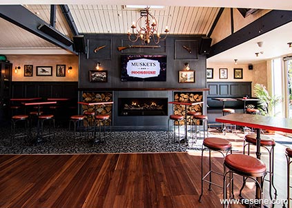
The colours specified were also picked up and used throughout the branding of the interior. The Resene Rapture was used in the X’s that were painted on the furnishings as well as the table edges. This building was particularly challenging in the sense of when and how the building was built.
Materials were so important in making the space feel homely and rich in warmth. Selection of a heavily patterned carpet helped with the creation of lounge style seating areas. The rustic simplicity and use of dark timber tones on the walls perfectly represents the pioneering beginnings of Queenstown. The dark timber and Resene High Tide paint colour used on the columns, partitions, ceiling trusses and joinery really gives that sense of a cosy home lounge.
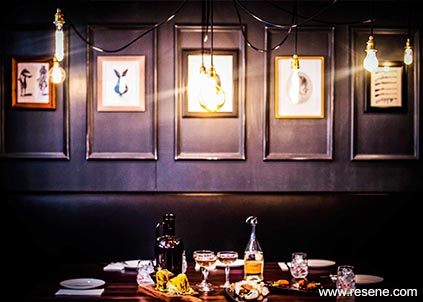
The paint effect created using Resene Double Bianca and Resene Dark Rum on the walls give them an aged feel, perfectly complementing the building’s history and keeping that old feeling within the interior.
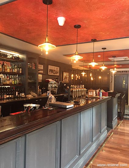
The ground floor existing black ceiling was repainted in Resene SpaceCote Flat tinted to Resene Double Bianca which lightened the space and enhanced the feature wallpaper sections over the bar area which were painted in Resene SpaceCote Low Sheen tinted to Resene Rapture using a paint effects technique and have a timber moulding finished in Resene High Tide. The timber ceiling was painted in Resene SpaceCote Flat was finished in Resene Alabaster.
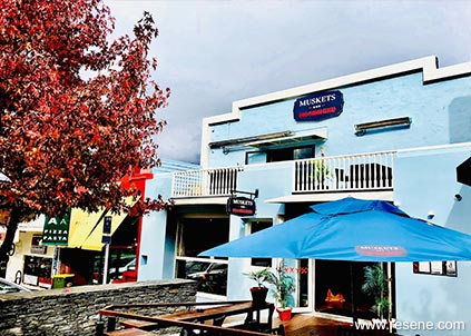
The external paint colours of Resene Lumbersider in Resene Escape and Resene Double Bianca, were chosen to increase the street appeal of what was a dark and unwelcoming frontage. The new shopfront provides an uplifting appeal, sympathetic to the surrounding buildings by opening the visual lines to the adjacent tenancies, achieving the goal to create a precinct between the adjoining shopfronts.
Architectural specifier: Element 17 Ltd
Client: Chris Buckley
Painting contractor: Cmac Painters
Paint effects: New Signs
Project: Resene Total Colour Awards 2018
Resene case studies/awards project gallery
View case studies that have used Resene products including many from our Resene Total Colour Awards. We hope these projects provide inspiration for decorating projects of your own... view projects
Total Colour Award winners:
2023 |
2022 |
2021 |
2020 |
2019 |
2018 |
2017 |
2016 |
2015 |
2014 |
2013 |
2012 |
2011 |
2010 |
Entry info
Latest projects | Project archive | Resene news archive | Colour chart archive
![]()
![]() Get inspired ! Subscribe
Get inspired ! Subscribe ![]() Get saving ! Apply for a DIY card
Get saving ! Apply for a DIY card
![]()
Can't find what you're looking for? Ask us!
Company profile | Terms | Privacy policy | Quality and environmental policy | Health and safety policy
Colours shown on this website are a representation only. Please refer to the actual paint or product sample. Resene colour charts, testpots and samples are available for ordering online. See measurements/conversions for more details on how electronic colour values are achieved.
What's new | Specifiers | Painters | DIYers | Artists | Kids | Sitemap | Home | TOP ⇧