Oamaru
Observatory Hill Trust was established to develop a key hill site into a large scale retirement village that would include apartments, care beds, care suite rooms, shared facilities and separate villa accommodation.
The chapel and meeting room share the same palette using Resene Half Truffle on walls with Resene Sea Fog ceilings and trims. This palette also extends into the community lounge teamed with Resene Half Robin Egg Blue on two walls. The TV and north lounges are instantly relaxing with Resene Robin Egg Blue in one and Resene Mantle in the other, which flows beautifully into the north dining area in Resene Duck Egg Blue. The café repeats the blue theme with Resene Abacus.
The toilet walls are finished in Resene ClinicalCote using Resene Half Robin Egg Blue in the public toilets and Resene Duck Egg Blue in the staff toilet. Working rooms, such as the kitchen, storage, rubbish rooms and laundries, are all finished in Resene Lustacryl semi-gloss tinted to Resene Sea Fog, allowing for plenty of light in these busy locations.
The last decade has seen a growing elderly population in Oamaru with a limited availability of quality care beds and services for this market. Then Observatory Hill Trust was established to develop a key hill site into a large scale retirement village that would include apartments, care beds, care suite rooms, shared facilities and separate villa accommodation.
Design Federation were contracted as interior designers for the Village which included all aspects of the development and generating a colour palette that would reflect a North Otago based development.
The design needed to push the boundaries, to move away from traditional aged care colour schemes and put together a sophisticated and timeless palette that directly reflected the North Otago environment. A key aspect was the shared spaces and making these attractive to both the residents and visitors, to ensure the environment was not only welcoming but comfortable and ensured that visitors had a desire to stay longer and spend more time with their loved ones.
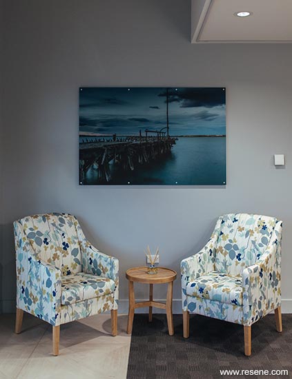
Working with local photographers the design team were able to generate further inspiration through contracting them to shoot at different times during the year providing imagery and inspiration that could also be used as large scale artworks for hallways and common areas.
A North Otago Colour Project was created using Instagram to generate images that directly reflect the local environment. Images were gathered during travels within the area and saved to Instagram using the hashtag #northotagocolourproject. Key themes and colours emerged with lake and river scenes, coastal beaches, high country hills and farmland areas.
This research became the basis for the colour concepts to look at three key facets of the region:
Through developing this overarching colour plan, this was narrowed down to specific colours in the Resene range that best reflected the images gathered.
Given the elderly market, the palette was designed to be soft and gentle but with bright and uplifting contrasting trims and ceilings.
This became a very personal project. Having experienced below average care facilities for elderly family members in the past, the design team wanted to ensure we created a beautiful environment for the people entering the facility. As well as the colour palettes, the fit-out included an uplifting upholstery and furniture scheme, artworks from the environment and décor/accessories that would be both positive and interesting.
This was a true community project where the project managers engaged all local tradespeople to work together and make this a success.
It was an early decision to use a contemporary white, Resene Sea Fog, as the base neutral to bring freshness to the scheme while complementing with dusty neutrals, blues and greens.
In the entranceway Resene Duck Egg Blue provides instant calm. Given the General Manager has a highly stressful role Resene Robin Egg Blue was used to provide a calming environment for them.
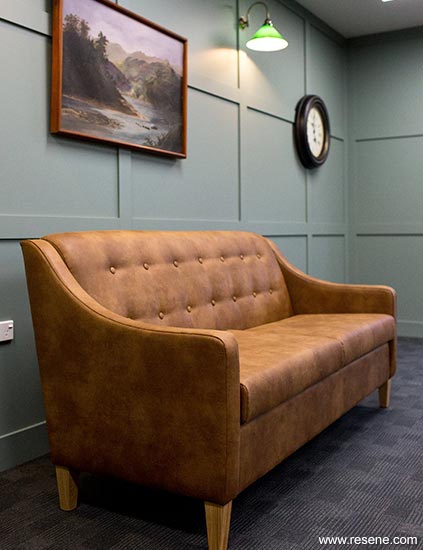
The corridors were all finished in Resene Quarter Truffle to give the neutral background to the gallery wall of large scale artworks provided from local photographers.
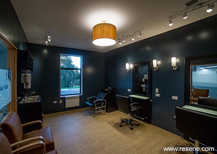
The hair salon suited a glamorous and sophisticated look, painted in bold and dramatic Resene Coast complemented with crystal lighting so that when residents enter this space it feels like a luxury.
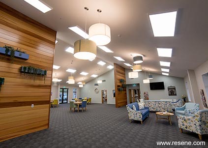
The main common area included a dining and lounge seating area with vaulted ceiling. The ceiling pitch meant that the two end walls looked naturally like two hills. These were painted in Resene Half Robin Egg Blue.
Tasmanian Oak was specified on the two wall partitions in this space to directly reflect the natural environment. These were stained in Resene Qristal HD Poly-Satin to bring out the timber grain.
Care beds were divided into the three schemes, each teamed with Resene Sea Fog ceiling and trims using Resene Ceiling Paint and Resene Lustacryl semi-gloss waterborne enamel, and finished in:
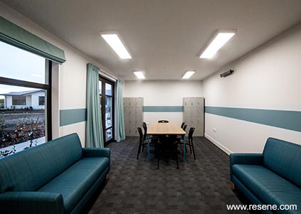
The marketing office uses these three key colours into a hill side wall mural. In the staff room, Resene Whirlwind and Resene Half Cut Glass create a wall stripe for something fun for the staff environment.
A masculine scheme was chosen for the games room, inspired by old smoking rooms with a pool table and games. Resene Smoky Green contrasts against leather furniture and wooden tables.
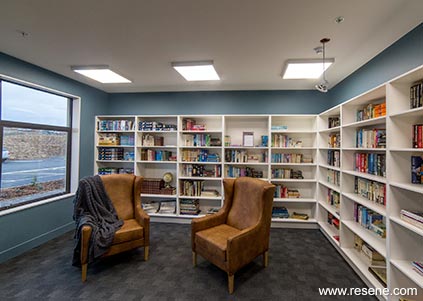
The library included built in cabinetry for donated books and reading desks which complemented nicely with Resene Blue Bayoux.
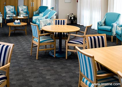
The second main common area, the Atrium Lounge, had a nautical theme based on the coastal scheme, with Resene Duck Egg Blue on the ceiling and Resene Half Truffle on walls, to work with the large skylights bringing in the natural sky colour and light.
Two smaller lounges were painted in soft Resene Half Washed Green and Resene Conch to provide a calm and serene atmosphere.
Bringing uplifting colour into the gym was necessary to inspire activity; the perfect combination was Resene Balance and Resene Duck Egg Blue.
In the 12 apartments the spaces were divided into the three overarching colour palettes and produced the following scheme for each, using Resene SpaceCote Low Sheen on walls and Resene Ceiling Paint on ceilings:
The chapel and meeting room share the same palette using Resene Half Truffle on walls with Resene Sea Fog ceilings and trims. This palette also extends into the community lounge teamed with Resene Half Robin Egg Blue on two walls. The TV and north lounges are instantly relaxing with Resene Robin Egg Blue in one and Resene Mantle in the other, which flows beautifully into the north dining area in Resene Duck Egg Blue. The café repeats the blue theme with Resene Abacus.
The toilet walls are finished in Resene ClinicalCote using Resene Half Robin Egg Blue in the public toilets and Resene Duck Egg Blue in the staff toilet. Working rooms, such as the kitchen, storage, rubbish rooms and laundries, are all finished in Resene Lustacryl semi-gloss tinted to Resene Sea Fog, allowing for plenty of light in these busy locations.
Overall the palette used 21 different Resene colours to work together and provide a scheme that is sophisticated, welcoming and positive for residents.
The result is that the interior design of the Observatory Retirement Village is a direct response to the North Otago environment, tying in the key areas of high country, Waitaki valley and coastline to bring together a natural, coordinated and timeless palette.
Architectural specifier: John McKenzie
Building contractor: Roger Gilchrist Construction
Client: Observatory Village Trust
Colour selection: Annabel Berry and Meghan Nockels
Painting contractor: Darryn Stewart Painting
Photographer: Rachel Wybrow Photography
Project: Resene Total Colour Awards 2018
Resene case studies/awards project gallery
View case studies that have used Resene products including many from our Resene Total Colour Awards. We hope these projects provide inspiration for decorating projects of your own... view projects
Total Colour Award winners:
2023 |
2022 |
2021 |
2020 |
2019 |
2018 |
2017 |
2016 |
2015 |
2014 |
2013 |
2012 |
2011 |
2010 |
Entry info
Latest projects | Project archive | Resene news archive | Colour chart archive
![]()
![]() Get inspired ! Subscribe
Get inspired ! Subscribe ![]() Get saving ! Apply for a DIY card
Get saving ! Apply for a DIY card
![]()
Can't find what you're looking for? Ask us!
Company profile | Terms | Privacy policy | Quality and environmental policy | Health and safety policy
Colours shown on this website are a representation only. Please refer to the actual paint or product sample. Resene colour charts, testpots and samples are available for ordering online. See measurements/conversions for more details on how electronic colour values are achieved.
What's new | Specifiers | Painters | DIYers | Artists | Kids | Sitemap | Home | TOP ⇧