Wellington
The metaphor concept focused on taking as the colour scheme the idea of brainwaves and frequencies (given the intellectual activity of the brain when drafting legislation).
After over 20 years in the same office fit-out, the Parliamentary Counsel Office (the New Zealand government department responsible for drafting and publishing legislation passed by Parliament and regulations and rules made by the government and the Courts – ‘PCO’) wanted to renovate its office space to reflect and reinforce its changing culture and operations.
PCO noted that “The physical layout of the PCO accommodation (inherited from previous tenants many years ago) has become a barrier to greater collaboration and discussion amongst our staff. We are aiming to make significant but economic changes to the layout… [through]… the opening up of the floors and better collocation of business units [which] will aid in achieving collaboration, along with more usable meeting areas and updated facilities.”
After the award of the contract for architectural services, the basic design brief was discussed further with the Chief Parliamentary Counsel, who was anxious to ensure that light and colour was introduced into the workspace through the creative and economic use of painted surfaces and flooring where possible.
Following research and client discussions, SOCCA developed a metaphor based on the functions and operating model of PCO – a sequenced yet iterative process. Initial instructions from PCO’s client agencies are the starting point for a partnership approach between PCO and its clients, which leads to development of a narrative set of policy propositions and requirements that the legislative drafters then transform into draft legislation (Bills for Parliament and Regulations for the government). That partnership and collaboration continues as the Bill or Regulations transition through the various legislative stages in Parliament and government, and final publication.
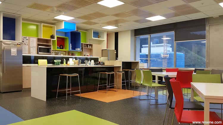
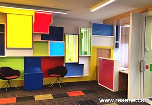
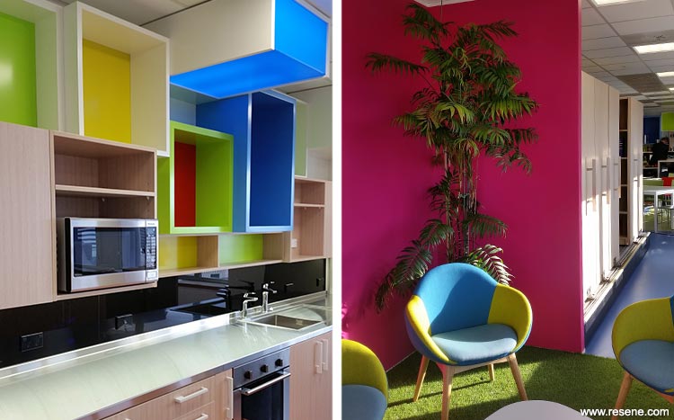
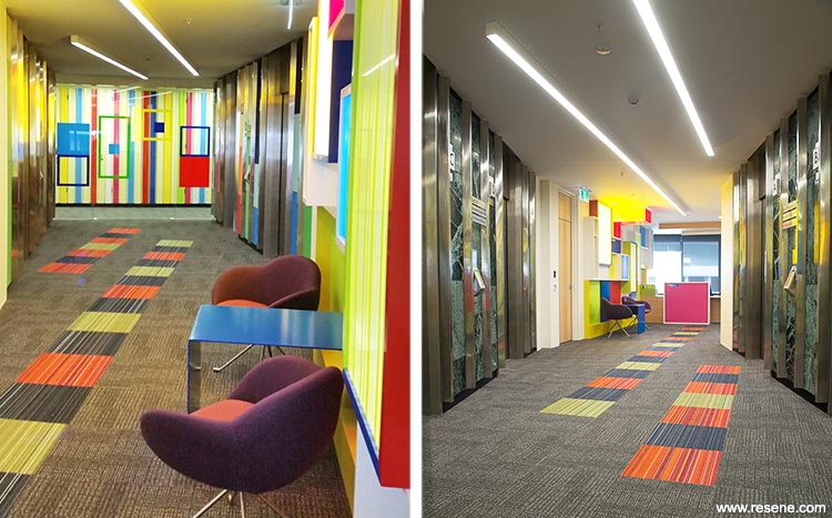
The metaphor concept focused on taking as the colour scheme the idea of brainwaves and frequencies (given the intellectual activity of the brain when drafting legislation). From this, the colours used to represent different brainwave frequencies (Alpha, Beta, Theta and Delta) formed the foundation of the colour palette for the project. The representation of brainwave colours are red for Alpha, yellow for Beta, green for Theta and blue for Delta.
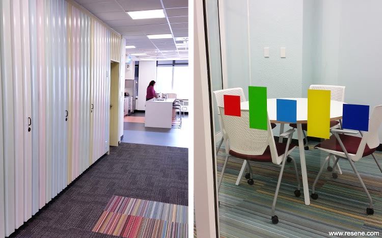
From this metaphor, SOCCA developed the Resene pastel palette to be used as the main wall finish to increase the amount of light reflection (with connotations of transparency and openness) within what had previously been a very sombre, dark and somewhat formal working environment. This met the client’s brief for a complete change from the past and reflected the culture change that PCO was developing – greater transparency and openness.
Varying intensities and tones of the four main colours were used. Aside from aesthetic considerations, this was done as a way of mirroring what happens in our brains over the course of a day, when the rhythm and frequencies of brainwaves vary according to our activities. The pastel palette of the four main colours used in offices and open-plan office areas is meant to cultivate and encourage awareness and fresh creative energy. The palette is also associated with other wellness functions such as the treatment of stress.
For the feature walls and highlighted accents, a bolder more solid Resene palette of colours was chosen, reflecting the metaphor of brainwaves at their peak frequencies. This was used in conjunction with architectural features of light boxes and three-dimensional windows of different sizes and depths in the reception area. These boxes and windows are representations of the different various instructions and conversations that frame the process used by PCO into develop legislation. A mix of colourful spaces is included to support mood and encourage well-being.
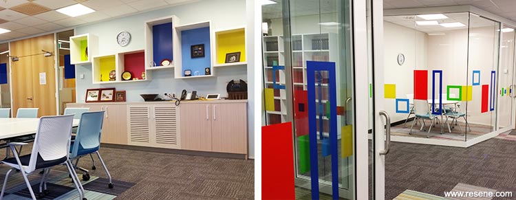
Feature areas finished in bolder hues of Resene Havelock Blue, Resene Resolution Blue, Resene Wellywood, Resene Broom and Resene Bullseye in Resene Lustacryl semi-gloss waterborne enamel.
Core areas are finished in Resene Cut Glass, Resene Primrose, Resene Pale Prim and Resene Pot Pourri, with neutral Resene Rice Cake in Resene SpaceCote Low Sheen.
In the kitchen, the island front is finished in Resene Black with the high island in Resene Colorwood Rock Salt. The client was very specific about the type and colouring of the glass splashbacks for the staff kitchen and kitchenette areas. They needed to offer contrast, be fun and be something different. This was delivered by a Resene Special Effects finish.
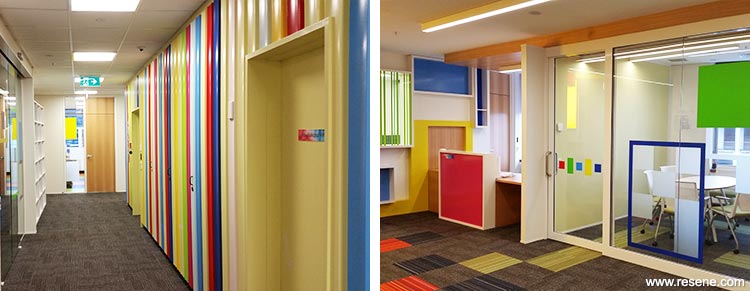
There is also a fifth frequency, Gamma. This range is the most recently discovered and is the fastest frequency. According to a popular theory, initial research shows Gamma waves are associated with bursts of insight and high-level information processing. In the PCO project, Gamma is represented by Resene Scrumptious (electric fuchsia pink), using Resene Lustacryl semi-gloss waterborne enamel and Resene SpaceCote Low Sheen. The colour is used in at the reception, research library and sunroom, areas where our brainwaves associate with peak concentration and the brain’s optimal frequency for cognitive functioning.
Architectural specifier: SOCAA
Building contractor: Zeal Commercial Interior
Client: Parliamentary Counsel Office
Painting contractor: Betta Decorators Ltd
Project: Resene Total Colour Awards 2017
Resene case studies/awards project gallery
View case studies that have used Resene products including many from our Resene Total Colour Awards. We hope these projects provide inspiration for decorating projects of your own... view projects
Total Colour Award winners:
2023 |
2022 |
2021 |
2020 |
2019 |
2018 |
2017 |
2016 |
2015 |
2014 |
2013 |
2012 |
2011 |
2010 |
Entry info
Latest projects | Project archive | Resene news archive | Colour chart archive
![]()
![]() Get inspired ! Subscribe
Get inspired ! Subscribe ![]() Get saving ! Apply for a DIY card
Get saving ! Apply for a DIY card
![]()
Can't find what you're looking for? Ask us!
Company profile | Terms | Privacy policy | Quality and environmental policy | Health and safety policy
Colours shown on this website are a representation only. Please refer to the actual paint or product sample. Resene colour charts, testpots and samples are available for ordering online. See measurements/conversions for more details on how electronic colour values are achieved.
What's new | Specifiers | Painters | DIYers | Artists | Kids | Sitemap | Home | TOP ⇧