Brookvale
The brief was to give visitors to the company a warm impression when they first enter the building and reinforce that the company is progressive and friendly.
The Harrison Group is a family owned company founded in 1923 and is involved in the distribution, manufacturing and exporting of a wide range of specialised materials servicing the petroleum, rubber, surface coating, plastic, pharmaceutical, cosmetic and fire-protection industries.
Administration and sales occupy the ground floor of the newly refurbished Head Office building, together with a suite on the upper level. The company occupies five acres in an industrial area of Brookvale behind Waringah Mall Shopping Centre. There are several buildings on the site, all involved in the manufacturing side other than the main building.
The Head Office main building faces Old Pittwater Road and is where all company meetings are held. The brief was to give visitors to the company a warm impression when they first enter the building and reinforce that the company is progressive and friendly.
The Head Office building is a simple two level rectangular box with a soffit over the slightly recessed front entry. The single green colour, was looking very tired, and the shape of the building was very uninspiring.
To give the building some dimension and to enliven the tired looking building, a colour blocking effect was implemented to add visual interest and make it easier to see the location of the main entry.
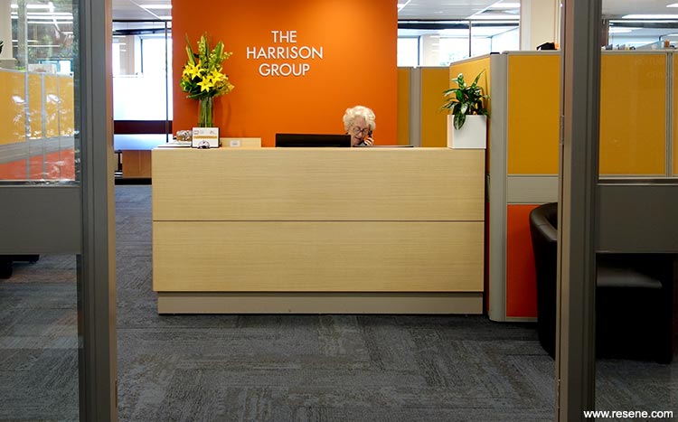
The new colour scheme of three colours is energetic and incorporates an orange, Resene Ayers Rock, evocative of the corporate logo. The entry is now easy to locate with Resene Ayers Rock and Resene Half Tea providing a bold contrast to the main wall colour of Resene Double Mondo. Resene Ayers Rock continues from the outside wall into the interior foyer and is also used on a feature wall behind the reception desk, which can be seen through the glass entry doors.
The biggest challenge was to make the building more interesting. Not only was the building a big rectangular block, but the walls were a mix of brickwork, render and metal, including some large metal vents on the front wall. The aluminium windows, vents, brickwork and metal cladding were all painted in Resene Double Mondo so that they appears on one surface. Resene Double Mondo was chosen because not only did the other feature colours complement it really well, but it also sat well in the building’s environment. The site has a number of jacaranda and eucalypt trees to the front and side of the building, which tone beautifully with the main wall colour.
Resene Lumbersider low sheen waterborne paint was ideal for most areas other than the metal areas which were finished in Resene Lustacryl semi-gloss waterborne enamel after prepping with Resene Vinyl Etch primer and one coat of Resene Quick Dry.
On the interior, the working environment had changed little from 1970 other than the introduction of new technology. Many of the offices had timber veneer panelling and the colour scheme was drab and had little connection to the company’s objectives and values. Staff morale needed improvement as did day to day interaction between staff and other company people.
The ceiling panels, lighting and carpet were replaced and a new colour scheme implemented. The reception desk was also replaced and new boardroom furniture installed along with turning and existing meeting room into a staff lunchroom were all part of the brief.
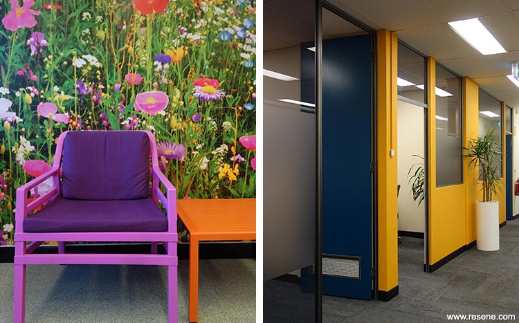
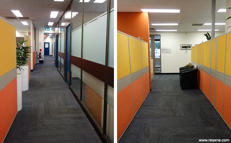
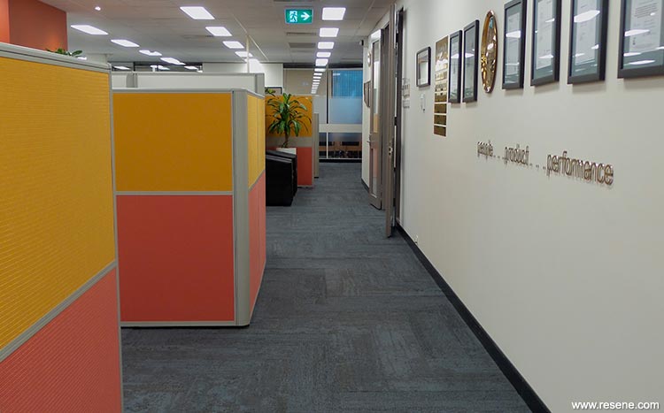
In addition to these requirements the workstations partitions were recovered with fabric in Marigold (yellow) and Autumn (orange) to tone with the paint colours.
Artwork was also added to the corridor walls to reflect the blues, yellows and oranges in the colour scheme throughout the office.
There are 10 colours in the palette. The Resene Ayers Rock links the outdoor colour scheme with the indoor environment and reflects the company logo. It is also a social colour so encourages interaction. Resene Fuel Yellow was to inject some dynamic energy and to punctuate common areas that interlink different purpose areas.
The colours in the workstation screens (yellow and orange) repeated the orange and yellow in a more subtle but still energetic way throughout the main office area.
Resene Kangaroo was chosen for the boardroom to create a less stressful environment for meetings and to relax overseas visitors.
Resene Barometer used for the doors was a good link for all the colours and is a great complement for Resene Ayers Rock and Resene Fuel Yellow. It is also used for the stairwell ceiling. The remaining colours – Resene Half Spanish White, Resene Biscotti, Resene Quarter Canterbury Clay, Resene Coffee Break and Resene Quarter Caracas on the ceiling ground the brighter ones.
Resene SpaceCote Low Sheen was used throughout the interior walls, Resene SpaceCote Flat on the ceilings and Resene Illustrator semi-gloss waterborne enamel was applied to the doors and trim. The timber veneer that adjoined the glass panelling was finished in Resene Colorwood Dark Rimu and Resene Aquaclear waterborne urethane.
Selected office meeting room walls were overcoated in Resene Write-on Wall Paint to enable the walls to be writing on without damaging the paint finish.
The entry foyer tiles were a particular challenge as these had to remain. A dramatic zigzag feature ‘rug’ was created from carpet tiles to give impact to the entry and detract from the tiles. It also provided a link to the carpet in the main area.
As the company is in the oil and grease business, there was a requirement that the new carpet not show grease marks. Interface Human Nature carpet tiles were specified. These have a mottled texture and two different patterns were combined to create a more textured appearance. In removing the previous carpet tiles, it was found that the entire floor had to be ground back as there was considerable glue residue.
Architectural specifier: Judith Briggs
Building contractor: Peninsula Office Interiors
Client: The Harrison Group
Painting contractor: Morris C Painting
Other key contributor – flooring: Clovelly Carpets
Other key contributor – workscreens: Gala Upholstery
Project: Resene Total Colour Awards 2016
Resene case studies/awards project gallery
View case studies that have used Resene products including many from our Resene Total Colour Awards. We hope these projects provide inspiration for decorating projects of your own... view projects
Total Colour Award winners:
2023 |
2022 |
2021 |
2020 |
2019 |
2018 |
2017 |
2016 |
2015 |
2014 |
2013 |
2012 |
2011 |
2010 |
Entry info
Latest projects | Project archive | Resene news archive | Colour chart archive
![]()
![]() Get inspired ! Subscribe
Get inspired ! Subscribe ![]() Get saving ! Apply for a DIY card
Get saving ! Apply for a DIY card
![]()
Can't find what you're looking for? Ask us!
Company profile | Terms | Privacy policy | Quality and environmental policy | Health and safety policy
Colours shown on this website are a representation only. Please refer to the actual paint or product sample. Resene colour charts, testpots and samples are available for ordering online. See measurements/conversions for more details on how electronic colour values are achieved.
What's new | Specifiers | Painters | DIYers | Artists | Kids | Sitemap | Home | TOP ⇧