Celebrating 10 years of the Resene Total Colour Awards, a new crop of colourful projects has been rewarded for their clever and creative colour use.
Colour that cleverly supports architecture wins Waterfront House the top colour award in the Resene Total Colour Awards 2019.
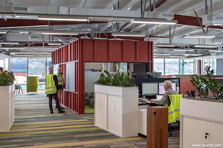
The judges said “a thorough integration of colour and architecture, the industrial structure is celebrated with the red which knits this project together. The colour palette is fitting; it feels unforced and subtle, yet it is beautifully detailed and befitting of the local environment. The colour takes you on a journey through the space bringing together all staff into a space that melds a traditional office environment with a grunty industrial vibe. Colour makes this space.”
Resene has a long history of colour and today's colour range of thousands of hues is a far cry from the handful that was available when Resene started 73 years ago. The Resene Total Colour Awards were launched to encourage and celebrate excellent and creative use of colour; to showcase striking colour palettes and combinations and provide fresh inspiration.
Awards have been given for the best colour use in: Residential Exterior, Residential Interior, Commercial Exterior, Commercial Interior Office, Commercial Interior Shared Space, Commercial Interior Public + Retail Space, Installation - Experiential - Product, Education, Bright Spot, Neutrals, Rising Star and Lifetime Achievement, with the Colour Master Nightingale Award for the best overall colour use.
Colour Award winners
The Resene Total Colour Master Nightingale Award, named after the Nightingale family who founded and still run Resene today, recognises excellence in colour and paint use. The Award went to:
Waterfront House by Pippa Ensor, Kim Salt and Trevor Watt of Athfield Architects Limited.
Also winner of the Resene Total Colour Office Interior Award.
The judges said “with a mixed audience to appeal to, this project cleverly morphs an industrial building with office space. The colours of containers are woven through the project. Deep earthy red knits the building together combined with a palette that is grunty yet reassuring. With an abundance of high vis attire, the space complements the fluoro, creating a space that is a comfortable collaborative area for all workers.”
This project uses Resene Wan White, Resene Double Foundry, Resene Fahrenheit, Resene Colorwood Totem Pole wood stain, Resene Colorwood Pickled Bluewood wood stain, Resene Colorwood Kumera wood stain and Resene Aquaclear clear urethane.

Find out more about this project
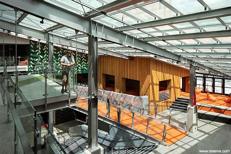
University of Canterbury – Rehua by Athfield Architects Limited
The judges said “sophisticated and integrated with the architecture of the building, this palette evolves from space to space embracing open areas, while still distinguishing spaces and harnessing canvases such as the ceiling to add touches of colour. The power of colour is fully embraced with bolder colours to support wayfinding and quieter colours to allow for contemplation. The perfect lesson in how to use colour.”
This project uses Resene Pohutukawa, Resene Fire, Resene Seaweed, Resene Double Crisp Green, Resene Hot Toddy, Resene Mai Tai, Resene Blue Moon, Resene Avalanche and Resene Black White.

Find out more about this project
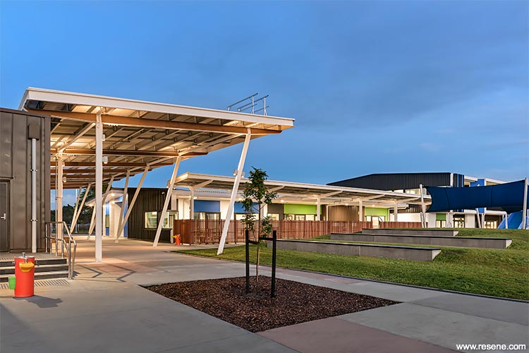
Matua Ngaru School - by ASC Architects
The judges said “strong, bold and fun, this project uses colour blocking in a rhythmical way to draw attention. Fresh and inviting, the colour palette softens the scale to welcome in children and teachers alike. Blocks of colour play off each other and the neutral backdrop to add a sense of play, inspiring children to get creative with their own ideas and never be afraid to paint outside the lines.”
This project uses Resene Black White, Resene Endeavour, Resene Malibu, Resene Kakapo, Resene Atlantis, Resene Touche, Resene Grey Friars, Resene Hyperactive, Resene Reef, Resene Tory Blue, Resene Cod Grey, Resene Bilbao and Resene Waterborne Woodsman.

Find out more about this project
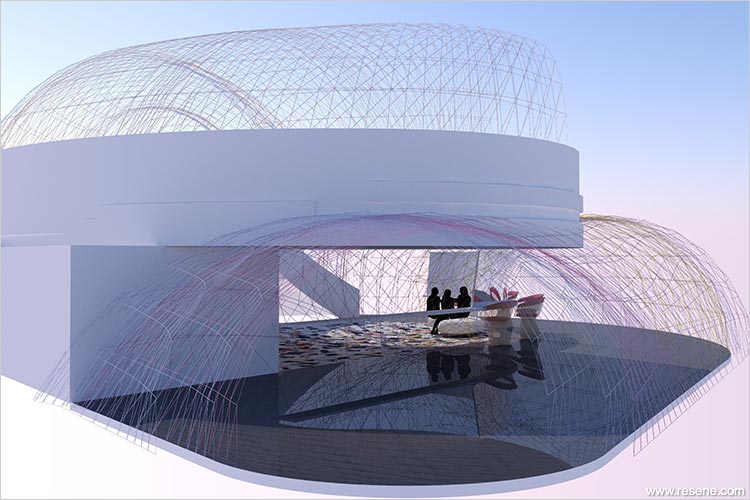
The Orchidstra Cocktail bar by Rachel Mao.
The judges said “this bar imagines a world where painted string in a pop up bar space adds delicate whimsical colour in spiralling swirls. It’s a unique twist on colour application. Painted strings are arranged to create a rhythm of colour, beautiful from all angles. A clever concept that embraces and celebrates colour so well.”
This project uses Resene Big Bang, Resene Mellow Yellow, Resene Wax Flower and Resene Tasman.
Find out more about this project
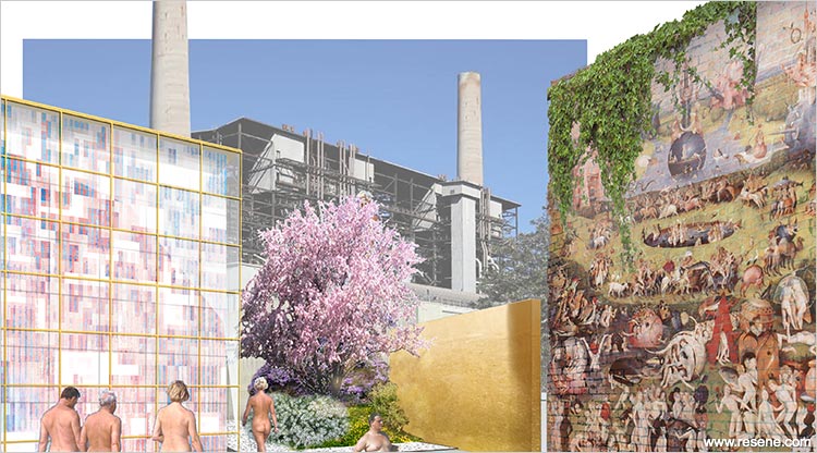
Naked Salad by Qun Zhang.
The judges said “deeply considered and provocative, this project takes you on a journey through colour to self-discovery. Delightful and intellectual, the colours underpin the transformation. Nurturing colours are combined in a myriad of ways to free both the mind and soul. It’s a fresh take on how to harness colour to help us free ourselves.”
This project uses Resene Freefall, Resene Pattens Blue, Resene Glorious, Resene Shirley Temple, Resene Captain Cook, Resene We Peep, Resene Cupid, Resene La Luna, Resene Goldmine and Resene Eighth Black White.
Find out more about this project
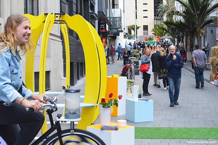
Go Bananas shelter by Sharon Shin.
The judges said “combining a delightful sense of humour with striking colour, this bright spot invites you to come closer to find out more. It’s quirky and fun, a delight to all ages. Who wouldn’t want to feel like what standing inside a banana would be like? In the age of digital, this project takes talkability to the street encouraging shareable moments. The perfect way to share colour.”
This project uses Resene Half Turbo, Resene Eighth Rice Cake, Resene California, Resene Unicorn, Resene Sail and Resene Black.

Find out more about this project
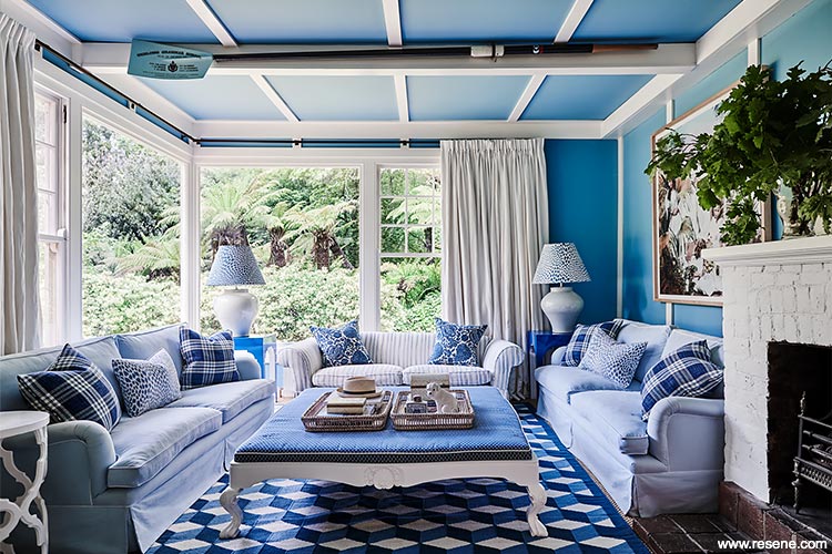
Mt Macedon Residence by Charlotte Coote of Coote&Co.
The judges said “feel relaxation wash over you as you view these living areas so tastefully decorated in soothing colours, a welcome respite from busy life. A changing symphony of colour against a very richly decorated and accessorised house, bolder choices add personality to key spaces. Colour flows seamlessly from wall to floor, ceiling to accessories, a match made in colour heaven.”
This project uses Resene Double Parchment, Resene Bianca, Resene Nauti, Resene Malibu, Resene Half Bianca, Resene Cosmos and Resene Cooled Green.

Find out more about this project
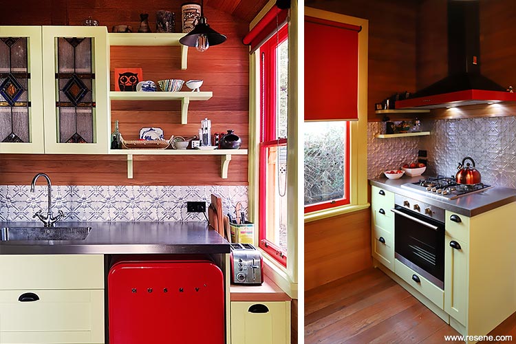
Te Iti Kahurangi by Lizzie Cook.
The judges said “this interior lives up to the colourful and quirky promise of the exterior. A confident and passionate application of colour, even the smallest details in this cottage are touched with colour. The extensive retro colour palette brings warmth and imbues each space with a colour personality of its own. A true labour of colour love, this project gleams with colour inside and out.“
This project uses Resene Pizza, Resene Rob Roy, Resene Vault, Resene Shiraz, Resene Blue Chalk, Resene Perfume, Resene Eskimo, Resene Obelisk, Resene Gravity, Resene Billy T, Resene Astra, Resene Shiraz, Resene Corn Field, Resene First Light, Resene Stun, Resene Norway, Resene Zodiac, Resene Red Red Red, Resene Coral Tree, Resene Ship Cove, Resene Hypnotic, Resene Havoc, Resene Scotty Silver, Resene Delta Blue, Resene Ipanema and Resene Gold Dust.
Find out more about this project
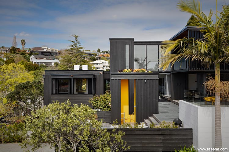
Railley House by Daniel Marshall of Daniel Marshall Architects.
The judges said “sunshiny yellow shines from the stairwell, inviting you to enter. This clever punch of colour within a black exterior knits together old and new seamlessly. As a studied accent to powerful black robust architecture, the Resene Happy yellow lights up this project with its exuberant personality. It’s a reminder to all of us how the right colour in the right place makes a project memorable.”
This project uses Resene Pitch Black wood stain, Resene Happy and Resene Half Whiteout.

Find out more about this project
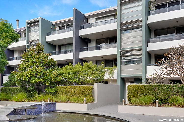
Glo Apartments by Nadine Donazzan of DNADesign.
The judges said “from bland to beautiful, a palette of neutrals and softened hues has brought a sense of home to this project. The new palette adds personality and freshness with colours carefully juxtaposed to bring out the best in each and add interest to the design. With lush establishing planting, this palette works with the landscape, not competes with it. Colour makes this home complete.”
This project uses Resene Fuscous Grey, Resene Viktor, Resene Half Sandstone and Resene White Pointer.

Find out more about this project
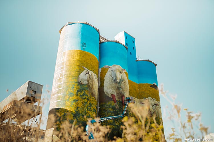
Merriwa Silos by Christopher Skyner of Authority Creative.
The judges said “Art and colour come together to elevate these silos and turn them into a landmark. The blue painted sky reaches out into the sky and clouds beyond. The extensive colour palette is so well chosen for the imagery and the organic shape of the silos. It fits with the landscape, standing out, while still fitting in. A beautiful and breath taking use of colour.”
This project uses Resene Fun Blue, Resene Sail, Resene Point Break, Resene Grass Hopper, Resene Buddha Gold, Resene Moon Yellow, Resene Cardin Green, Resene Zuccini, Resene Limeade, Resene Trendy Green, Resene Pirate, Resene Colonial White, Resene Popcorn, Resene Golden Sand, Resene Whiskey, Resene Delta Grey, Resene Madras, Resene Twine, Resene Outpost, Resene Havoc, Resene Flame, Resene Ruby Tuesday, Resene Mission Brown, Resene Double Resolution Blue, Resene Trouble, Resene Black and Resene White.
Find out more about this project
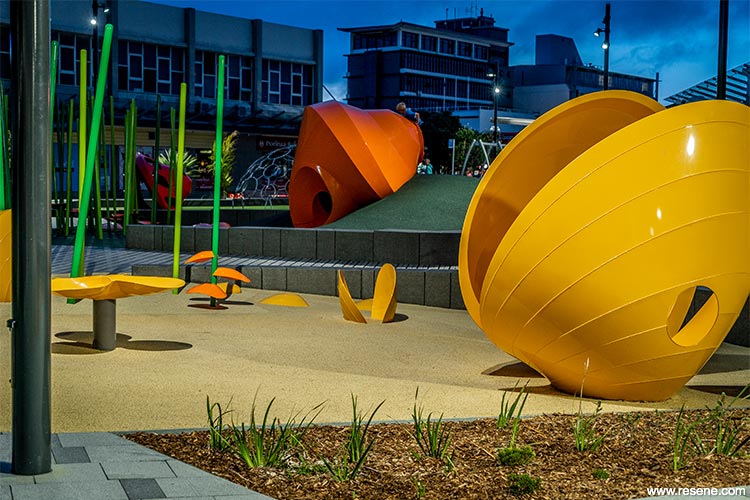
Te Manawa Playspace by Isthmus.
The judges said “the seashore has come to ashore with over-scaled shells inviting young and old to play. The organic forms are welcoming, celebrated in colour, but not with the predictable seaside colours you might expect. Irresistible orange and yellow seashells are beacons to children. This palette is lively, fun and bursting with personality. Who wouldn’t want to play in a park like this?”
This project uses Resene Quill Grey, Resene Bullseye, Resene Adrenalin, Resene Buttercup, Resene Left Field, Resene Limerick, Resene Foundry, Resene Blast Grey 3 and Resene Windfall.
Find out more about this project
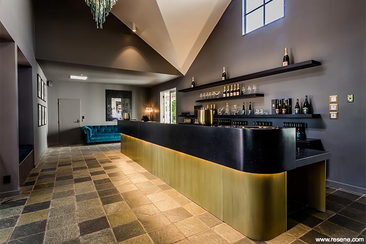
Palliser Estate Winery Tasting Room by Victoria Read of Aspect Architecture.
The judges said “Who wouldn’t want to while away time tasting wines in a space like this? A contemporary take on a tasting room, it’s wrapped head to toe in dark welcoming and cocooning colour. The shape of the ceiling cleverly catches the light and shows the dark colour in so many different ways. Once you come in you’ll never want to leave.”
This project uses Resene Half Baltic Sea and Resene Half Wan White.

Find out more about this project
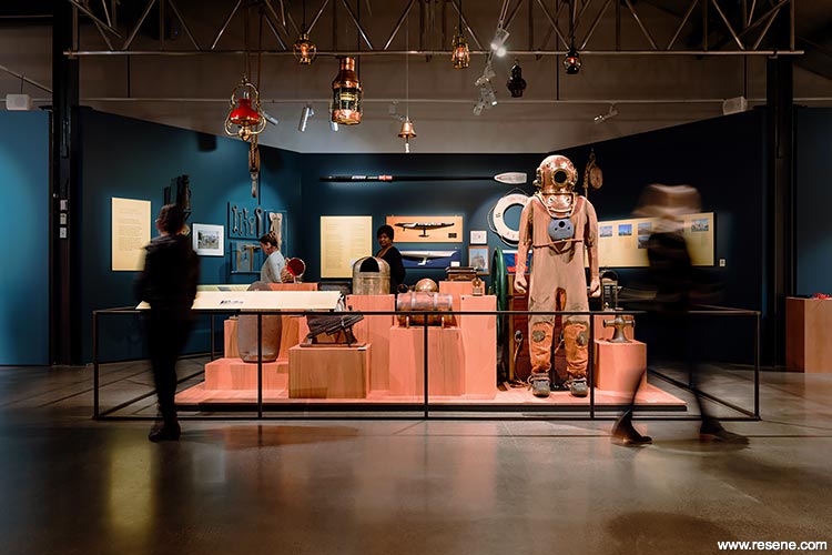
One Man’s Treasure, New Zealand Maritime Museum by Nick Eagles of The Letter Q.
The judges said “immersive and moody, this complementary colour palette captures attention and draws visitors into the exhibition. The hues work to bring focus and a sense of continuity and storytelling to the collected pieces so they can take centre stage. The colours become part of the exhibition story woven into the theme. Colour brings this collection together.”
This project uses Resene Tangaroa, Resene Seachange, Resene Bali Hai and graphics in Resene Del Toro and Resene Dolly.

Find out more about this project
Karekare Residency by Lyn Bergquist.
The judges said “a beautiful and striking collection of artworks, the clever use of colour so accurately captures the landscape and brings it into works that can be enjoyed for years to come. This series of works gives a coloured insight into the moodiness of the landscape and Mother Nature at its best. It makes you want to break out the testpots and get painting.”
This project uses blends of Resene White, Resene Black, Resene Turbo, Resene Resolution Blue, Resene Guardsman Red and Resene Japanese Laurel.


Find out more about this project
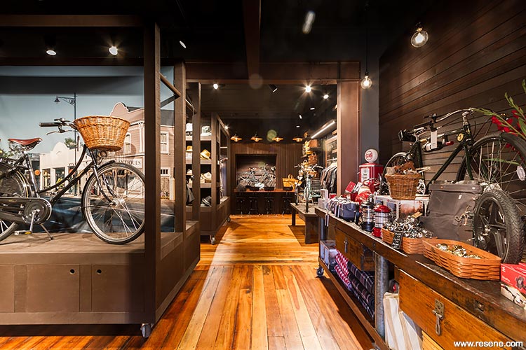
Blackwell and Sons: Emporium of Wonder by Mackit Architecture.
The judges said “a deceptively wide range of layered paint and stain colours seamlessly meld together different eras of building elements. The backdrop of dark colour thrusts the product forward but also speaks to its grunty industrial vibe and mechanic nature. Like entering a new world, the palette and product range is immersive from top to toe encouraging you to take your time and explore. An instant winner.”
This project uses Resene Black Magic, Resene Copperhead, Resene Armadillo, Resene Double Stack, Resene Colorwood Bark wood stain, Resene Colorwood Dark Rimu wood stain and Resene Colorwood Pitch Black wood stain.

Find out more about this project
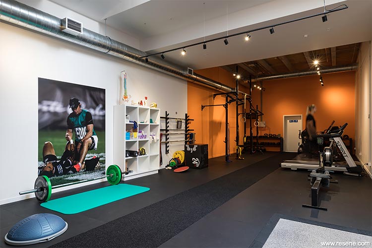
In Good Hands Physio by Michael Cooper of Michael Cooper Architects.
The judges said “active and energising, this colour palette makes you want to get up and moving; it’s the perfect palette for a physio. Bursts of bold and energetic colour play off the neutral backdrop. Instead of every wall being painted in full, the colour meets the neutral part way, emphasising the boldness of the contrast as they meet without overwhelming each space. A clever use of colour energy.”
This project uses Resene Boogie Wonderland, Resene Drop Dead Gorgeous, Resene Hyperactive, Resene Limerick, Resene Red Hot, Resene Supernova, Resene Wild Thing, Resene Wot Eva, Resene Transmission and Resene Black White.

Find out more about this project
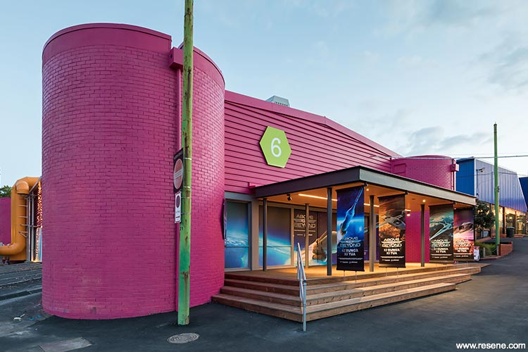
MOTAT Building 6 by Athfield Architects Limited & MOTAT.
The judges said “this building truly embraces its chosen palette, earning its new nickname as The Pink One. The brave and bold colour palette pops out of its surroundings and is a striking contrast to the dark interior. Drawing attention, it has become the colourful heart of Motat and a popular meeting spot; you could never mistake this building for any other.”
This project uses Resene Irresistible, Resene Hero, Resene Baltic Sea, and a custom colour Resene Persian Nights on the interior.
Find out more about this project
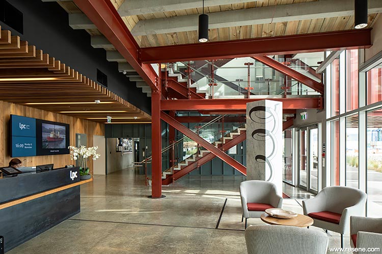
Waterfront House by Athfield Architects Limited.
The judges said “with a mixed audience to appeal to, this project cleverly morphs an industrial building with office space. The colours of containers are woven through the project. Deep earthy red knits the building together combined with a palette that is grunty yet reassuring. With an abundance of high vis attire, the space complements the fluoro, creating a space that is a comfortable collaborative area for all workers.”
This project uses Resene Wan White, Resene Double Foundry, Resene Fahrenheit, Resene Colorwood Totem Pole wood stain, Resene Colorwood Pickled Bluewood wood stain, Resene Colorwood Kumera wood stain and Resene Aquaclear clear urethane.

Find out more about this project
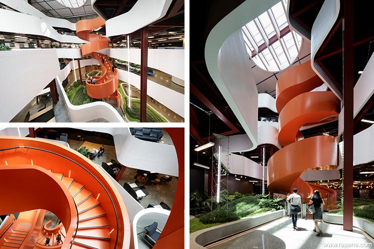
B:Hive, Smales Farm by BVN in association with Jasmax.
The judges said “drenched in colour, this central staircase feels like something out of Jack and the Beanstalk invoking curiosity and a desire to venture up to see what awaits. The bold colour highlights the curvaceous shape of the stairs as they twist and turn skyward and plays off against the neutral surrounds. Forget taking the lift when there are colourful stairs like these to enjoy.”
This project uses Resene Red Oxide, Resene Sea Fog, Resene Nero and a custom made bright orange inspired by the classic steelwork primer colour.
Find out more about this project
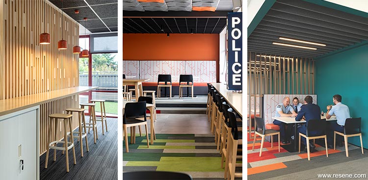
Henderson Police Whangaia by GHDWoodhead creativespaces.
The judges said “this project cleverly breaks down the barriers with colour, bringing the police and the community together in a positive environment where all are welcome. The palette deviates from the austerity and formality you might normally expect, using a careful mix of bold and softer hues. United by colour, this colour palette brings togetherness.”
This project uses Resene Periglacial Blue, Resene Fuscous Grey, Resene Stromboli, Resene Sea Green, Resene Alabaster, Resene Ayers Rock, Resene Port Phillip, Resene Streetwise, Resene St Kilda and Resene Quarter Mako.
Find out more about this project
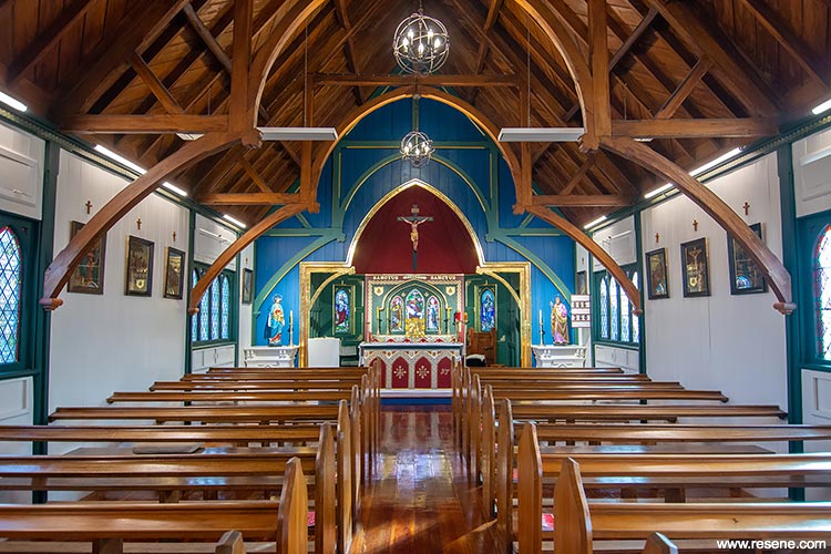
Church of the Holy Passion by Damien Walker of The Studio of Saint Philomena.
The judges said “This project is clearly dear to the hearts of many. The colour palette has been ever so carefully researched and delightfully celebrates the building’s history. In sympathy with the tradition of ecclesiastical ornamentation, the bold colour palette is immediately inviting and uplifting not austere as you might expect. The colour focus captures your attention and holds it; a passionate use of colour.”
This project uses Resene Prussian Blue, Resene Holly, Resene Quarter Villa White and Resene Madam M.

Find out more about this project
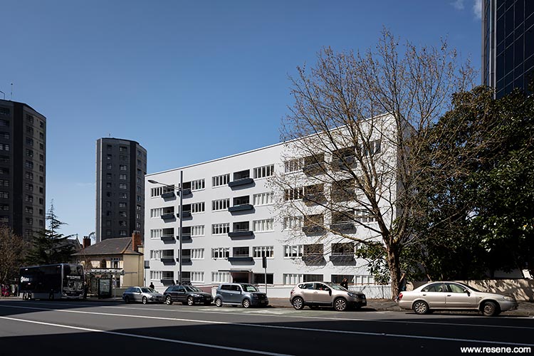
Waikohanga House by RTA Studio in collaboration with Archifact.
The judges said “this serene and calm colour palette draws your eye to the architecture of the building, celebrating it with respect. A classic example of New Zealand modernism, it has been carefully restored and colour researched. It’s a textbook example of how a tonal colour palette can bring out the best in a project and offers a fresh welcome to all.”
This project uses Resene Half Duck Egg Blue, Resene Half Dusted Blue, Resene Dark Side, Resene Black White and Resene Countdown.
Find out more about this project
Debbie Abercrombie
If Debbie Abercrombie was a colour, she would be the rainbow.

Debbie’s long and successful career as a colour expert in her own right, has seen her help many clients, from large to small, navigate their way through colour choices to get just the right palette for their project. From colour to furniture, commercial to homeowner, Debbie’s portfolio of projects is impressive.
As well as her own direct advice, Debbie has shared her passion for, and knowledge of, colour through her long running colour courses.
Debbie is a familiar face for many of those nervously starting out in colour. She has patiently guided a myriad of students through a journey teaching them how to harness and use the power of colour to bring out the best in their own projects and how to apply that learning to client projects in the real world.
Through Debbie’s work and the work of her students armed with the colour knowledge she has imparted, Debbie’s colour advice and expertise has helped recolour thousands of projects already, with many more still to come in the future.
Debbie’s passion and commitment to colour has already been an inspiration to so many and we look forward to seeing her inspiration continuing to colour projects for years to come.