From BlackWhite magazine - issue 08, red alert
Why colour trends continue to differ by geographic region and the Resene hues you’ll want to use here and now.
Thanks to technological advancements and the widespread use of social media platforms, design professionals and their clients can see and appreciate projects from around the planet on a daily basis.
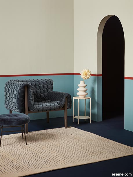
Being exposed to inspiring imagery from all over the world has led to more colour and design trends from outside our borders having an impact on our projects. However, New Zealand and Australia have managed to maintain a unique design identity due to our geography, flora, climate, culture and natural lighting circumstances. Upper wall painted in Resene Pumice, lower wall in Resene Upside, stripe in Resene Pioneer Red, floor in Resene Indian Ink and vase in Resene Half Tea. Armchair, stool and rug from Ligne Roset.
If you think back to earlier in your career and recall having a better handle on colour and design trends even just 10 or 15 years ago, that’s not just your memory playing tricks on you. Thanks to the internet and social media, the pace at which colour trends in architecture and interior design shift and evolve has indeed accelerated. The advent of platforms focused on image and video sharing like TikTok, Instagram and Pinterest – which serve as virtual repositories of design ideas from around the planet – allow all of us to discover and share projects instantly. As a result, trends that used to take months or even years to spread now proliferate within days or weeks, leading to faster turnover in design preferences.
In the past, trend forecasting was a domain reserved for industry experts who conducted market research, attended trade shows and subscribed to publications produced by professional trend forecasting agencies. Today, social media platforms serve as live barometers of consumer preferences and design tastes, and the accessibility of this data has completely democratised the forecasting process. Anyone who cares to dig into the numbers can gauge the popularity of certain colours and styles by monitoring engagement metrics such as likes, shares and comments on social media posts.
While the increased accessibility and ubiquity of information we have at our fingertips plays a crucial role in the speediness at which colour and design trends disseminate, social media platforms have also facilitated greater collaboration and cross-pollination among designers, architects and brands. Designers can now easily connect with peers and colleagues from around the world, sharing ideas, collaborating on projects and influencing each other’s work in real-time – further fuelling the rapid evolution of colour trends.
Increased connectivity and globalisation have had a profound impact on the adoption of colour trends locally. Historically, we were not as heavily influenced by design trends from other parts of the world due to our geographic isolation. However, technology and shipping logistics have eroded geographical barriers so that design influences from around the globe can now easily reach even the most remote corners of the world. As a result, it no longer matters that we are on the opposite side of the planet from tastemakers in cosmopolitan design centres like London, Paris, Milan and New York. Designers and consumers here now have access to the same wealth of design inspiration and trend information as our European and American counterparts.
While increased exposure to global design trends has led to greater diversity and dynamism in our local design scene, as designers draw inspiration from a broader palette of influences and incorporate elements of international design into their work, there continue to be colours and design trends that don’t gain traction here. Conversely, there are trends that exist in New Zealand and Australia that aren’t widely embraced elsewhere.
Firstly, the uniqueness of our region affects what trends locally. The relatively mild to hot climates we inhabit both allow and, in some ways, demand a particular style of architecture to ensure comfort and enjoyment of year-round indoor/outdoor living. If you have ever lived in or visited Europe or North America, you may have noticed a difference in their natural lighting circumstances compared to our part of the world. The tilt of the Earth’s axis affects the angle that the sun’s rays enter the atmosphere. The angle of the sunlight and the amount of atmosphere it has to pass through both indirectly impact the intensity and colour temperature of the light perceived from one geographic region to the next. When compared with the yellower light seen in the Northern Hemisphere, the sunlight here appears relatively blue.
Whether you realise it or not, these inherent and distinctive variances have likely led you to make different paint colour decisions on projects than you might have if you were developing a design on the opposite side of the world. For one, our lighting tends to enhance the look of bluer and dustier or greyed colours over certain warmer or yellower tones. So, when you’re looking at inspiring images of projects produced by a studio in London or New York, for example, you may find something feels a bit off when trying to implement an identical colour palette locally. It could be because of our natural lighting circumstances, and it could also be because the natural vegetation in the project’s surrounding environment is completely different (and thus clashes with certain colours).
More and more designers are layering multiple warm neutrals within a single space to add depth and cosiness.
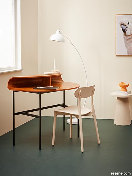
Break things up with surprising use of colour, like an interesting hue on the floor and bold touches of orange, red or pink through decorative accents. Walls and windowsill painted in Resene Solitaire, floor in Resene Top Notch, chair, side table and candleholder in Resene Bone and vase in Resene Roxy. Desk from Ligne Roset, floor lamp from Lighting Plus.
For many years, there has also been a strong inclination for many New Zealanders and Australians to decorate with understated and neutral tones such as white and off-whites – and it’s a notable culture difference. In many other countries, brighter and bolder colours are favoured for buildings – particularly in places where people aren’t surrounded by lush greenery year-round. In Norway or Iceland, a white building would be lost amongst the snow during winter. And living with all-white interior walls, ceilings, doors and windows framing vistas of leafless trees sprinkled throughout an endless white, barren landscape is a recipe for depression.
So, despite the internet’s best efforts to homogenise design across the globe, these geographic contrasts underscore the value that comes from readers sharing their projects with us and entering them in the annual Resene Total Colour Awards. It provides our editorial team with valuable insight into homegrown trends, allowing us to see how and where you are using colour in the buildings and spaces you create, and witness the shifts in colour preferences that occur year on year. It helps us to provide you with more accurate and relevant information on where colour and design trends are moving in a way that overarching global predictions never will. Plus, sharing your projects provides priceless inspiration to others in the industry who greatly benefit from geographically-relevant influences.
When you tuck into an issue of BlackWhite magazine, you can be sure that we are focused on providing you with the most regionally-specific (yet globally-conscious) colour forecast our data allows. For those down under, these are the Resene paint colours popular now and those that will dominate in the months to come.
top tip Take care trying to uplift paint colour trends from Europe to use locally, as they often don’t translate well and look too sweet for our natural light.
A colour that’s anything but passive, it seems fitting that the triumphant return of red has gone off with such a bang. Among celebrities and fashionistas, it’s become the quintessentially vogue choice for the runway and the red carpet, appearing with noticeable frequency throughout the most recent awards season and fashion week presentations. For designers, there’s simply nothing else that turns heads quite the way that red does. The colour’s confidence never ceases to feel fresh and exciting yet classically chic, making it an ideal accent hue when a space needs a splash of drama.
From vibrant vegetal capsicum and tomato reds with purple or orange undertones such as Resene Jalapeno and Resene Thunderbird to deep wine hues like Resene Incarnadine and Resene Vanquish, the breadth of options that are considered on trend is a major indicator of just how smitten designers and clients have become with this eye-catching colour. But more than any other, there is one particular version worth singling out that’s proven to be a top favourite in our geographic region: Resene Pioneer Red.
The fact that Resene Pioneer Red appears in both the current Resene The Range fashion colours collection as well as the Resene Classic Colour Collection says it all – the hue is as much on trend as it is timeless. Bright yet muted, this cinnabar red oxide is shockingly flexible and pairs wonderfully with so many other colours, from salty yellow greens like Resene Nirvana and terracotta pinks like Resene Soiree to deep blue greens like Resene Forty Six and powdery blues like Resene Duck Egg Blue. Depending on the lighting circumstances, how it’s used and what other colours it’s used with, Resene Pioneer Red can either stand out or take a step back – making it a brilliant choice for both interiors and exteriors.
It’s also worth noting that the rise of red is influencing the undertones of other hues in the trend forecast – particularly deep browns and purples. While not overtly red, Resene Moccaccino, Resene Trek and Resene Cab Sav are perfect examples of trend-worthy paint colours with a ruddy edge that have been gaining popularity.
With the staggering array of design inspiration from around the world at our fingertips and the speed with which trends evolve, it can be difficult to stay on top of what’s hot and what’s not.
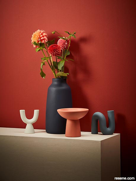
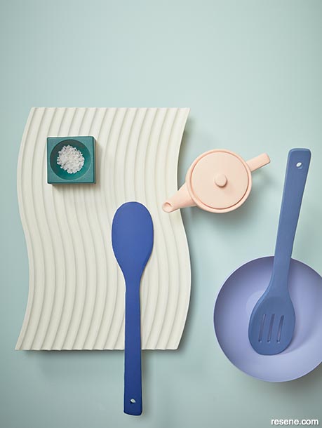
Customising projects to meet client needs and preferences using paints and wood stains developed especially for our climate’s unique challenges will always be in fashion. Background painted in Resene Soiree, top left bowl and round wall hook in Resene Pumice, oval tray in Resene Half Tea, round hooks on top of tray (from top) in Resene Watermark and Resene Upside, wavy trivet in Resene Pioneer Red and small vase in Resene Indian Ink.
In a world that is so connected, design sometimes feels increasingly homogenised.
The instant feedback loop of social media metrics has enabled manufacturers of furniture and décor to quickly identify emerging trends and produce new designs accordingly. This results in the rapid availability of trending décor and furnishings in the marketplace and contributes to the oversaturation of certain shapes and designs. Painting furniture and décor items is one option for increasing customisation and uniqueness within your project. Wall painted in Resene Pioneer Red, plinth in Resene Half Tea and vases in (from left to right) Resene Pumice, Resene Indian Ink, Resene Soiree and Resene Watermark.
In past design eras, the popularity of pink has waxed and waned. However, it’s a colour that’s hung on to its relevancy ever since the term ‘Millennial pink’ was coined in 2016. On the surface, the tenure of pink’s prevalence may seem surprising to some, but the hue is a superb example of why brushing up on your colour theory and paying attention to the overarching societal forces at play can offer contextual understanding of colour trends. Pink has spent more than seventy years associated with femininity. But now, it has become a symbol of empowerment. Once a tool of the patriarchy to label something as ‘weaker than’, pink has been reclaimed and reassigned a new emblematic meaning of strength and perseverance for all genders. To embrace the colour pink is to embrace a love for humanity; on the inside, we are all pink.
When it comes to using pink in your projects, it’s ideal for spaces where people come together. When teamed with moody lighting, trend-worthy versions like Resene Soiree, Resene Drop Dead Gorgeous and Resene Valentine spell decadence and romance in restaurants and other hospitality settings. Pinks also tend to enhance the appearance of all skin tones and lend the effect of a healthy glow. When used on walls, colours like Resene Dawn Glow, Resene Tropical and Resene Awaken ‘throw’ their bewitching rosy tones to make those in the space look their best – making pink a fantastic choice for bathrooms, makeup retailers and clothing shops.
Warm, complex neutrals like Resene Bone and Resene Solitaire sit well with pink, orange and green accents and tend to look rosier or yellower in their presence.
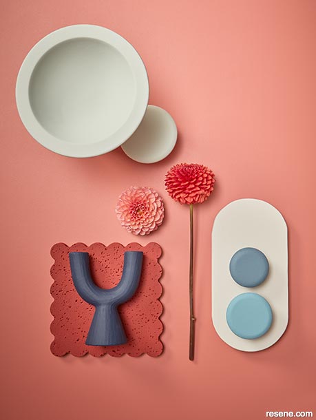
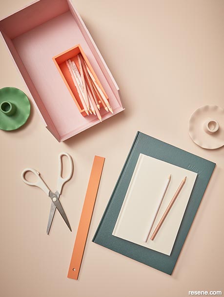
Be sure to view larger samples of your proposed complex neutral hues along with your accent hues by leveraging tools like Resene testpots or A4 drawdown paint swatches before locking in your specifications. Background painted in Resene Bone, storage box in Resene Valentine, pencil box in Resene Tropical, candleholders in Resene Aloe Vera (left) and Resene Bone (right), scissors and top book in Resene Solitaire, ruler in Resene Roxy and bottom book in Resene Top Notch.
Fearless use of bold colour continues to be a trend in spaces that want to appeal to younger demographics – restaurants, cafés and retail settings, in particular.
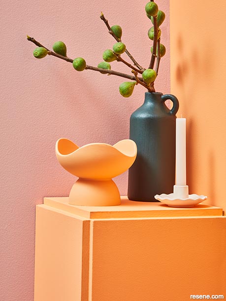
Left wall painted in Resene Valentine, right wall and plinth in Resene Tropical, vases (from left) in Resene Roxy and Resene Top Notch and candleholder in Resene Half Tea.
Another colour family with proven staying power is green. Unquestionably, it was the most popular accent colour throughout the pandemic’s lockdown years, when many of us were focused on bringing softness and comfort to our upended lives and looked for ways to increase our connection to the natural world outdoors during a time when most of us were forced to stay inside. In the years since, the gentler sage, mossy and olive greens that took us through those hard times have been dropped for more energetic, verdant varieties like Resene Boundless, Resene Home Run and Resene Aloe Vera and we’ve seen acidic yellow greens like Resene Funk and Resene Tarzan emerge.
While these exciting greens will remain relevant in the design world for a couple of years yet, we expect many of those familiar softer, earthier greens that coddled us during the worst years of Covid-19 to return to favour. So, if your project’s completion date is still a year or two out, don’t dissuade your clients from choosing colours like Resene Field Day, Resene Tic Tac Toe, Resene Contour and Resene Wabi Sabi. When more depth is needed, look to bluer emerald and teal greens like Resene Deep Teal, Resene Welcome and Resene Top Notch as an unexpected pairing for cooler blue, periwinkle and purple colour palettes. For warm palettes, try Resene Seaweed. While some of these variations might seem passé at this precise moment, rest assured that they’ll be back on trend in no time.
Affectionately considered to be ‘everyone’s favourite colour’, chances are that you and everyone you know can find at least one Resene blue that appeals. This means that blue never really goes out of style – but there are always variations of blue that are more on trend than others, and there are times when blue is a less popular choice for decorating with.
Saturated denim and ultramarine blues make a beautiful base for a cosy and creative colour scheme by offsetting them with accents of green-edged white, peachy pink, pale blue and deep teal.
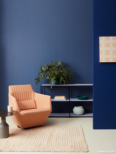
Back wall painted in Resene Rulebreaker, side wall in Resene Aviator, floor in Resene White Noise, shelf in Resene Heliotrope, DIY artwork created with Resene Romantic and Resene White Noise, planter pot and bowl on shelf in Resene Deep Teal and wooden planter in Resene Morning Haze. Armchair and table from Ligne Roset.
Right now, blue is having a major resurgence as a key colour trend. While most other colour families will go through marked changes over the next two years, interestingly, the variations of blue that are preferred today are projected to remain quite stable. Bold Klein and lapis ultramarine blues like Resene Aviator and Resene Ultramarine from the Resene Beyond the Sea collection continue to be favoured accent colours for bringing attention to architectural features or statement furniture – and they are expected to remain relevant for the foreseeable future. Navy and inky black blues like Resene Carpe Noctem and Resene Indian Ink have become a trendy option for kitchens, but we expect to see them used more frequently as a favourable alternative to deep greys on walls. And for easy-to-love powder blues like Resene Duck Egg Blue, Resene Timeless and Resene Comfortably Numb, it’s steady as she goes.
The only significant exception to this period of stability is that the turquoise blues that are currently having a moment are not expected to stick around for long. In less than a year’s time, vibrant aqua colours like Resene Now Or Never will be shifting into less green varieties like Resene Key Largo before softening in vibrancy, so look to hues like Resene Island Time, Resene Skylight and Resene Sail Away if you want to get ahead of this trend.
With aesthetic movements like ‘quiet luxury’ and ‘warm minimalism’ proving to be enduring trends, layering character neutral colours that exude warmth and sophistication in varying values and strengths has become preferable over the single hue, all-white minimalism of years past.
From serene creams to leathery tans to earthy greiges, designers are gravitating towards sumptuous shades that evoke calm and balance while still making a statement. Among the most popular neutral colours being used to create stunning spaces are nuanced hues like Resene Rocky Point, Resene Hindsight, Resene Piazza, Resene Half Tea, Resene Athena, Resene Creme De La Creme, Resene Half Putty and Resene Triple Spanish White. While a true black like Resene All Black is about as timeless as it gets, there has also been a noticeable shift towards the use of softer blacks like Resene Thunderstorm and Resene Night Magic both indoors and out. Not only do these blacks tend to sit better in contrast with warmer neutrals, these paint colours look stunning in matte finishes like Resene SpaceCote Flat – which continues to be hugely desirable.
As neutral colour preferences tend to go through long cycles of a decade or longer, fluctuating between warm versus cool colour temperatures, it’s safe to expect that these warm neutrals will continue to serve as the foundation for interior spaces for years to come – providing a versatile backdrop that can be easily accented with pops of colour or texture.
Often considered the most polarising of colours, purple has been having something of a renaissance in recent years. However, we’re likely to see the prevalence of this hue wane as early as next year – though we don’t expect purple will disappear completely for some time yet.
Certain shades are better poised to soldier on. Warmer options that will remain relevant include soft orchid purples and deep aubergines like Resene I Do and Resene Half Aubergine. For shades on the cooler side, look to deep violets, denim indigos and pretty periwinkles that sit between blue and purple on the spectrum, such as Resene Black Doris, Resene Rulebreaker and Resene Heliotrope. These versions are considered more ‘liveable’ and thus easier to design with than brighter and bolder fuchsia-toned purples, but it’s still recommended to use them as accent colours rather than hero hues. A little will go a long way, and it will be less of a task for clients to paint over them as trends evolve further or if their tastes change.
Peach has quickly risen to relevancy after the hue was chosen as the Pantone Color of the Year.
The hue’s ability to infuse a space with softness, warmth and comfort makes Resene Romantic a popular paint colour for those who want to get on board with this trend. Wall and floating shelf painted in Resene Romantic, console in Resene Aviator and, from left, small vase in Resene Deep Teal, lamp base in Resene Morning Haze, abstract vase in Resene Rulebreaker, jug in Resene White Noise and raised dish in Resene Heliotrope.
Timeless blues like Resene Morning Haze, Resene Duck Egg Blue and Resene Comfortably Numb are trending alongside deeper blues like Resene Rulebreaker and Resene Aviator. Instead of the slow shifts we’ll see other colour families undergo, these blues are expected to remain stable and relevant for the foreseeable future.
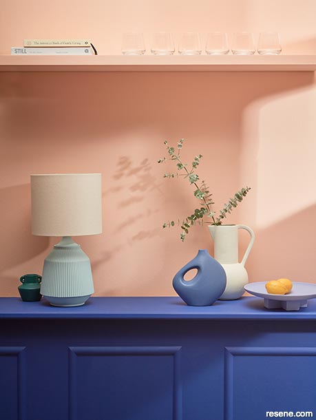
Background painted in Resene Morning Haze, curved tray in Resene White Noise, salt dish in Resene Deep Teal, teapot in Resene Romantic, bowl in Resene Heliotrope and serving spoons in Resene Aviator (left) and Resene Rulebreaker.
Looking a bit further ahead in the forecast, yellows are expected to emerge as a key accent colour – but not the bright, clear variations you might be expecting. Instead, the brassy yellows and harvest golds that became a staple in the 1970s will be returning to relevance. Yellows like Resene Amaranth, Resene Daylight, Resene Sunbeam and Resene Liquid Gold are poised to become a major global colour trend over the next couple of years and may even eventually dethrone red as the must-have accent hue. However, we expect these yellows to have more uptake in Australia than New Zealand as golden tones tend to sit more naturally with Australia’s native flora.
Orange tones, too, will be emerging more in the coming years – but how significant a role they will play in local architectural and interior design is yet to be seen. This shift comes on the coattails of this year’s Pantone Color of the Year announcement, with peach hues being embraced earlier and with more gusto than previous picks. For the next couple of years, pinky oranges like Resene Romantic and Resene Roxy are the colours to choose if you’re looking to align with this particular peach trend. You can also look to Resene Kombucha, Resene Clockwork Orange and Resene Tequila Sunrise as accent options once truer oranges begin to rise to relevancy next year and beyond.
Colours mentioned in this article...
Product mentioned in this article...
Projects: Amber Armitage
Images: Wendy Fenwick
This is a magazine created for the industry, by the industry and with the industry – and a publication like this is only possible because of New Zealand and Australia's remarkably talented and loyal Resene specifiers and users.
If you have a project finished in Resene paints, wood stains or coatings, whether it is strikingly colourful, beautifully tonal, a haven of natural stained and clear finishes, wonderfully unique or anything in between, we'd love to see it and have the opportunity to showcase it. Submit your projects online or email editor@blackwhitemag.com. You're welcome to share as many projects as you would like, whenever it suits. We look forward to seeing what you've been busy creating.
Earn CPD reading this magazine – If you're a specifier, earn ADNZ or NZRAB CPD points by reading BlackWhite magazine. Once you've read an issue request your CPD points via the CPD portal for ADNZ (for NZ architectural designers) or NZRAB (for NZ architects).
![]() Get inspired ! Subscribe
Get inspired ! Subscribe ![]() Get saving ! Apply for a DIY card
Get saving ! Apply for a DIY card
![]()
Can't find what you're looking for? Ask us!
Company profile | Terms | Privacy policy | Quality and environmental policy | Health and safety policy
Colours shown on this website are a representation only. Please refer to the actual paint or product sample. Resene colour charts, testpots and samples are available for ordering online. See measurements/conversions for more details on how electronic colour values are achieved.
What's new | Specifiers | Painters | DIYers | Artists | Kids | Sitemap | Home | TOP ⇧


