From the Resene decorating blog
Layer up hue-on-hue for an interior scheme you’re sure to love.
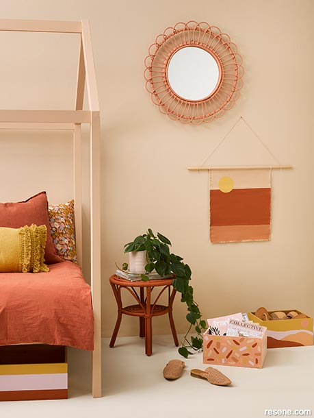
Put desert pinks and earthy terracotta together in a tonal scheme for a trend-focused look. Wall in Resene Bone, floor in Resene Blanc, bed in Resene Cashmere, table in Resene Moccasin, mirror in Resene Just Dance, vase painted in Resene Twilight and wooden crates in Resene Moccasin, Resene Just Dance, Resene Twilight, Resene Sante Fe and Resene Apache. Project by Vanessa Nouwens, image by Melanie Jenkins.
Yoga, meditation, a long soak in a hot bath – all are tried and true routes to relaxation. But the lesser-known and longer-lasting path you may be overlooking? A tonal interior colour scheme.
A tonal approach to decorating sees different strengths of a single shade, or similar shades within a single colour family, combined to create a layered look so cohesive it soothes the senses. Incorporating lighter and darker variations of your chosen base colour, it’s an on-trend effect that’s simultaneously built to last, and easy to achieve at your place with a little insider know-how.
Owner of homeware store Blackbird Goods, Gem Adams, is a big fan of a layered look and says although she’s tended to embrace it in the form of texture, the more she delves into colour, the more she loves it.
“The tonal style adds so much depth and creates real interest without being OTT. I’m a busy-brained gal, so I’m always trying to create calm in my surroundings. Tonal schemes do this for me; whether neutrals or brighter colours, a spectrum of variation as opposed to high contrast manifests the feeling I’m hoping for,” explains Gem.
She says tonal decorating is great for those who are averse to taking big risks with colour but still seek a look less ordinary. “New Zealanders have historically been a little more subdued in their interior choices, possibly harking back to our English roots, but as we become more adventurous, working with tones is a way to experiment without pushing us too far from our comfort zone. It’s a trend but also an enduring look that can evolve with us.”
Taking a tonal approach may be the most fuss-free and fool proof way to paint, as decision-making becomes so simple when you have your eye on one prize hue and can simply riff off that. And with the visual aids on hand at your local Resene ColorShop, it’s virtually impossible to make a mistake. A great way to start is with the Resene The Range Whites & Neutrals fandeck – a handy tool for discovering which neutrals go together. Displaying several variations and strengths of a colour on each card, it’ll give you a solid understanding of what this look is all about. Choose a single base colour, then at least two other strength versions of it – one lighter, one darker – that are sufficiently different to offer visual interest.
Some might say ubiquitous neutral beige is boring, but as part of a tonal scheme, it’s anything but – and extremely easy to live with. “For that ever-popular putty shade, I love Resene Bison Hide – from bleached beige Resene Eighth Bison Hide to deep mudbrick brown Resene Triple Bison Hide,” says Gem.
Greys are another neutral that can create an effortlessly harmonious tonal effect. For winter, mid-toned sandy grey Resene Half Stack, armament grey Resene Stack and militant Resene Double Stack make a cosy combination you can complement with accessories in cream and blush to striking and soothing effect.
In fact, grey is a compelling prospect for both inside and out. “My husband and I are currently planning the paint for the exterior of our 1910 cottage and wanting something reminiscent of its heritage that also makes an impact, we’ve gone with smoky grey Resene Tapa and urban grey Resene Gravel, both deep tones that complement each other in a fresh way and also sit well with soft grey Resene Ash and sandy Resene Half Grey Olive,” says Gem.
Today’s tone-on-tone colour schemes are often built from the same colour family rather than relying on different strengths of a single hue.
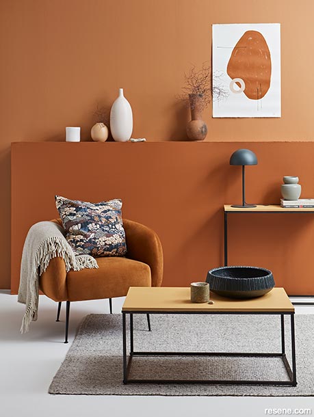
Back wall in Resene Dark Buff, shelf wall in Resene Korma, floor in Resene Eighth Drought, coffee and console tables in Resene Twine, tall vase in Resene Alpaca, short vase in Resene Gold Coast, DIY artwork in Resene Korma and Resene Gold Coast, large bowl in Resene Cod Grey. Project by Gem Adams, image by Wendy Fenwick.
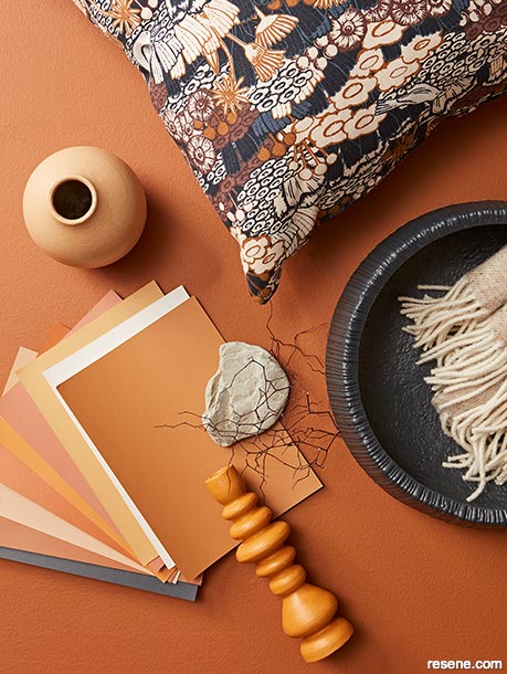
Rich caramel tones are easy to not only blend with one another, but they work beautifully with other trendy desert tones, too.
Background in Resene Korma and A4 drawdown paint swatches in (from top to bottom) Resene Chelsea Gem, Resene Alpaca, Resene Twine, Resene Sante Fe, Resene Mai Tai, Resene Korma, Resene Gold Coast, Resene Dark Buff and Resene Cod Grey, vase in Resene Gold Coast, candlestick in Resene Mai Tai and large bowl in Resene Cod Grey. Project by Gem Adams, image by Wendy Fenwick.
If you’d prefer to inject a little more colour into your home, Gem says she’s forever a fan of the dusty tonal combo of sweet toffee Resene Nougat, sandalwood Resene Baroque, terracotta Resene Twizel and ginger brown Resene Desperado. She says deepening your understanding of the colours you’re deliberating over will help you create a cohesive scheme. “Are they cooler or warmer? Do they have blue, yellow or red undertones? Pairing like with like is always pleasing in the eye.”
Nature also puts together tonal combinations like a pro. Look to the blue-on-blue of sea and sky – think pastel astral Resene Seagull, mid sea blue Resene Shakespeare and heavenly Resene Hemisphere, say – or the green-on-green of native bush with mid-toned Resene Norway, murky Resene Highland and forest green Resene Dingley, or sunrise pinks (think sorbet Resene Vanilla Ice, pale cherry Resene Gelato and dusty magenta Resene Rouge) for inspiration. Building your palette with gradually intensifying hues lets you combine several colours with confidence knowing they’ll never overwhelm.
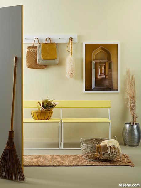
This soft and understated tonal scheme with walls in Resene Moonlight and floors in Resene Grey Olive, looks warm and inviting to guests and the door in Resene Quarter Pearl Lusta offers a cheerful surprise with edges painted Resene Influential.
Bench in Resene Chorus Line and Resene Quarter Pearl Lusta, kete baskets in Resene Grey Olive and Resene Influential; basket with flowers in Resene Influential, basket of throws in Resene Grey Olive, broom handle in Resene Influential, hook rack in Resene Quarter Pearl Lusta with Resene Grey Olive knobs and picture frame in Resene Quarter Pearl Lusta. Project by Kate Alexander, image by Bryce Carleton.
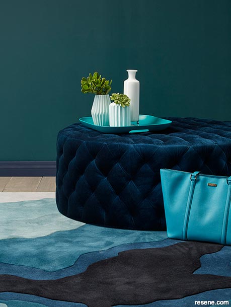
Look to nature for tonal inspiration. This room was inspired by a cross-section of agate, which was also the basis of the rug design.
Wall in Resene Atlas, skirting board in Resene Indian Ink, floor in Resene Colorwood Mid Greywash, tall glass vase in Resene Mystery, ribbed vases in Resene Meditation and Resene Kandinsky and tray in Resene Yowza. Project by Megan Harrison-Turner, image by Bryce Carleton.
To stop a tonal colour palette becoming bland, up the ante with accent hues and textures that both provide a break for the eye and the contrast this look needs to come to life. Choose accent colours of the same ilk, such as a dusty pink highlight amid chalky greys, or you might like to turn your attention to opposites on the colour wheel – a single bright red piece in pure chromatic red Resene Havoc surrounded by true blues, for example, or a pop of gem-like purple such as showy Resene Christalle in an emerald green scheme.
Keep in mind that the essence of this look is its minimalist sophistication, so you’re aiming for subtle excitement rather than a shouty statement. Resene’s A4 drawdown paint swatches are a useful resource when determining which pieces will come together well with your chosen wall colours.
When we’re talking texture, timber and other natural materials such as raw linen and wool are top teammates for a neutral palette. Include some textured wallpaper, velvet furniture or a woven throw or rug. Use affordable and accessible Resene testpots to paint a vase or two in an accent hue, then fill it with dried flowers or foliage that complement your tonal colour family. If you find decorative pieces in shapes you love but colours you don’t, you can also use Resene testpots to paint them in your chosen tonal hues.
Mixing matte painted finishes, such as Resene SpaceCote Flat or Resene SpaceCote Low Sheen, with glossier ones, such as Resene Enamacryl, is another way to ensure a tonal space remains interesting. Bear in mind though, that the higher the gloss, the more the finish will reflect the light.


April 30, 2020
For more ideas and inspiration, see the Resene Decorating Inspiration gallery online. If you need extra help choosing colours, try out the free Ask a Resene Colour Expert service, or book a Resene Colour Consultation.
Book a colour consult | Ask a Colour Expert | Ask a Paint Expert
Resene's decorating blog
Paint your home beautiful! Discover the latest decorating trends, tips and colour news.
![]()
Previous «
Psyched about colour
![]()
Blog home
View the latest trends, tips and news
![]()
» Next
You can paint that?
![]() Get inspired ! Subscribe
Get inspired ! Subscribe ![]() Get saving ! Apply for a DIY card
Get saving ! Apply for a DIY card
![]()
Can't find what you're looking for? Ask us!
Company profile | Terms | Privacy policy | Quality and environmental policy | Health and safety policy
Colours shown on this website are a representation only. Please refer to the actual paint or product sample. Resene colour charts, testpots and samples are available for ordering online. See measurements/conversions for more details on how electronic colour values are achieved.
What's new | Specifiers | Painters | DIYers | Artists | Kids | Sitemap | Home | TOP ⇧


