From the Resene decorating blog
Watching the clock as the working week passes, weekends spent catching up with family and friends amid the after-effects of the unsettling last few years; it is easy to feel the weeks sweep by quickly.
But when you do get the chance to have some free time, there's nothing better than spending a few hours or a day at home.
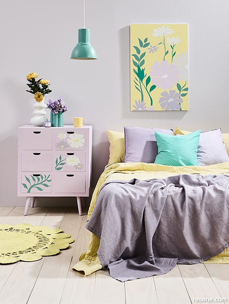
Colour can play an important role in our moods; purple evokes a sense of imagination while yellow triggers the creative part of the brain associated with getting things done.
When paired together, the setting is optimistic and fresh. Say yes to colourful art when choosing pastels for a bedroom; simple floral murals on the drawers mimic those of the artwork, bringing in a touch of spring all-year round. Wall in Resene Urbane, floor in Colorwood Breathe Easy, drawers in Resene Petal with flower detail in Resene Lola, Resene Petal, Resene Boundless, Resene Green Acres, Resene Moonbeam and Resene Rice Cake, pendant in Resene Green Acres, round rug in Resene Moonbeam, tall Resene bobble white vase in Resene Rice Cake (with yellow flowers in it), artwork in Resene Moonbeam, Resene Rice Cake, Resene Lola, Resene Boundless and Resene Green acres, rattan flower mirror painted in Resene Boundless and green-shaped vase (with purple flowers) on the dressing table in Resene Green Acres, Mug from Freedom, quilt and pillowcases from Adairs, candle, throw and lilac cushion covers from H&M Home. Project by Vanessa Nouwens, image by Bryce Carleton.
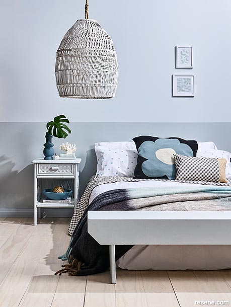
Quiet pastels mean nothing visual shouts out at you or looks like it doesn’t belong. A simple palette doesn’t mean boring. This wall has been split into two plains of colour, the darker version acting almost as a headboard. Layers of comforting textiles enhance the cosy factor while the rattan brings interest though.
Wall painted in Resene Breathless (top) and Resene Duck Egg Blue (bottom), floorboards in Resene Colorwood Breathe Easy, skirting board in Resene Breathless and large rattan pendant in Resene Colorwood Whitewash, bedside table in Resene Half Duck Egg Blue, bedside light in Resene Half Villa White and bed end stool in Resene Duck Egg Blue. Project by Annick Larkin, image by Bryce Carleton.
If you feel like you're still struggling to unwind even when you have the time, look at your surroundings. Is it time to create a more harmonious gentle interior? Somewhere that celebrates serenity and restoration. If you want to ramp up an on-trend vibe at home, your starting point should be colour. And in this case, pastels are your friend.
For years, pastel colours have been associated with youth – pale pink or yellow bedrooms for girls and baby blue or soft green for boys, generally speaking. Today they adopt a more dynamic, softer, romantic role rather than pale and bland.
Resene Canterbury Design Advocate Brooke Calvert says that the wide array of Resene pastel colours available is ideal for adding a tranquil home base. "They are the perfect blend to brighten up or create a sense of calm in any space; I love the soft quality they offer and how easily they can incorporate into an existing scheme."
There are several ways to use these hues successfully in your home, and one look she is currently obsessing over is the interior colourwashed plaster finish. "Pastel shades seem to work very well with this look, particularly colours like Resene Dawn Glow, Resene Half Perfect Taupe and Resene Awaken." These hues lean towards milky beige and mango-pink, soothing and pale, which lend a light, optimistic feel.
"For a standard paint finish to complement your pastel colours on interior walls, I suggest opting for a flat finish like Resene SpaceCote Flat waterborne enamel or low sheen finish such as Resene SpaceCote Low Sheen waterborne enamel to complete the look."
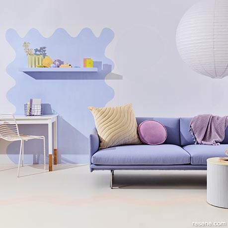
These walls could let the living room sofa do the talking, but by painting a wall feature in a soft lilac they reach another level. The fluid lines of the wall art tie in with the organic curves of the pendant, cushion and footstool, all of which add to the sensual nature of the space.
Back wall painted in Resene Snow Drift, floor painted in a base layer Resene Half Milk Punch with a top layer in Resene Tuft Bush, shape on wall Resene Hawkes Blue, stool in Resene Half Alabaster, desk in Resene Eighth Black White with leg bottoms left bare and shelf in Resene Hawkes Blue. Couch by Bauhaus, chair from Cintesi. Project by Kate Alexander, image by Bryce Carleton.
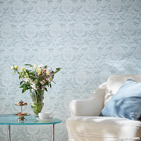
Timeless and calming, blue and white in the softest forms create a perfect sanctuary. Resene Wallpaper Collection 570830 evokes the gentle blue of a sunny sky in a unique pattern. Accessories in the cushion and tabletop in the same shade tie the look together.
Use similar Resene colours such as Resene Comfortably Numb, Resene Blue Moon, Resene Quarter Frozen to tie in with this colour wallpaper. As a nod to the pastel-toned flowers, add a touch of Resene Heliotrope, Resene Illuminate or Resene Valentine as an accent.
So where to start? Let's take the bedroom, the ultimate calming space in your home. For this room, Brooke suggests a palette centred around blue, itself calming and tranquil. Blues are known for their soothing and de-stressing qualities; soft shades make this hue the perfect choice for a bedroom.
The key is that although blue dictates the room's mood, its shades vary. A pale blue can be youthful, whereas a richer, dark version can offer atmosphere and something moody, with mid-range brights providing an element of fun.
"Imagine you are redecorating your bedroom, and you want to create a restful but fun look; paint the walls and flooring in Resene Timeless, team it with white Resene Alabaster for the ceiling and trim, then add accent colours on an arched-shaped mirror in Resene Jordy Blue, Resene Sail and Resene Timeless," she says.
"For a pop of colour, paint a side table in Resene Sail Away." Hints of unexpected bold colours will modernise the space, grounding the pale colours. "Bring in small elements of dark navy or black to avoid the space from being too wishy-washy."
Consider how you want the room to feel; for something more sumptuous, you might minimise the pastel, using a more significant amount of darker hues instead. Alternatively, more pastels will lend an airier, lighter feel. Not to mention a warm greige that will lend an earthier touch.
Brooke says pastel shades can work in any space, residential and commercial, when the tones are paired and used correctly. "From soft shades of Resene Duck Egg Blue on bedroom walls to rosy, pink kitchens, there are a lot of stylish ways to incorporate pastels in your space, and this doesn't have to be limited to just the walls."
When bringing in pastels to a space, how do you ensure your interior evokes a soft romantic feel, and doesn't just look washed out? Brooke suggests teaming your colour with a crisp white like Resene Double Alabaster on the trim and ceiling to help lift and brighten up the space: “Or bring in a bold accent colour like Resene Salted Caramel on a piece of furniture. You’ll find lots of fun colour options in the latest Resene The Range fashion colours fandeck.”
The role of pastels today is edgier than the sugar-sweet ones of yesteryear. They're replaced by colours that in the past may have seemed unusual in the past. So don't be afraid of mixing pastel with a stronger version of its colour.
Let your blue be in a bright, zesty form, such as Resene Wet N Wild, the perfect contrast to the milky mango pastel of Resene Tacao.
"Contrasting with dark colours takes pastels to a modern, dramatic, more grown-up look, taking away from the usual 'cutesy' and soothing look we all know pastels to be," Brooke says. "For example, paint your walls in Resene Eau De Nil a tranquil pale green and pair with Resene Off The Grid a mid-toned green – as opposed to keeping the whole scheme light and airy."
While you want to pay attention to which colours make your heart sing, there is an element of formula that should be applied when using pastels. "To get a balanced colour scheme with your selected pastels, a good rule to follow is the 60:30:10 rule. 60% is the main colour (for most of the walls, and perhaps some furniture and a rug), 30% is the secondary colour that supports the main colour (for example, drapes and linens) and 10% is the exact accent colour (cushions, lamps and accessories); it could also be a bold paint colour."
To get a flawless finish with your paint colours, Brooke suggests studying the tones of the colours you want to use, ensuring there is an element of consistency among them. "The trick to using more than one pastel is to use colours with the same saturation or tint levels. So, either all dusky pastels together or all light and bright pastels together."
Give a hint to those visiting your home about what’s inside by painting your front door a fabulous pastel. When your door opens, create visual harmony by coating the internal entrance in a pastel complementary to your front door.
Finally, add further interest to your pastel paints by combing them with a wall in a patterned Resene wallpaper that complements your hue. The pattern gives further visual interest while the pastel base will hold the setting, quietly resonant in its pale beauty.


March 06, 2023
For help choosing colours to suit your projects, visit your local Resene ColorShop, ask a Resene Colour Expert online or book a Resene Colour Consultation.
Book a colour consult | Ask a Colour Expert | Ask a Paint Expert
Resene's decorating blog
Paint your home beautiful! Discover the latest decorating trends, tips and colour news.
![]()
Previous «
Innovative outdoor storage ideas
![]()
Blog home
View the latest trends, tips and news
![]()
» Next
Colour connections inside and out
![]() Get inspired ! Subscribe
Get inspired ! Subscribe ![]() Get saving ! Apply for a DIY card
Get saving ! Apply for a DIY card
![]()
Can't find what you're looking for? Ask us!
Company profile | Terms | Privacy policy | Quality and environmental policy | Health and safety policy
Colours shown on this website are a representation only. Please refer to the actual paint or product sample. Resene colour charts, testpots and samples are available for ordering online. See measurements/conversions for more details on how electronic colour values are achieved.
What's new | Specifiers | Painters | DIYers | Artists | Kids | Sitemap | Home | TOP ⇧