If there is one trend that’s been hugely popular over the past couple years, it’s arches. If you are building a new house or renovating your existing home, incorporating open Art Deco or Moroccan-inspired arch shaped doorways can allow greater light and flow from one space to another while also providing cosily defined areas for separate activities to take place.
But if you’re taking this route to incorporate the arch trend as a physical characteristic of your home, you’ll want to pay close attention to your colour scheme and how you apply it to the spaces on either side of your arch. Because this design creates sightlines where your other area is visible from the adjacent room you’re standing in, it’s best to take a unified approach to your colour palette in order to achieve a seamless, cohesive look that flows just as smoothly as your light and movement.
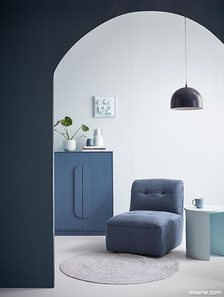
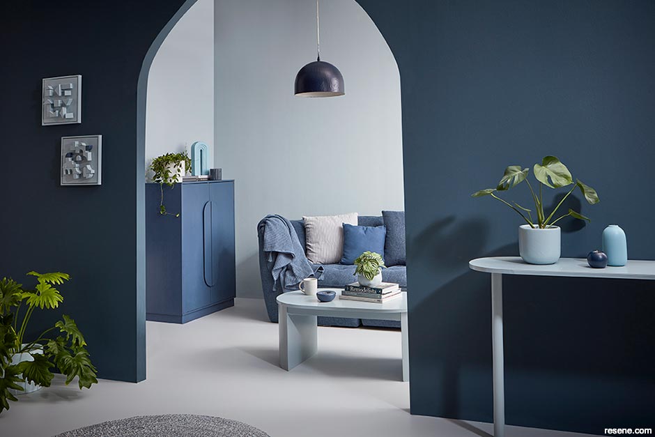
A simple method to achieve this is by creating a single, unifying colour palette that can be leveraged in both of the spaces. However, this doesn’t mean you should necessarily take the same wall colour across both – which could end up looking boring or not provide enough depth or definition between the two areas. Depending on the tasks or activities that will be taking place in these spaces, you may also want to create a different mood for each. For example, you may want darker walls for a lounge where you can get cosy on the couch with family members to watch movies than you would in an adjacent space where you need to prepare food or work from home. Instead, you’ll want to make sure your colour palette includes light, mid-range and darker hues so that you can look to create inversed schemes in each space – one that’s light on dark and another that’s dark on light.
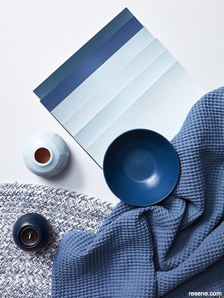
You may find it easier to rely on a tonal palette to execute this strategy, where all of the hues that you use are different variations from the same colour family – or even different strengths of the exact same one. Then, you’ll want to focus on choosing one to three light tones, one to three mid-range tones and one to three dark tones that sit well together as well as one true neutral, for balance.
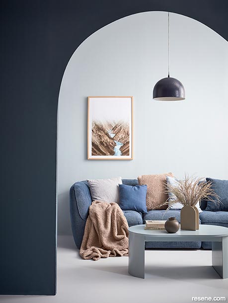
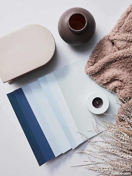
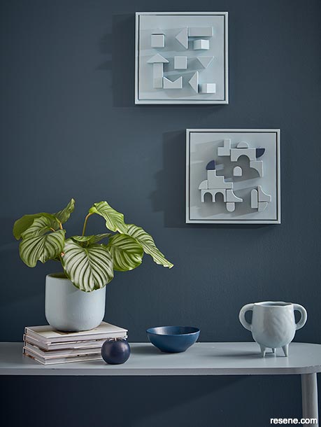
In these spaces, we relied on Resene Half Dusted Blue and Resene Quarter Powder Blue as our lights, Resene Dusted Blue, Resene Periglacial Blue and Resene Casper as our mid-range hues and Resene Shadowy Blue, Resene Avalanche and Resene Coast as our darks plus Resene Surrender as our neutral – which was used to paint our floor and flow between the two adjacent areas. In the far living space, we employed a ‘dark on light’ strategy with Resene Half Dusted Blue walls accented with the medium and dark hues painted on furniture, accessories and the pendant lamp. In the front space, we used light hues over darker ones, with walls in Resene Coast, a table in Resene Dusted Blue, a bench in Resene Quarter Powder Blue and smaller accents like vases, plant pots and candleholders primarily painted in our lightest Resene colours. We even created some DIY artworks using upcycled children’s block toys and a couple of framed canvases and painted in Resene Casper and Resene Dusted Blue to bring some of our mid to light tones higher up on the wall to draw the eye, helping the onlooker take in the full picture.
The result is a truly cohesive and unified space where the two areas feel at one with each other. And yet, each has its own distinct vibe to suit its individual purpose.
Paint two small pre-framed canvases in two coats using Resene testpots in your choice of colours – we painted ours in Resene Casper and Resene Dusted Blue.
Paint upcycled children’s wooden building blocks in two coats the same hues. We painted our triangle blocks in Resene Casper and the arch shaped ones in Resene Dusted Blue.
Once your blocks and canvases have dried, use a hot glue gun to attach the blocks to the canvases in your desired layout. Allow your projects to dry overnight before hanging.
Styling by Vanessa Nouwens. Photography by Wendy Fenwick. 2022
Colour inspiration - latest looks gallery
Get inspired with colour and the latest decorating and colour trends! Select just the right look and mood for your space.
Filter: kids & teens | greens | blues | yellows | neutrals | oranges/browns | pinks/reds | greys/blacks | violets | pops-of-colour/multi-colour
The royal treatment
Royal blue, rich red and gold bedroom
Trusty dusty blues
Pale blue bedroom with dark contrasting archway
![]() Get inspired ! Subscribe
Get inspired ! Subscribe ![]() Get saving ! Apply for a DIY card
Get saving ! Apply for a DIY card
![]()
Can't find what you're looking for? Ask us!
Company profile | Terms | Privacy policy | Quality and environmental policy | Health and safety policy
Colours shown on this website are a representation only. Please refer to the actual paint or product sample. Resene colour charts, testpots and samples are available for ordering online. See measurements/conversions for more details on how electronic colour values are achieved.
What's new | Specifiers | Painters | DIYers | Artists | Kids | Sitemap | Home | TOP ⇧


