A contemporary and elegant space that’s also a little quirky.
A pale tonal colour scheme used to be, well, very tonal. So you might take a colour such as Resene Spanish White or Resene White Pointer and use the different variants and strengths to build up a beautiful and restful scheme – you could use the main strength of the colour on the walls, then a half of that for the trims such as the architraves, a quarter strength would go on the ceiling, and a double or triple strength would be used to paint adjoining rooms such as the hallway or a second living area.
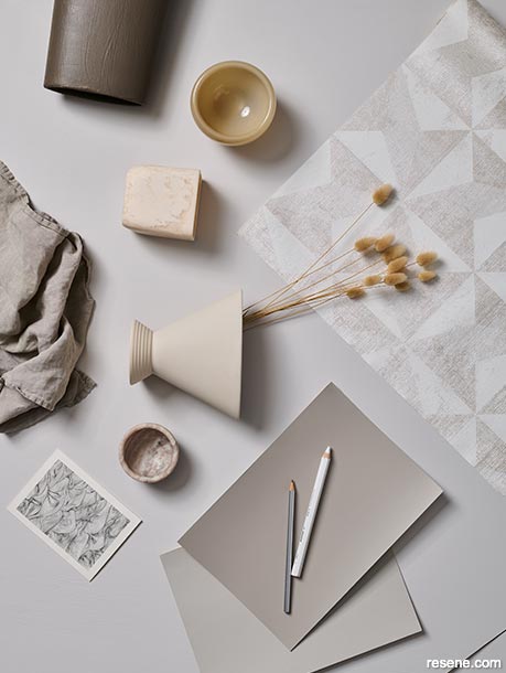
The Resene Whites & Neutrals colour collection makes it super easy to build a scheme like this as it has cards, available free from your local Resene ColorShop, arranged in the various colours along with their different strengths. Some of the most popular whites and neutrals come in eight different strengths.
Using Resene whites and neutrals this way can result in a tonal scheme in its purest form which could become the backdrop for adding accent colours or textural furnishings.
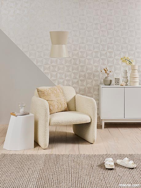
As we become more confident with colour, we find the courage to mix things up a little. So instead of sticking slavishly to a cream-on-cream scheme or using just the variants of one particular Resene colour, we can play with blending different whites and creams together. This room has a combination of warm greys and whites at its heart, using Resene Westar on the triangular section of the wall – it’s described as a stony hint of grey and brown, sedate and sensitive. Then Resene Half Rice Cake, a clean starchy white, is used to paint the sideboard.
Added to these two colours is the light beige Resene Parchment, which has a yellow base and therefore might seem at odds with the pale grey/white combo. But it works. And one of the reasons that is does, is that it’s used in three places – on the pendant lampshade, on the tall vase and its colour is echoed in the occasional armchair.
Any good interior stylist will tell to work in odd numbers when using a particular colour or element within a room – and that’s what happens here.
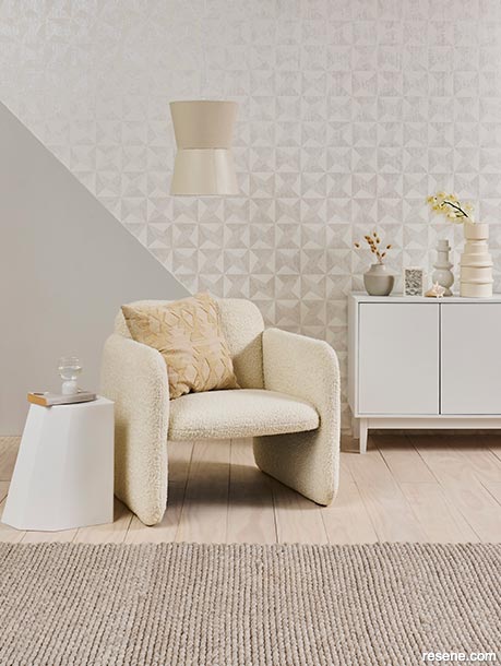
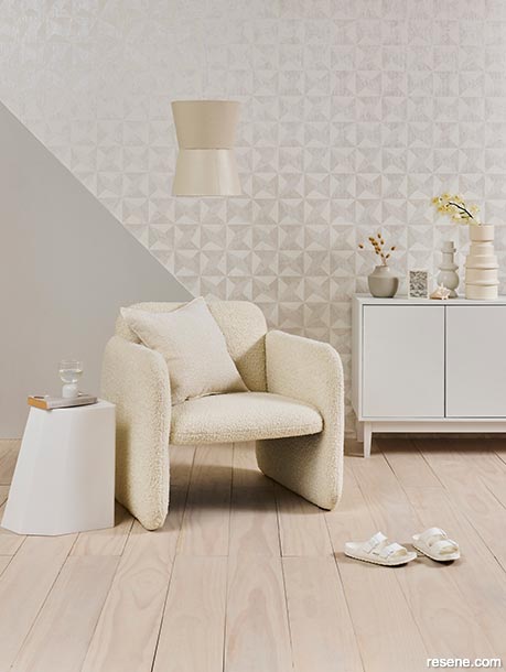
The hero of the room is the beautiful Resene wallpaper with it’s almost 3D geometric design which also uses a marbled effect – it’s contemporary but also elegantly timeless.
The room is also a lesson in using a combination of wallpaper and paint in a creative way. Rather than paper the entire wall or room, the wallpaper has been hung in a triangular section on the upper part of the wall which is then joined by another triangular section of wall painted in Resene Westar – which is a colour that’s been matched to one within the wallpaper design.
The facetted design of the wallpaper is echoed in the geometric side table. The accessories, such as the vases, build on the complex tonal scheme by introducing yet more colours from the Whites & Neutrals collection, Resene Black Haze, a cloudy grey white and Resene Napa, a smoky grey beige.
The other successful design features of the room are pattern and texture. Aside from the obvious patterning of the wallpaper, the curvy chair is upholstered in a pronounced boucle-style fabric giving it a subtle retro or look, the grain of the floor is celebrated by being finished in Resene Colorwood Whitewash, the sisal rug has a ribbed texture and a couple of the vases are also ribbed.
The chair harks to a recent design trend called neotenic in which soft almost child-like oversizes curves and rounded shapes are used.
All of these elements combine to create a contemporary and elegant space that’s also a little quirky.
Project by Kate Alexander. Photography by Bryce Carleton. July 2022
Colour inspiration - latest looks gallery
Get inspired with colour and the latest decorating and colour trends! Select just the right look and mood for your space.
Filter: kids & teens | greens | blues | yellows | neutrals | oranges/browns | pinks/reds | greys/blacks | violets | pops-of-colour/multi-colour
A superior exterior in beachy blues
Create a beachy vibe at home
Of shape, tone and texture
Decorating with timeless tonal colour schemes
![]() Get inspired ! Subscribe
Get inspired ! Subscribe ![]() Get saving ! Apply for a DIY card
Get saving ! Apply for a DIY card
![]()
Can't find what you're looking for? Ask us!
Company profile | Terms | Privacy policy | Quality and environmental policy | Health and safety policy
Colours shown on this website are a representation only. Please refer to the actual paint or product sample. Resene colour charts, testpots and samples are available for ordering online. See measurements/conversions for more details on how electronic colour values are achieved.
What's new | Specifiers | Painters | DIYers | Artists | Kids | Sitemap | Home | TOP ⇧