From habitat magazine - issue 38, feature home
Ann was determined to go bold during the remodel of her Wellington deco-styled home, opting for bright colours tempered by more subdued hues.
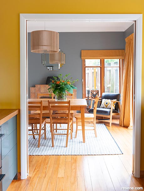
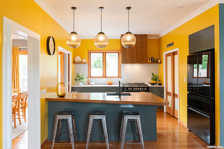
Stormy Resene Trojan on the dining room walls contrasts perfectly not just with their wooden décor but also the vibrant, sunny Resene Thumbs Up in the connecting kitchen, framed by the trim and ceiling in Resene Quarter Bianca.
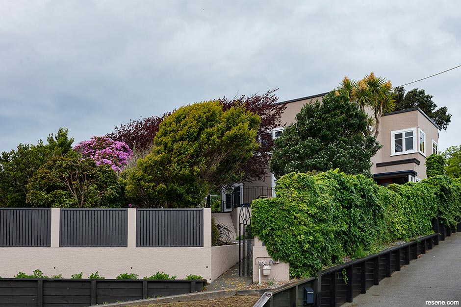
Here’s a challenge: Stop smiling as you walk up to Ann and Matt’s home. The exterior is painted in elegant Resene Double Malta, teamed with a front door in Resene Rock Spray, a fiery orange ensuring a bright and cheery entrance to this Ngaio deco-style home. “I wanted people to smile and go, ‘Oh!’” says Ann, sitting in a favourite spot in her Resene Streetwise living room. “I wanted to give visitors a clue they are about to enter a colourful world.”
Creating that colourful world was challenging, so Ann invited interior designer Katie Peck from Kurio to lend an eye. “I knew what colours I liked but didn’t know how to put them together. Katie set up a Pinterest page, and we started pinning colours. I was pinning a lot of navy and lighter blue tones, and golds and mustard. I do like yellow – it makes me happy.”
Ann’s colour choices for her and Matt’s former home were “a lot less daring”, with Resene Haystack a favoured neutral, but she wanted the colours in this one, which the couple bought over a decade ago, to be “a lot more adventurous”. Despite her love of paint, the home’s timber features were never going to see a paintbrush. “I love the look and warmth of the wood and how it glows against the colour.”
Katie readily accepted Ann’s invitation. “I love that she was so brave. People can find it hard to be different without solid direction from someone like a designer. It’s hard to be sure they’re making the right decisions. But if someone says, ‘That’s great, let’s do it,’ they feel more confident.”
Client and designer had plenty of wall space upon which to enjoy their adventure as Ann and Matt – with Katie’s help as an interior designer – reconfigured most of the house. They opened the kitchen into the living room, installed sliding doors, closed off openings, shifted a hallway and added a walk-in wardrobe to Ann and Matt’s bedroom, along with a small but perfectly formed ensuite bathroom. The wall in the upstairs hallway was moved and is now curved, elegantly embracing the ensuite inside the curve.
Ann and Katie (with a veto vote from Matt, who had to be convinced about the yellow) have created a colourful family home that’s happy and playful, making inventive pairings within Resene’s vast colour palette. It caught the attention of the judges at the Resene Total Colour Awards, winning the Resene Total Colour Maestro – Residential Interior Award.
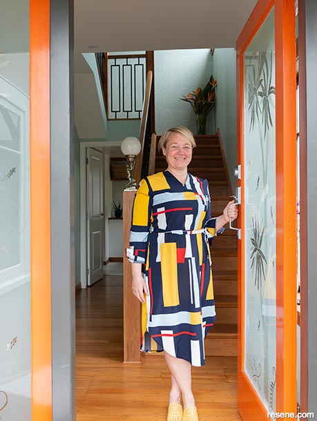
Ann was adamant she wanted colour to be a feature of the home but sought advice on using it well, including the choice of Resene Rock Spray on the front door which opens to the hallway in Resene Unwind.
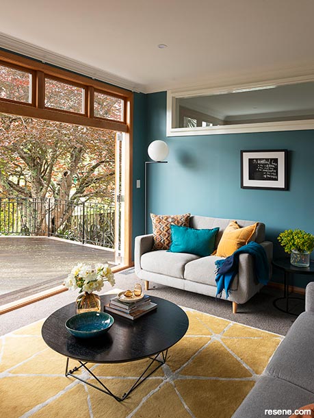
Slate blue Resene Streetwise adds a cool contrast to the living room, while emphasising the connection to the outdoors.
Ann is reluctant to pick a favourite colour – or room. As a mother of three (Sarah, 18, James, 15, and Olivia, 12), it’s possibly impossible to single out a most beloved. But – if you were to press her – maybe the kitchen, with its mustardy sunflower yellow walls in Resene Thumbs Up, contrasted against the cabinetry in Resene Possessed. “I originally wanted yellow tiles as a splashback with white walls, but I couldn’t find any to suit. So, we flipped it to have yellow walls and white tiles, which are much easier to find,” says Ann.
In the dining room, which can be open to, or closed off from, the kitchen, the walls are painted in Resene Trojan, a few shades lighter than Resene Possessed. It is a technique Katie replicated in other parts of the home. For example, she used Resene Unwind upstairs in the children’s bathroom, complemented by Resene Paris White, a few steps – and a few shades – away in the adjoining hallway. “I like to use slightly different hues to talk back to each other throughout a home by using a colour in one room that links to another space in a way that might be less intense,” she says.
Likewise, the downstairs toilet is Resene Biscay, a beautiful dark and stormy blue that links to Resene Blue Night and the complementary blue tiles in the couple’s ensuite bathroom. Both are deep navy blues that make the antique gold fixtures shine.
Katie says she’s never had a problem finding a colour to suit from the Resene range, and, as most of Ann’s preferences were in the blue palette, her job was made even easier. “Resene has a particularly great range of blues.”
One of Ann’s beloved blues surrounds her in her favourite place to relax on her living room couch, curled up and cosy but uplifted by Resene Streetwise, a warm and gentle teal that tones down the kitchen’s vibrant Resene Thumbs Up. She loves taking in those gorgeous colours or resting her eyes on Resene Paris White, a gentle marine green in the stairway. “I look at these colours around me, and I love them all. They reflect my personality, and they make me happy. They make this a warm and welcoming place to be.”
Find multiple options Start with one colour, then get a minimum of three Resene drawdowns (A4 paint swatches) in other similar colours to try. Katie often uses up to six. You can view these swatches free at your local Resene ColorShop in their instore colour library or order online at www.resene.com/drawdowns. Or use Resene testpots, available at your local Resene ColorShop or buy online at shop.resene.com/testpots.
Oranges need zest! Love the colour orange? A fresh, natural zesty orange is often best. Try Resene Pizazz.
Hot on mustard? Mustard yellows can have an enormous impact, but they can be tricky. Don’t overuse them; contrast them with other more subdued colours – an excellent tip to tone down any bright colour. Try Resene Galliano with Resene Half Aubergine.
Go big in the whole room Katie is into “being immersive”, or colour drenching, which is painting the walls, ceiling, architraves and window surrounds in a single colour. The look does depend on the space, the home’s era and, of course, the colour. Katie’s favourite is Resene Green Meets Blue.
Favourite neutrals It can’t all be bold, so Katie’s favourite complementary neutrals include Resene Black White, Resene Alabaster, Resene Rice Cake and Resene Merino, which has a warm undertone if a space needs a little warming up. With greys, she prefers Resene Truffle or Resene Half Truffle.
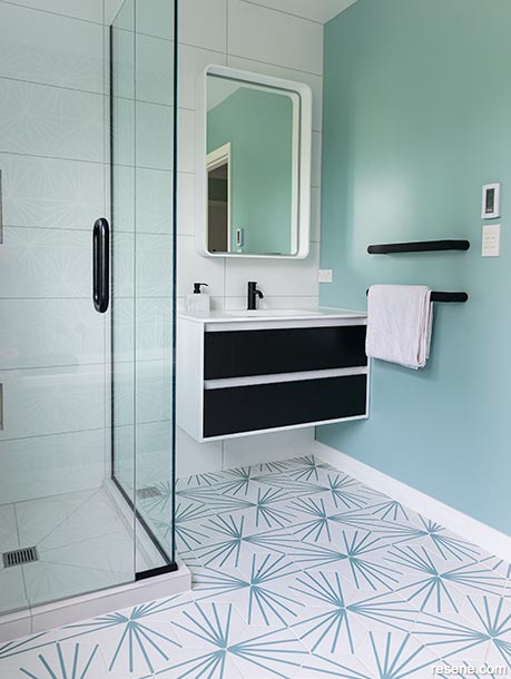
Ann’s love of blues is well represented in the soothing tones of Resene Unwind in the family bathroom.
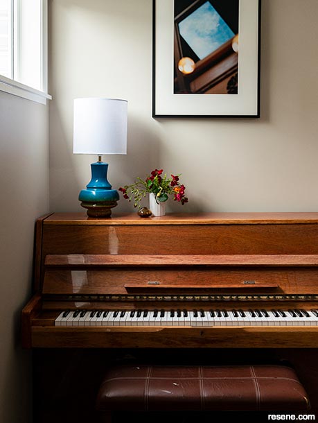
This musical space is kept fresh and neutral with wall walls in Resene Triple Blanc and a crisp Resene Quarter Bianca window frame.
Choose the right Resene colours and paints for the job.
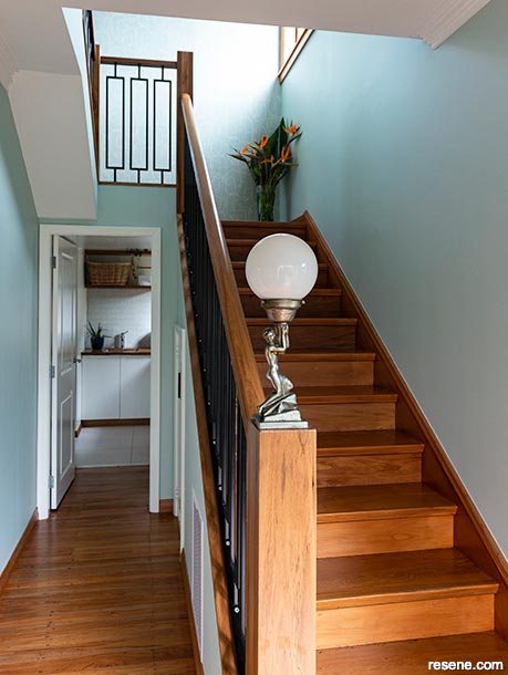
Subtly green Resene Paris White lends freshness and light to the stairwell.
To make your front door pop, use Resene Enamacryl gloss waterborne enamel or Resene Lustacryl semi-gloss waterborne enamel. These durable enamel-style paints are ideal for high-contact areas, such as doors, trims, windowsills, stair rails and balustrades and are easy to clean.
To create colour-blocked walls with contrasting colours, use Resene SpaceCote Flat or Low Sheen and quality masking tape. Paint the wall in the lightest colour first and allow it to touch dry before applying masking tape on the desired edge. Use a brush to paint over the edge of the tape in the light colour. Then allow it to dry to prevent the paint from bleeding beneath the tape. Now paint the darker colour, using a brush when painting over the tape. Remove the tape when the paint is almost, but not completely, dry.
Protect native timber flooring with Resene Qristal ClearFloor 1K. This satin finish, waterborne urethane is extra durable to handle foot traffic and wear and tear from chairs and tables. To add colour and enhance the timber’s natural beauty, add Resene Colorwood Enhance to Resene Qristal ClearFloor 1K.

botanical freshness for easy living
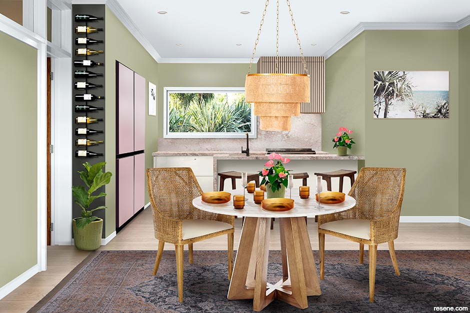
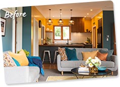
Resene Colour Consultant Amy Watkins suggests this alternative scheme:

Amy Watkins
I’ve created a beachy summer space with a take on vintage rustic design. I wanted to create a soft, calm, welcoming look and feel by using chilled-out, relaxing Resene colours and changing the layout to a combined kitchen and dining setup. This features a continual wooden floor finished in Resene Colorwood Breathe Easy from the Resene Colorwood ‘We Speak Beach’ range. This makes the space feel larger and spacious. Repeating the same stain on the rangehood adds balance while preventing the kitchen corner from becoming too dark. The Samsung bespoke refrigerator is in Glam Pink, a fun point of difference that blends nicely with the pink-toned benchtop which adds texture. The eggshell white of Resene Umber White on the cabinets ensures the kitchen doesn’t get too dark, and having Resene Aspiring on all the walls gives the room the connection to the outdoors. The dining chairs are wrapped in a natural rattan weave adding some rustic connections to the look.
email amy.watkins@resene.co.nz web www.resene.com/colourconsult
Top tip It’s easy to rejuvenate and enhance the colour of timber flooring, walls and ceilings with Resene Colorwood. Choose traditional wood colours, or opt for a beachwashed style with the Resene ‘We Speak Beach’ collection.
freshness, finished in luxury
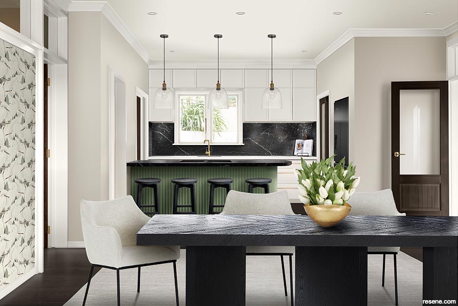
Designers Emma Adkins and Georgia Hay suggest this alternative scheme:

Emma Adkins and Georgia Hay
With inspiration drawn from the detailed timber doors and architraves, we have created a traditional chic, open-plan kitchen and dining room, with a touch of glam. Resene White Pointer on the walls keeps the space light without feeling stark and Resene Quarter White Pointer is used on the shaker-style kitchen cabinetry, trims and ceiling to create a subtle contrast. Having a soft curve at the end of the island, accentuated with Resene Half Washed Green from the Karen Walker Paints collection, visually widens the space and creates an inviting kitchen. Resene Colorwood English Walnut grounds the timber floor and showcases the traditional timber doors. Finally, the feature Resene wallpaper, combined with accents of black and brass, adds personality and glamour.
email info@sampleworkshop.co.nz web www.sampleworkshop.co.nz

Top tip Use Resene Kitchen & Bathroom paint, made with anti-bacterial silver and MoulDefender, in wet areas for extra protection and a durable finish.
Design: Kate Peck, Kurio
Words: Lee-Anne Duncan
Images: Helen Bankers
Search habitat magazine stories
Printed copies of habitat highlights are available from late March 2024 at Resene ColorShops and resellers, while stocks last. You can view back issues of habitat magazine online.
Specifiers:
If you have an idea, project or story that you think would suit habitat, we’d love to hear from you. Please drop us an email with your details and include photos if submitting a project.
Sign up for a DIY card and Save! Australia | New Zealand