Regional and special colour palettes
Colour guidelines for the exterior decoration of CBD buildings
Heart of Gisborne is proposing to introduce Gisborne City Design Principles to guide appropriate development within the CBD. The includes guidelines on aspects such as the building façade and verandahs, as well as a colour palette. The important consideration is to ensure the new development is of quality, and that it fits within the established streetscape.
The use of colour on buildings in the city has a significant impact on the streestscape. Gisborne is an isolated, culturally diverse coastal retreat. The natural beauty of the coastline, our sunburnt pastures and contrasting lush green vineyards and cropping fields are underpinned by a strong Maori heritage and sense of pride in this unique place. Previously on of New Zealand's best kept secrets, Gisborne is fast becoming the investor and holidaymakers' destination of choice.
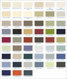
The Gisborne colour palette has been developed to reflect those important influences on Gisborne and focuses on the earth and the ocean. The palette features muted colours that reflect the city's laid back, quiet confidence with a hint of brighter colours to reflect our vitality. Colours have been chosen to add value to buildings of many styles and eras and complement existing colour schemes. The range features earthy browns, oranges, and greys reflecting our land, while an array of blues and purples reflect the ever changing colours of the ocean. A smattering of complementary reds associated with Maori tradition have also been included. Pinks and strong browns are noticeably absent from the palette as it is believed that these are not part of the true Gisborne identity.
Particular care must be taken when a building is bulky and featureless and when large plain surfaces are visible to the public. Expanses of wall, unbroken by windows or doors, can have a detrimental effect on the streetscape if they are painted in colours that are out of character with the rest of the street, such as very dark colours or white (which can become grubby or produce glare).
Consider treatment of the surfaces to enable easy graffiti removal.
Choose colours sympathetic to neighbouring buildings.
Choose colours that recognise the context of the building. If the building is on a corner site, its surfaces will be highly visible. This building will already be prominent and a colour scheme that enables the building to sit back rather than stand out will achieve a better fit within its environment.
Consider the era of the building. Pastel colours can be effective for contemporary buildings and pre-1930 buildings are well suited to more traditional colour schemes.
Some colours naturally co-ordinate well together to create a pleasing effect whilst other colours are discordant when placed together.
Avoid large amounts of bright colours such as bright red, blue, pink or green. These colours make a building stand out and say 'look at me'. There are other ways to draw attention to a business, such as window display and effective signage. Bolder colours can be incorporate into a colour scheme to accent building detail and provide a contrast against a more neutral backdrop.
Avoid corporate colour schemes in the central CBD. Elements of a corporate colour scheme can be introduced without dominating a building.
Elsewhere in the CBD, consider toning down corporate colour schemes.
Note that there are always exceptions to a pastel or neutral colour scheme: an unexpected colour scheme can be effective and become a valued and appreciated part of the streetscape. This is usually achieved through co-ordination of the building's signage, detailing and colours and consideration of the building's context and use. It is recommended that professionals such as artists, architects, landscape architects or colour consultants are employed.
All colours are drawn from the Resene Total Colour System, available at Resene ColorShops.
View the Heart of Gisborne colour palette.
View Heart of Gisborne colour palette as a pdf. You will need Acrobat Reader to view this.
These colours are a representation only. Please refer to the actual paint or product sample. Resene colour charts, testpots and samples are available for ordering online.
Resene regional and special colour palettes
As well as all the normal colour charts we release, Resene also has the ability to make and display custom colour palettes too.
![]() Get inspired ! Subscribe
Get inspired ! Subscribe ![]() Get saving ! Apply for a DIY card
Get saving ! Apply for a DIY card
![]()
Can't find what you're looking for? Ask us!
Company profile | Terms | Privacy policy | Quality and environmental policy | Health and safety policy
Colours shown on this website are a representation only. Please refer to the actual paint or product sample. Resene colour charts, testpots and samples are available for ordering online. See measurements/conversions for more details on how electronic colour values are achieved.
What's new | Specifiers | Painters | DIYers | Artists | Kids | Sitemap | Home | TOP ⇧