Auckland Airport warehouse
The use of strong colours to identify the building and create interest is also a departure from the usual low-key treatment of warehouse buildings, and was a client-led and most welcome innovation.
Located in the landside business park to the north of the existing international terminal and runway, this large multi-unit warehouse project at Auckland Airport comprises an 8000 square metre warehouse divided into ten units.
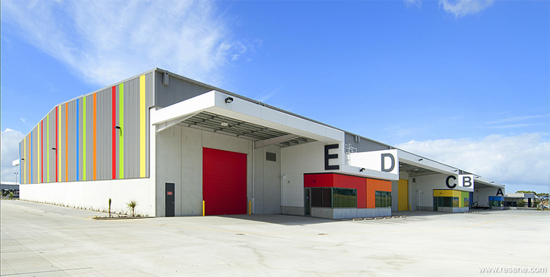
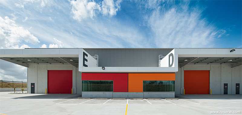
Canopy and office structures are integrated creating a seamless stepping line along each side of the main warehouse ‘shed’ form. This is a significant departure from the standard treatment of these components, which are normally separated. At eye level close to the building this helps to reduce the bulk of the high stud warehouse, which at 137m long by 60m wide, would otherwise dominate. The building is known commercially as ‘Flex’ in recognition of its ability to be subdivided to the specific requirements of tenants.
The use of strong colours to identify the building and create interest is also a departure from the usual low-key treatment of warehouse buildings, and was a client-led and most welcome innovation. The request was for the building to be noticeable from two perspectives – from the main road network – but also from other roads. The colour scheme therefore needed to address all four sides.
The colour palette focuses on ‘Pacifica’ colours, with Resene Red Hot (primary red), Resene Hyperactive (frenetic orange), Resene Yellow Submarine (striking yellow), Resene Limerick (Irish green) and Resene Primetime (bright blue), with Resene Concrete (frosted grey) and Resene White.
The main warehouse cladding colours have been kept low-key to reduce the visual impact of such a large structure. The gable ends of the building have been painted with 900mm wide brightly coloured stripes that match cladding colours used elsewhere. These are observable from a considerable distance and meet the client’s request for a noticeable presence for the development.
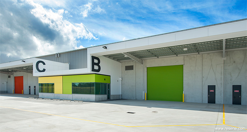
The same bright colours were used on the fibre cement sheet cladding for each of the 10 office areas. Along with giving presence, these also serve to differentiate the units to provide wayfinding and give identity for tenants.
Over each office area and flanking the warehouse canopies is the continuous line of the roof fascias, painted in pure white. Against the backdrop of the neutral warehouse cladding, and the strong colours of the offices, the contrasting brightness of the white emphasises the roof edge as a design feature. The crispness of the white also helps to lighten the overall effect.
The unique use of colour won this project the Resene Total Colour Commercial Exterior Award 2013. The judges appreciated the “magical impact as we see colour being used as a language, not just a token wayfinding. It is nice to see that the colour use isn’t based on a corporate identity, but is focused on clear topography. It is just right. It’s a simple yet very effective way of making a utilitarian building completely interesting through the use of block colour and creative colour stripes.”
Architectural Specifier: Murray Denby, Eclipse Architecture
Building Contractor: Haydn & Rollett
Client: Auckland International Airport
Interior Designer: Murray Denby and In Hae Chung, Eclipse Architecture
Winner: Resene Total Colour Commercial Exterior Award 2013
Project: Resene Total Colour Awards 2013
From the Resene News – issue 4/2013
Resene case studies/awards project gallery
View case studies that have used Resene products including many from our Resene Total Colour Awards. We hope these projects provide inspiration for decorating projects of your own... view projects
Total Colour Award winners:
2023 |
2022 |
2021 |
2020 |
2019 |
2018 |
2017 |
2016 |
2015 |
2014 |
2013 |
2012 |
2011 |
2010 |
Entry info
Latest projects | Project archive | Resene news archive | Colour chart archive
![]()
![]() Get inspired ! Subscribe
Get inspired ! Subscribe ![]() Get saving ! Apply for a DIY card
Get saving ! Apply for a DIY card
![]()
Can't find what you're looking for? Ask us!
Company profile | Terms | Privacy policy | Quality and environmental policy | Health and safety policy
Colours shown on this website are a representation only. Please refer to the actual paint or product sample. Resene colour charts, testpots and samples are available for ordering online. See measurements/conversions for more details on how electronic colour values are achieved.
What's new | Specifiers | Painters | DIYers | Artists | Kids | Sitemap | Home | TOP ⇧


