Wellington
The ultimate success of this space is the way that not one of the colours or textures overtakes or dominates the space.
The brief for this project was to replace a much-loved colourful family kitchen which had simply worn out. The clients, one of whom is a well-known New Zealand artist Rob McLeod, provided a simple brief that included the requests for maximum function in a very tight space while ensuring interesting shapes, colours, textures and finishes.
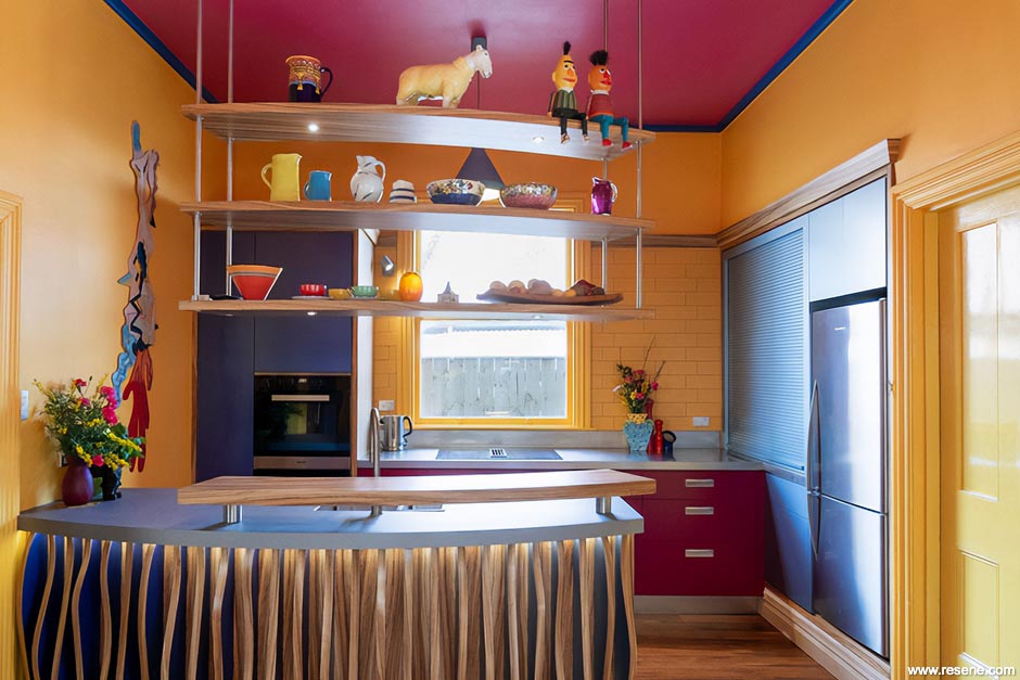
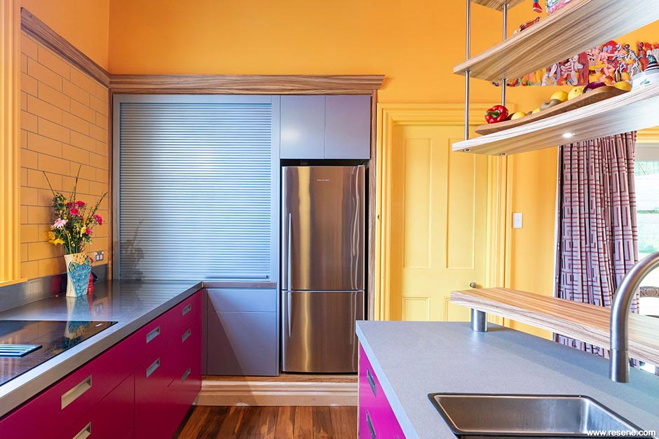
Beginning with the shape of the space, manipulating the functional elements and addressing their relationship with each other, ensured the space worked for the end user. From there I approached each functional element individually and began building up layers of texture, form and interest. With various existing architectural features to integrate into the design such as the high ceiling (3600mm) and a central single hung sash window, it was especially important to establish a clear connection within the new design. The hob was centred to the window giving it place.
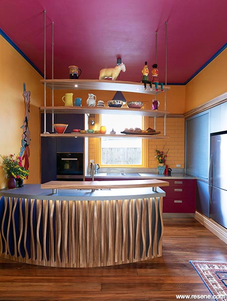
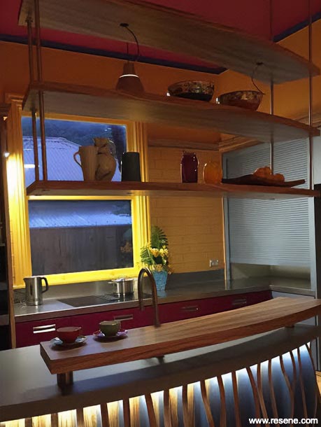
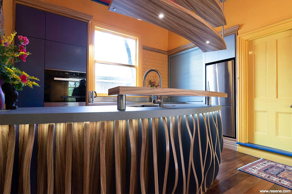
A suspended triple-tier shelving system was hung from the ceiling, mirroring the shape of the raised Zebrano bar below. Rob kindly allowed us to make a hole in his studio floor so the joiners could anchor the stainless steel rods into the floor joists and ensure stability of the shelving. The suspended shelving was a feat of engineering. The shelving had to be able to bear the weight of multiple crockery pieces and ornaments, house pin-LED’s with unseen wiring and remain stable if bumped or in Wellington’s case shaken!
The inspiration for one of the key features of the design – the organic shaped timber fins along the front of the peninsula came from viewing a unique piece of art that made a lasting impression while visiting another client’s finished project. The artwork bore hundreds of leaves all packed in tightly on end and spray painted two colours. As I walked from one side of the artwork to the other, the effect of the artwork changed, a simple but highly effective approach.
To achieve a similar effect in the client’s kitchen space, each side of the seven bespoke zebrano-spined fins were painted in the selected Resene metallic colours – Resene Time Warp and Resene Scotty Silver. To further increase the drama, lighting was added to the underside of the bench (along with other key parts of the space), creating a day/night dynamic, giving the kitchen an opportunity to re-invent itself throughout the day.
The ultimate success of this space is the way that not one of the colours or textures overtakes or dominates the space. Each holds its own and plays its part in enhancing the form and flow of the kitchen space. The result is a lively, energising space than can be revved up or calmed down throughout the day. This kitchen space is a true collaboration of where form and function can both exist in unity!
Rob McLeod is a master of colour. His bold approach to his artwork is reflected in the kitchen particularly with the inclusion of dark pink Resene Lip Service. With a beautiful matt finish, the colour is balanced expertly by the blues, greys and timber tones. The metallics were a risk that paid off.
Architectural specifier: Amanda Smith, ASDesign
Building contractor: MB Construction
Client: Rob McLeod & Robyn Baker
Colour selection: Rob McLeod
Painting contractor: Joinery painted by Living Timber
Splashback: Jamie Pollock – tiler
Photographer: Kevin Liu Creative
Project: Resene Total Colour Awards 2020
Resene case studies/awards project gallery
View case studies that have used Resene products including many from our Resene Total Colour Awards. We hope these projects provide inspiration for decorating projects of your own... view projects
Total Colour Award winners:
2023 |
2022 |
2021 |
2020 |
2019 |
2018 |
2017 |
2016 |
2015 |
2014 |
2013 |
2012 |
2011 |
2010 |
Entry info
Latest projects | Project archive | Resene news archive | Colour chart archive