Christchurch
Te Hohepa Kohanga Reo sets out to be a new typology for Maori childhood learning.
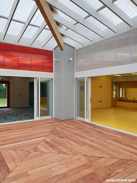
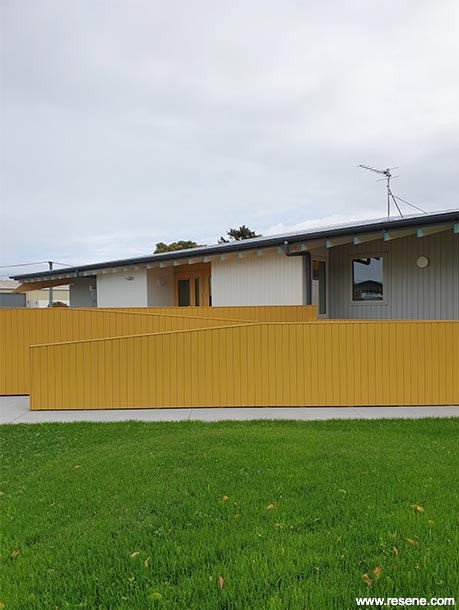
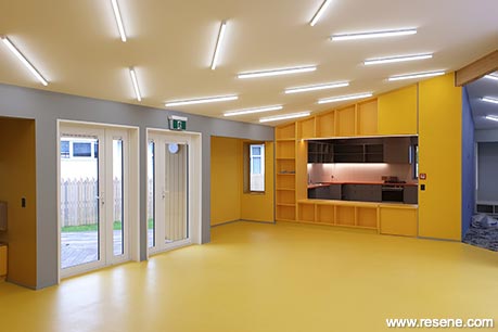
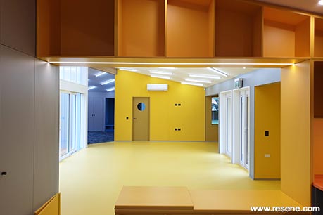
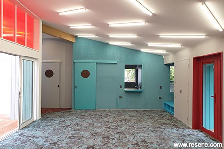
The new building sits on a former school field in an inner city Christchurch suburb where residential mingles with industrial. As a replacement to the preschool's existing building, it allows a capacity to nurture 50 children, over 270 square metres of floor area and 2700 square metre site area. Oriented on North-South and East-West axis, individual learning spaces are situated around a central courtyard, each having their own relationship to the sun and are concurrently separate but connected to each other. The covered central courtyard – a play space and gathering point – offers a semi-outdoor sanctuary from the colder Christchurch weather and a kaleidoscope of light and colour. Ancillary functions are efficiently located at each corner of the building while pop-outs offer day beds and storage. Vivid colour combinations connected to each space are both functional and evocative for the children.
This Kohanga Reo uses a strong eight pointed star – Tutohinga O Te Hohepa Kohanga Reo as its symbol. There are four colours – white, blue, yellow and dark red – each has a deep significance and sits as geometric diamond shapes to form the star.
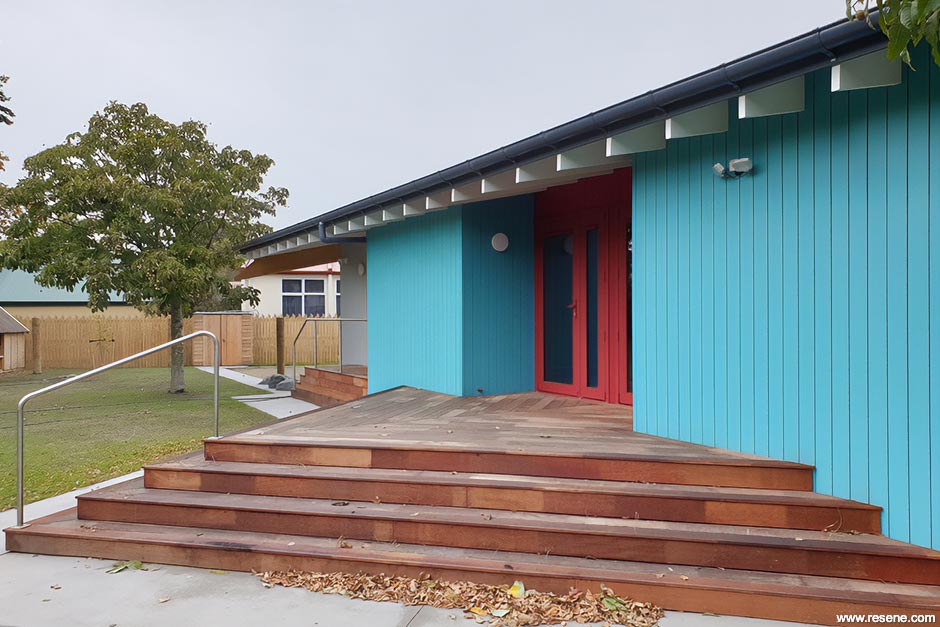
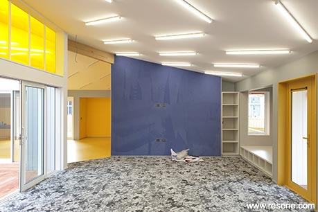
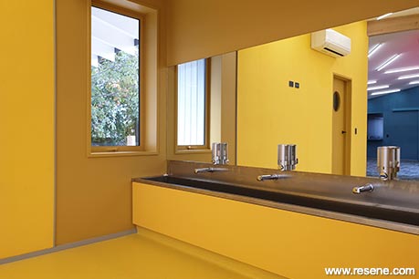
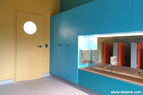
Each of the four elevations took one of these colours, which also made it easier to recognise each entry for wayfinding. Each of these elevations were also contrasted with one of the other colours on the joinery of the entry doors. The grey was used at the corners externally and internally as a background to the bolder colours and to unify the spaces. Each of the four colours were continued inside to their respective spaces and carefully coordinated with singular colour schemes for carpet, joinery, cabinetry, etc.
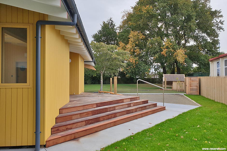
The exterior cladding colours had to be carefully paired with the joinery of the doors and windows. Many samples were matched by eye, but in the end three were then lab matched to get the perfect colour matches with Resene. Each of the four main colours needed to match their joinery equivalent but also the contrasting joinery colours as well as the other cladding colours because they could be seen together from different viewpoints from around the building. The downpipes were finished in Resene Lumbersider CoolColour in Resene New Denim Blue.
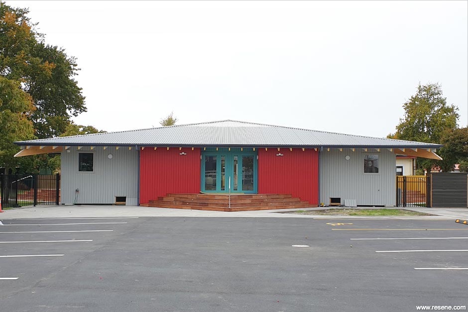
The weatherboards were finished in Resene Lumbersider in Resene Half Stack grey teamed with altered versions of Resene Pohutukawa, Resene Blue Chill and Resene Thumbs Up. These hues were also continued indoors using Resene SpaceCote Low Sheen in wet and high wear and tear areas and Resene Zylone Sheen in dry areas with exposed rafters/soffits in Resene Lumbersider tinted to Appliance White.
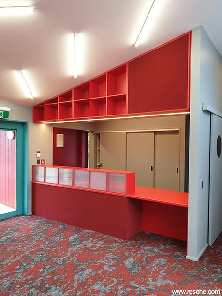
This project won the Resene Total Colour Education Award. The judges said "a little colour goes a long way with this project, bringing excitement and a warm welcome to young and old alike. Paint colours have been used as a versatile medium to co-ordinate with other materials. With the Kohanga Reo star leading the way, the hues have dual use as wayfinding devices, much as one might navigate by the stars at night. A considered use of the whole material palette with paint colours as the connection. An exciting new look for Kohanga Reo."
Architectural specifier: Bull O'Sullivan Architecture
Building contractor: E James Builders
Client: Te Kohanga Reo National Trust
Colour selection: Paul Anselmi
Painting contractor: Garden City Painters
Te Hohepa Kohanga Reo administrator: Nicole Keogh
Photographer: Paul Anselmi
Winner: Resene Total Colour Education Award
Project: Resene Total Colour Awards 2020
Resene case studies/awards project gallery
View case studies that have used Resene products including many from our Resene Total Colour Awards. We hope these projects provide inspiration for decorating projects of your own... view projects
Total Colour Award winners:
2023 |
2022 |
2021 |
2020 |
2019 |
2018 |
2017 |
2016 |
2015 |
2014 |
2013 |
2012 |
2011 |
2010 |
Entry info
Latest projects | Project archive | Resene news archive | Colour chart archive