Auckland
The final design is a blend of hand crafted, industrial and soft pastel colours, but using colours that move away from the traditional mint, pink and pastel blue.
The client had two sites within the 'Food & Beverage' building at the new Long Bay Village centre, which was beginning construction at the time. Their plan for the sites was to create a Mediterranean style restaurant in the larger, more prominent corner tenancy, with a complementary café and food outlet in the smaller adjacent tenancy. At that stage, there was a fairly clear idea about what the restaurant space was aiming to achieve, but the café space had a very open brief.

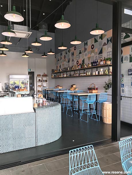
As well as interior tenancy space for kitchens and seating, the base building provided a large outdoor area under a projecting roof, perfect to shade from the sun on a hot summer day, and which during winter also allows lower angle winter sun to warm the sheltered seating areas. The first site visit however was to a low mound of clay within a dusty construction site, and a certain amount of vision was required to envisage the possibilities of the site.
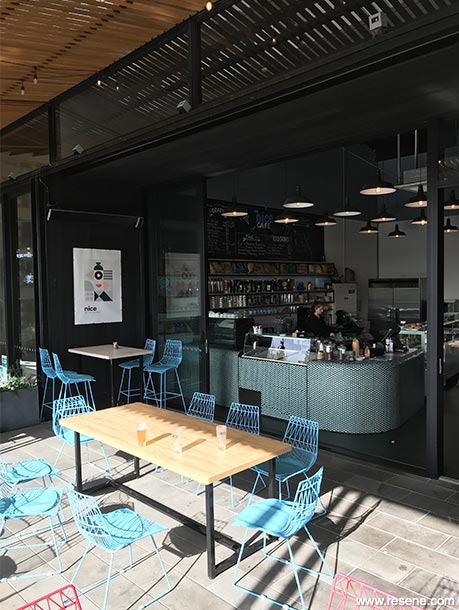
The new building is located beside the new northern entry to Long Bay Regional Park and beach, and the site provided a great opportunity to cater for the large number of visitors to the area. The café concept developed to include ice-cream, cold drinks and deli food offerings for takeaway. The Village centre is now complete and housing is continuing to be built in the surrounding neighbourhood.
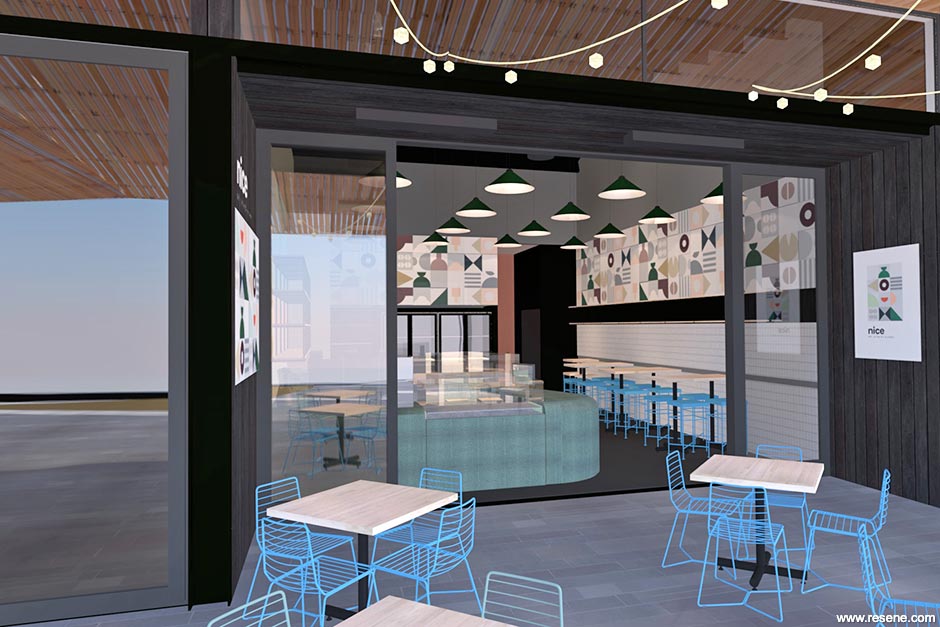
The client's food and beverage concept for the café space was to provide coffee, cold drinks, ice-cream and deli-food for picnickers on their way to the beach. The style however was an open question, and our design goal was to encapsulate that brief into a cohesive design that wouldn't confuse customers about what was on offer. The client could see that we needed to create a strong identity for the café, and to avoid generic 'corporate café' style.
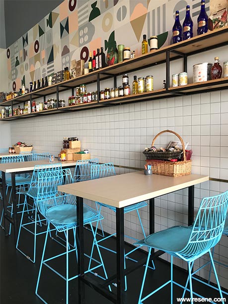
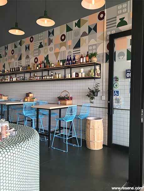
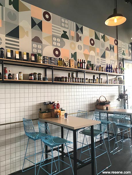
Graphic designer, Manolo Garcia, was a crucial part of the team, and the logo that was developed for the branding identity evolved into the mural that runs the length of one side of the cafe. The colour scheme used in the logo would have been too intense when used on the scale of an entire wall, so was developed along with the interior design scheme to create the final colour palette.

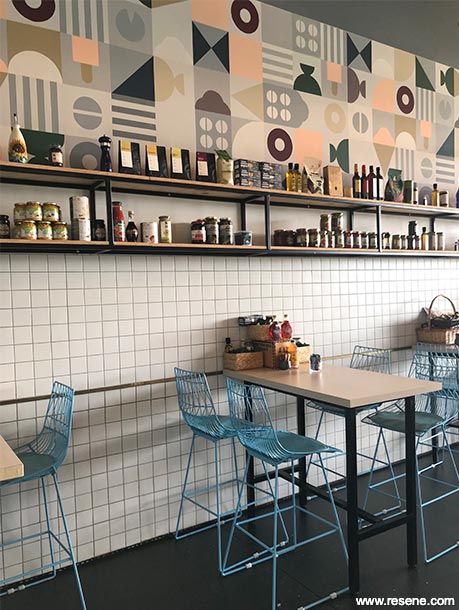
The final design is a blend of hand crafted, industrial and soft pastel colours, but using colours that move away from the traditional mint, pink and pastel blue.
To create a hand-crafted character for the project, the decision was made to paint the mural by hand, rather than a commercially printed decal. This would follow the theme of softer edges, and to show the personal attention of the people involved. This involved a large amount of stencilling, masking tape and patience on the part of the painter.
The mural is finished in a base of Resene Sea Fog with Resene Sanguine Brown, Resene Tangaroa, Resene Goblin, Resene Romantic, Resene Bullwhip, Resene Gull Grey and Resene Surrender. The upper wall is Resene Regent Grey, which is teamed with Resene Surrender on the interior.
Resene SpaceCote Flat was the obvious choice on the walls because for a soft sheen and lack of reflection that a flat paint finish allows. The flat finish also tends to hide any unevenness in the substrate or application, allowing the mural to be appreciated without any distracting light reflections.
On the floor, a paint finish was used over the new concrete slab. Resene Walk-on in Resene Eternity provided a dramatic contrast with white wall tiling and the pale teal button tiles on the counter. Resene Walk-on was chosen for ease of application and recoating, due to there being some trepidation about painting the floor almost black.
Architectural specifier: Nick Veint Architect Limited
Bench and cabinetry: Bob's Upholsterers
Building contractor: Eres Job Project Management
Client: Salanzo Limited
Colour selection: Manolo Garcia, Nick Veint
Graphic design: Manolo Garcia
Interior designer: Nick Veint Architect Limited
Mural painting: Mariya Sadykova
Steel and oak shelving: Inshelter
Photographer: Nick Veint
Project: Resene Total Colour Awards 2020
Resene case studies/awards project gallery
View case studies that have used Resene products including many from our Resene Total Colour Awards. We hope these projects provide inspiration for decorating projects of your own... view projects
Total Colour Award winners:
2023 |
2022 |
2021 |
2020 |
2019 |
2018 |
2017 |
2016 |
2015 |
2014 |
2013 |
2012 |
2011 |
2010 |
Entry info
Latest projects | Project archive | Resene news archive | Colour chart archive