Are you looking to revamp your interior design with a bold new colour aesthetic? While the process of picking paint is certainly an exciting one, it's important to ensure the hues you select work throughout your entire home.
There are many colour schemes to choose from, whether you're looking to make a statement or want a more subdued feel. Perhaps you've got a knack for reconditioning old furniture, in which case a fresh lick of paint on otherwise bland dining chairs can breathe fresh life into a space.
Here are three colour schemes we love that you might consider for your own home. Be sure to select a colour scheme that matches your personal tastes and works with your home's existing design. While turquoise looks fantastic in bathrooms flooded with light, the colour can be overpowering in a small study, so pick your colours carefully!
Tonal reds
One option when it comes to incorporating a colour scheme into your home is to pick similar tonal colours. Fiery shades of red as well as those with richer, blue-tinged hues create can create a fantastic warmth.
Start with a room that's used most often – most likely the living room. Using the Resene Find-A-Colour tool, you can start getting inspiration for bold red shades that would look fantastic in the space. There's the lively Resene Del Toro for a bright impact, while Resene Red Tape has playful magenta tones that make a space incredibly vibrant.
Given the bold shades for the walls, it's best to opt for low-pile cream carpet and beige or white furniture. You want your living space to feel open, rather than like a dim boudoir, so do away with dark accessories and flooring that will make the space feel closed in.
Once you've selected a definitive red shade for your living space – and possibly kitchen – choose paint colours for walls and key pieces of furniture in the same tone but lighter shades for other rooms in the house. Warm whites with a hint of red look fantastic in the bedroom, for example. Given that a bold red shade may be too much across the whole house, be selective where you use it for a more striking effect.
Complementary colours
While tonal reds can make a statement, so too can complementary colours.
By selecting colours on opposite sides of the colour wheel, you can create a sense of harmony in your home. Often, you can select more muted tones and incorporate them throughout your home.
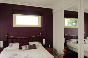
One fantastic combination is a sultry violet shade paired with a deep palm green. You can switch the colours up throughout the home, too.
For instance, Resene Scarlet Gum is a moody red violet. It's complemented by the rich green of Resene Bush. Select one colour for walls and use the complementary tone for skirting boards and statement pieces of furniture.
When it comes to bedrooms, violet tones look fantastic on the walls. By contrast, living spaces will suit Resene Bush or the peacock blue of Resene Arapawa on the walls, with violet-hued side tables, vases, photo frames and foot rests.
Entering spaces
In order to properly integrate a colour scheme into your home – whether complementary or tonal – it helps to walk through the various spaces.
For instance, if you can see the hallway from your living room and kitchen, it's important this thoroughfare is painted and decorated in a fashion that flows seamlessly from these shared spaces. Open all the doors so you can see how the colour and light will flow from one room into the next.
Don't just consider your home from the inside, either. It's essential to think about its exterior appearance, from window frames to the front door. A bold front door can introduce a hue used throughout your property's interior, whether its a deep red, lush green or even an excited yellow.

