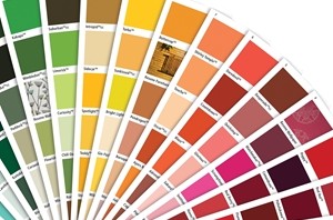
The colour palette is an important decision to make during the interior design planning process. Which room will have which colour? What will the furniture be?
You don't have to stick to plain-old cream, however. Get a little daring this New Year and try using as many colours of the rainbow in your home as possible.
Red
Red is a powerful colour that can be used in a variety of ways. Whether you have a deep, luscious Resene Red Berry or a more muted Resene Alter Ego, it is both versatile and attractive.
Add splashes of red to the furniture of your living room by adopting red leather chairs. Not only will this look sophisticated, but the colour brings people together in conversation when used in a public space.
Orange
Orange exudes auras of sunshine and warmth, so its addition to almost any room is always a plus.
If you intend to have a mixture of colours, you don't want to go overboard on a neon orange feature wall (or maybe you do, it's entirely your call). Orange such as Resene Tangerine in the main hallway, particularly around the front entrance, would be a welcoming colour, especially on colder winter months. On your walls, this colour could form part of an intricate pattern of dots, spirals, circles or other shapes to create a vibrant 80s look.
Yellow
Much like orange, yellow is a colour that instantly makes people feel warmer inside. It's a happy hue which is perfect for both public spaces and bedrooms.
A pastel, muted yellow such as Resene Pale Prim wouldn't go amiss as your wall colour, and it would certainly make your other features pop. Alternatively, splashes of stronger yellows here and there are effective ways to brighten an otherwise dull space up without coating an entire wall in it. Think ornaments, art pieces and other strong feature decor.
Green
Green is the natural colour. It brings a piece of nature with it into the home and makes it feel more down to earth. It's also a pleasing colour to look at when used correctly, and has a calming effect on the mind.
Rather than a living room, instead consider using green where you will be doing work. A feature wall of Resene Sushi will help stimulate the brain in a home office, and touches of leafy colours around the bedroom will make it feel more relaxing, especially if coupled with bamboo wood furniture.
Blue
Another calming colour, blue is perhaps the most peaceful hue you could use on your walls. You do have to be careful, though, because too icy or too deep a blue can make a space feel cold.
Why not try a muted tone such as Resene Jordy Blue as your bathroom wall colour, or add neon touches to the decor around other spaces in the house to create pockets of strong colour? A pastel grey-blue hue such as Resene Nepal is a brilliant neutral colour to use for your bedroom, too, offering the relaxing feeling of blue but with the versatility of grey.
Purple
You could try and break purple up into both indigo and violet, but in terms of effective interior decorating you can more or less class them both as a single hue.
To that end, the more indigo side of purple is great for a luscious wall colour. Resene Chetwode Blue could be used in a second living room, or perhaps to separate a spare bedroom from its counterparts (if you want to give each room its own unique character).
On the deeper side of purple, violets are both classy and sexy, so getting them into the bedroom is almost essential. Think about how you could utilise colours akin to Resene Victoria for bed linen, or even on the curtains.

